Building UI
This section covers the visual styling options in Guido. Learn how to create polished, professional-looking interfaces.
Styling Philosophy
Guido uses a builder pattern for styling - each method returns the widget, allowing chained calls:
#![allow(unused)]
fn main() {
container()
    .padding(16.0)
    .background(Color::rgb(0.2, 0.2, 0.3))
    .corner_radius(8.0)
    .border(1.0, Color::WHITE)
}
All styling is done in Rust code, not external CSS files. This provides type safety and IDE support.
In This Section
- Styling Overview - Complete styling reference
- Colors - Color creation and manipulation
- Borders & Corners - Borders, corner radius, and curvature
- Elevation & Shadows - Material Design-style shadows
- Text - Text styling and typography
Quick Reference
#![allow(unused)]
fn main() {
// Background
.background(Color::rgb(0.2, 0.2, 0.3))
.gradient_horizontal(start, end)
// Corners
.corner_radius(8.0)
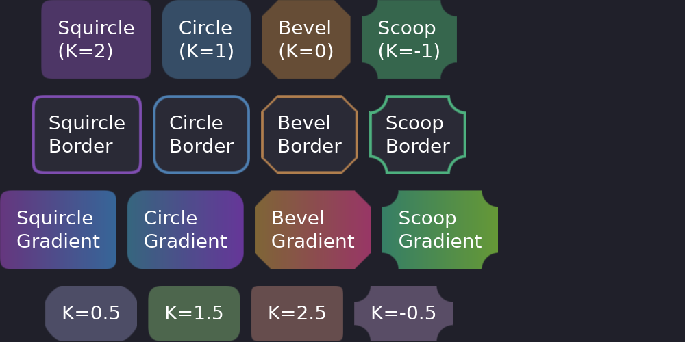
.squircle() // iOS-style smooth
// Border
.border(2.0, Color::WHITE)
// Shadow
.elevation(4.0)
// Spacing
.padding(16.0)
.padding_horizontal(20.0)
.padding_vertical(10.0)
// Size
.width(100.0)
.height(50.0)
}