Guido
A reactive Rust GUI library for Wayland layer shell widgets

Guido is a GPU-accelerated GUI library built with Rust and wgpu, designed specifically for creating Wayland layer shell applications like status bars, panels, overlays, and desktop widgets.
Key Features
- Reactive System - Fine-grained reactivity inspired by SolidJS with signals, computed values, and effects
- GPU Rendering - Hardware-accelerated rendering using wgpu with SDF-based shapes for crisp anti-aliasing
- Wayland Layer Shell - Native support for layer shell positioning, anchoring, and exclusive zones
- Multi-Surface Apps - Create multiple surfaces (windows) that share reactive state
- State Layer API - Declarative hover/pressed states with automatic animations and ripple effects
- Transform System - Translate, rotate, and scale widgets with spring physics animations
- Composable Widgets - Build complex UIs from simple, composable primitives
- Image Widget - Display PNG, JPEG, WebP, and SVG images with GPU texture caching
- Scrollable Containers - Vertical and horizontal scrolling with customizable scrollbars
Quick Example
use guido::prelude::*;

fn main() {
    App::new().run(|app| {
        let count = create_signal(0);

        app.add_surface(
            SurfaceConfig::new()
                .width(300)
                .height(100)
                .background_color(Color::rgb(0.1, 0.1, 0.15)),
            move || {
                container()
                    .height(fill())
                    .layout(
                        Flex::row()
                            .main_alignment(MainAlignment::Center)
                            .cross_alignment(CrossAlignment::Center),
                    )
                    .child(
                        container()
                            .padding(16.0)
                            .background(Color::rgb(0.2, 0.2, 0.3))
                            .corner_radius(8.0)
                            .hover_state(|s| s.lighter(0.1))
                            .pressed_state(|s| s.ripple())
                            .on_click(move || count.update(|c| *c += 1))
                            .child(text(move || format!("Clicked {} times", count.get())))
                    )
            },
        );
    });
}
What Can You Build?
Guido is ideal for:
- Status bars - System information displays anchored to screen edges
- Panels - Application launchers and taskbars
- Notifications - Overlay popups and alerts
- Desktop widgets - Clocks, system monitors, media controls
- Layer shell utilities - Any Wayland layer shell application
Platform Support
Currently, Guido supports Wayland on Linux with layer shell protocol. The library uses:
wgpufor GPU-accelerated renderingsmithay-client-toolkitfor Wayland protocol handlingcalloopfor event loop integrationglyphonfor text rendering
Getting Started
Ready to build your first Guido application? Head to the Installation guide to set up your development environment.
Getting Started
This section will guide you through setting up Guido and creating your first application.
What You’ll Learn
- Installation - Add Guido to your project and set up dependencies
- Hello World - Build your first Guido application step by step
- Running Examples - Explore the included examples to learn different features
Prerequisites
Before you begin, ensure you have:
- Rust (1.70 or later) - Install via rustup
- Wayland compositor - A compositor that supports the layer shell protocol (Sway, Hyprland, etc.)
- System dependencies - Development libraries for Wayland and graphics
Quick Start
If you’re eager to get started, here’s the fastest path:
# Create a new project
cargo new my-guido-app
cd my-guido-app

# Add Guido dependency
cargo add guido

# Run the app
cargo run
Then replace src/main.rs with a simple Guido application. See the Hello World guide for the complete code.
Installation
This guide walks you through setting up Guido for development.
System Requirements
Wayland Compositor
Guido requires a Wayland compositor with layer shell protocol support. Compatible compositors include:
- Sway - i3-compatible Wayland compositor
- Hyprland - Dynamic tiling Wayland compositor
- river - Dynamic tiling Wayland compositor
- wayfire - 3D Wayland compositor
Note: X11 is not supported. Guido is designed specifically for Wayland layer shell applications.
System Dependencies
Install the required development libraries for your distribution:
Arch Linux:
sudo pacman -S wayland wayland-protocols libxkbcommon
Debian/Ubuntu:
sudo apt install libwayland-dev libxkbcommon-dev
Fedora:
sudo dnf install wayland-devel libxkbcommon-devel
Adding Guido to Your Project
New Project
Create a new Rust project and add Guido:
cargo new my-app
cd my-app
cargo add guido
Existing Project
Add Guido to your Cargo.toml:
[dependencies]
guido = "0.1"
Or use cargo:
cargo add guido
Verifying Installation
Create a minimal test application to verify everything works:
// src/main.rs
use guido::prelude::*;

fn main() {
    App::new().run(|app| {
        app.add_surface(
            SurfaceConfig::new()
                .width(200)
                .height(100)
                .background_color(Color::rgb(0.1, 0.1, 0.15)),
            || {
                container()
                    .padding(20.0)
                    .background(Color::rgb(0.2, 0.3, 0.4))
                    .child(text("Hello, Guido!").color(Color::WHITE))
            },
        );
    });
}
Run the application:
cargo run
If you see a small window with “Hello, Guido!” text, the installation is successful.
Troubleshooting
“No Wayland display” Error
Ensure you’re running in a Wayland session, not X11:
echo $XDG_SESSION_TYPE # Should output "wayland"
Compositor Doesn’t Support Layer Shell
Some Wayland compositors (like GNOME’s Mutter) don’t support the layer shell protocol. Use a compatible compositor listed above.
Missing Libraries
If you get linker errors about missing libraries, ensure the system dependencies are installed. The error messages usually indicate which library is missing.
Next Steps
Now that Guido is installed, continue to the Hello World tutorial to build your first application.
Hello World
Let’s build a simple status bar to understand the basics of Guido. By the end of this tutorial, you’ll have a working application like this:
Creating the Project
Start with a new Rust project:
cargo new hello-guido
cd hello-guido
cargo add guido
The Complete Code
Replace src/main.rs with:
use guido::prelude::*;

fn main() {
    App::new().run(|app| {
        app.add_surface(
            SurfaceConfig::new()
                .height(32)
                .anchor(Anchor::TOP | Anchor::LEFT | Anchor::RIGHT)
                .background_color(Color::rgb(0.1, 0.1, 0.15)),
            || {
                container()
                    .height(fill())
                    .layout(
                        Flex::row()
                            .spacing(8.0)
                            .main_alignment(MainAlignment::SpaceBetween)
                            .cross_alignment(CrossAlignment::Center),
                    )
                    .child(
                        container()
                            .padding(8.0)
                            .background(Color::rgb(0.2, 0.2, 0.3))
                            .corner_radius(4.0)
                            .child(text("Guido")),
                    )
                    .child(container().padding(8.0).child(text("Hello World!")))
                    .child(
                        container()
                            .padding(8.0)
                            .background(Color::rgb(0.3, 0.2, 0.2))
                            .corner_radius(4.0)
                            .child(text("Status Bar")),
                    )
            },
        );
    });
}
Run it with cargo run.
Understanding the Code
Let’s break down each part:
The Prelude
#![allow(unused)]
fn main() {
use guido::prelude::*;
}
The prelude imports everything you need: widgets, colors, layout types, and reactive primitives.
Surface Configuration
#![allow(unused)]
fn main() {
App::new().run(|app| {
    let _surface_id = app.add_surface(
        SurfaceConfig::new()
            .height(32)
            .anchor(Anchor::TOP | Anchor::LEFT | Anchor::RIGHT)
            .background_color(Color::rgb(0.1, 0.1, 0.15)),
        || { /* widget tree */ },
    );
});
}
The SurfaceConfig defines how the window appears:
- Height - 32 pixels tall
- Anchor - Attached to top, left, and right edges (full width)
- Background color - Dark background for the bar
Note: run() takes a setup closure where you add surfaces. add_surface() returns a SurfaceId that can be used to get a SurfaceHandle for modifying surface properties dynamically.
Building the View
The view is built using containers - the primary building block in Guido:
#![allow(unused)]
fn main() {
container()
    .height(fill())
    .layout(
        Flex::row()
            .spacing(8.0)
            .main_alignment(MainAlignment::SpaceBetween)
            .cross_alignment(CrossAlignment::Center),
    )
}
This creates a container that:
- Fills the available height with
fill() - Uses a horizontal flex layout
- Centers children vertically with
cross_alignment - Spreads children across the space with
SpaceBetween
Adding Children
Each section of the status bar is a child container:
#![allow(unused)]
fn main() {
.child(
    container()
        .padding(8.0)
        .background(Color::rgb(0.2, 0.2, 0.3))
        .corner_radius(4.0)
        .child(text("Guido")),
)
}
The container has:
- Padding - 8 pixels of space around the content
- Background - A dark purple-gray color
- Corner radius - Rounded corners
- Child - A text widget
Text Widgets
#![allow(unused)]
fn main() {
text("Hello World!")
}
The text() function creates a text widget. Text inherits styling from its container by default, with white text color.
Adding Interactivity
Let’s make it interactive with a click counter. Update your code:
use guido::prelude::*;

fn main() {
    App::new().run(|app| {
        let count = create_signal(0);

        app.add_surface(
            SurfaceConfig::new()
                .height(32)
                .anchor(Anchor::TOP | Anchor::LEFT | Anchor::RIGHT)
                .background_color(Color::rgb(0.1, 0.1, 0.15)),
            move || {
                container()
                    .height(fill())
                    .layout(
                        Flex::row()
                            .spacing(8.0)
                            .main_alignment(MainAlignment::SpaceBetween)
                            .cross_alignment(CrossAlignment::Center),
                    )
                    .child(
                        container()
                            .padding(8.0)
                            .background(Color::rgb(0.2, 0.2, 0.3))
                            .corner_radius(4.0)
                            .hover_state(|s| s.lighter(0.1))
                            .pressed_state(|s| s.ripple())
                            .on_click(move || count.update(|c| *c += 1))
                            .child(text(move || format!("Clicks: {}", count.get()))),
                    )
                    .child(container().padding(8.0).child(text("Hello World!")))
                    .child(
                        container()
                            .padding(8.0)
                            .background(Color::rgb(0.3, 0.2, 0.2))
                            .corner_radius(4.0)
                            .child(text("Status Bar")),
                    )
            },
        );
    });
}
What Changed?
- Signal -
create_signal(0)creates a reactive value - Hover state -
.hover_state(|s| s.lighter(0.1))lightens on hover - Pressed state -
.pressed_state(|s| s.ripple())adds a ripple effect - Click handler -
.on_click(...)increments the counter - Reactive text -
text(move || format!(...))updates when the signal changes
Next Steps
You’ve built your first Guido application. Continue learning:
- Running Examples - Explore more complex examples
- Core Concepts - Understand the reactive system
- Building UI - Learn styling and layout
Running Examples
Guido includes several examples that demonstrate different features. Clone the repository and run them to see the library in action.
Getting the Examples
git clone https://github.com/zibo/guido.git
cd guido
Running an Example
cargo run --example <example_name>
Available Examples
status_bar
A simple status bar demonstrating basic layout and containers.
cargo run --example status_bar
Features demonstrated:
- Horizontal flex layout with
SpaceBetweenalignment - Container backgrounds and corner radius
- Text widgets
reactive_example
Interactive example showing the reactive system.
cargo run --example reactive_example

Features demonstrated:
- Signals and reactive text
- Click handlers with
on_click - Scroll handlers with
on_scroll - Background thread updates
- State layer hover effects
- Borders and gradients
state_layer_example
Comprehensive demonstration of the state layer API.
cargo run --example state_layer_example
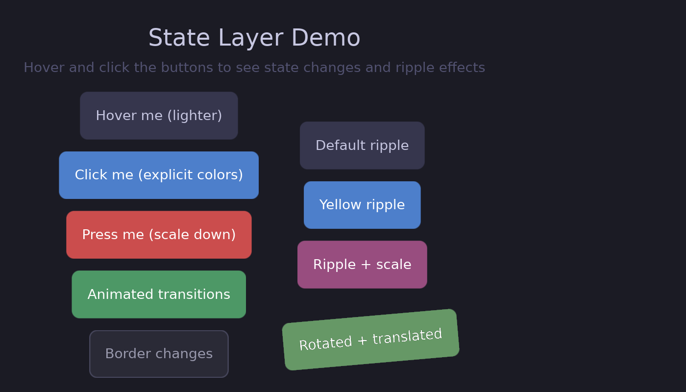
Features demonstrated:
- Hover states with
lighter()and explicit colors - Pressed states with transforms
- Animated transitions
- Border animations
- Ripple effects (default, colored, with scale)
- Transformed containers with ripples
animation_example
Animated properties with spring physics.
cargo run --example animation_example
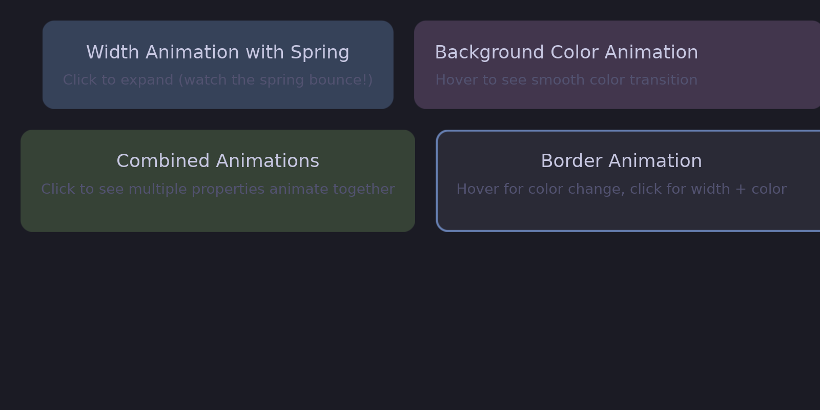
Features demonstrated:
- Width animation with spring physics
- Color animation with easing
- Combined animations
- Border animation
transform_example
The 2D transform system.
cargo run --example transform_example

Features demonstrated:
- Static rotation and scale
- Click-to-rotate with animation
- Spring-based scale animation
- Transform origins (pivot points)
- Nested transforms
showcase
Corner curvature variations using superellipse rendering.
cargo run --example showcase
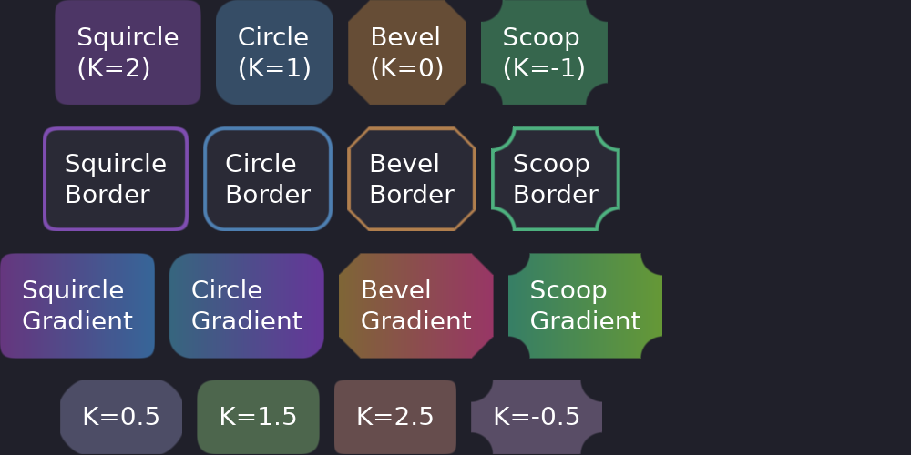
Features demonstrated:
- Squircle corners (iOS-style, K=2)
- Circular corners (default, K=1)
- Beveled corners (K=0)
- Scooped/concave corners (K=-1)
- Borders and gradients with different curvatures
flex_layout_test
All flex layout alignment options.
cargo run --example flex_layout_test
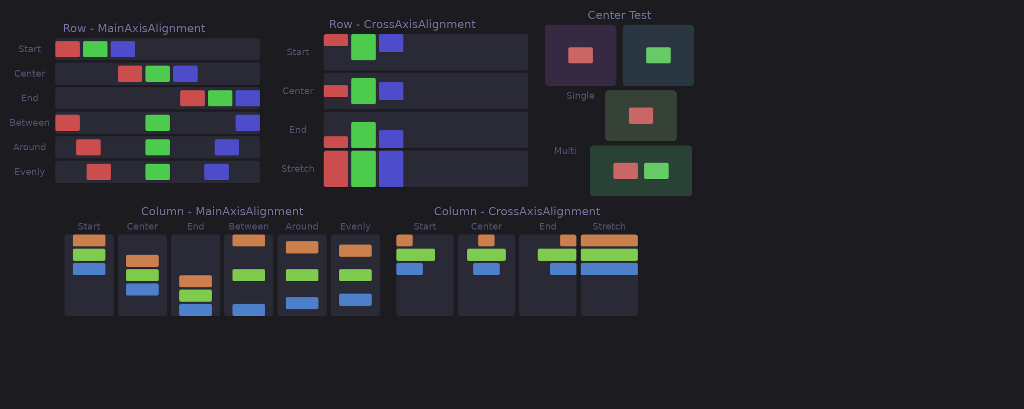
Features demonstrated:
MainAlignment: Start, Center, End, SpaceBetween, SpaceAround, SpaceEvenlyCrossAlignment: Start, Center, End, Stretch- Row and column layouts
component_example
Creating reusable components with the #[component] macro.
cargo run --example component_example
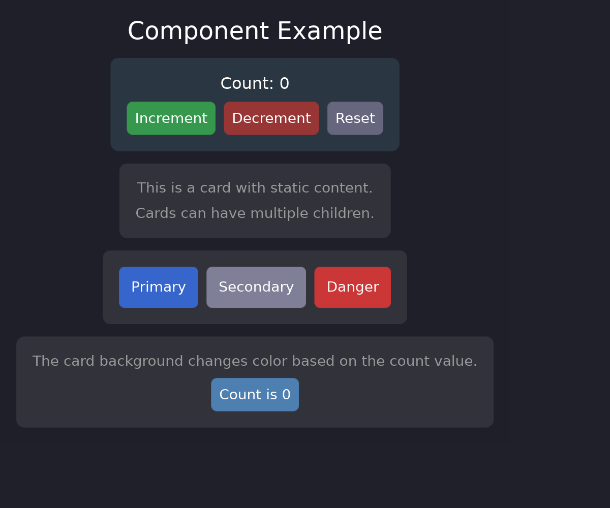
Features demonstrated:
#[component]macro for reusable widgets- Component props and signals
- Stateful components with internal signals
- Composition of components
children_example
Dynamic children and child management patterns.
cargo run --example children_example
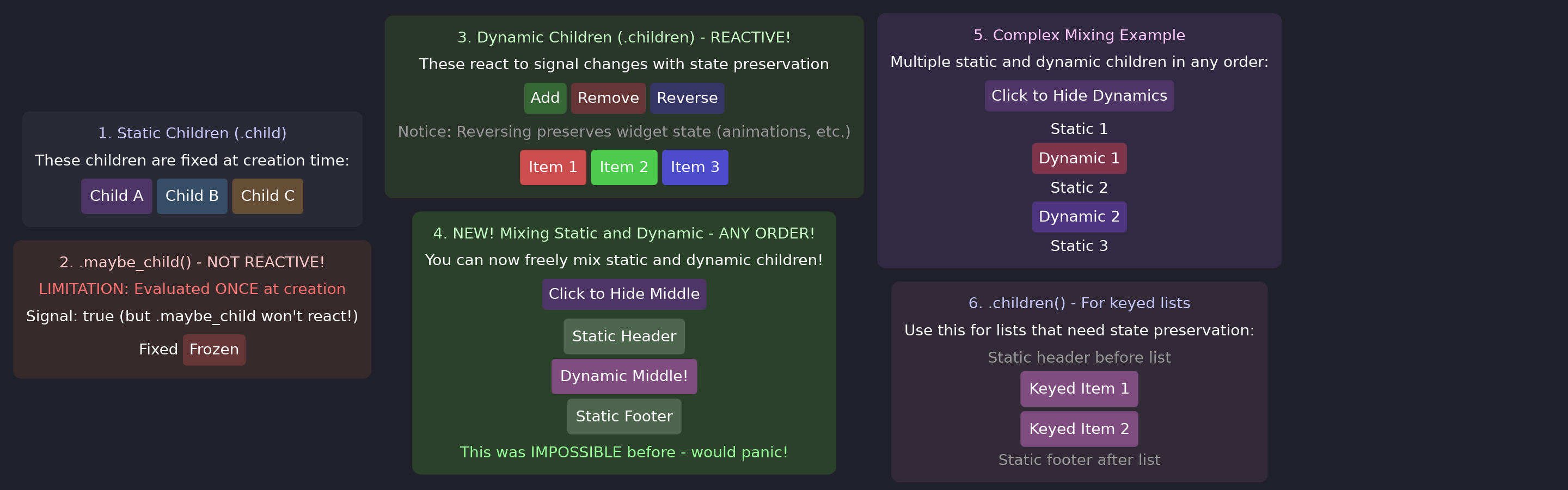
Features demonstrated:
.child()for single children.children([...])for multiple children.maybe_child()for conditional rendering.children_dyn()for reactive lists
elevation_example
Material Design-style elevation shadows.
cargo run --example elevation_example
Features demonstrated:
- Different elevation levels (2, 4, 8, 12, 16)
- Elevation changes on hover/press
- Animated elevation transitions
image_example
Displaying raster and SVG images.
cargo run --example image_example
Features demonstrated:
- PNG/WebP raster images
- SVG vector images
- ContentFit modes (Contain, Cover, Fill)
- Images with transforms
scroll_example
Scrollable containers with customizable scrollbars.
cargo run --example scroll_example
Features demonstrated:
- Vertical and horizontal scrolling
- Custom scrollbar styling (colors, width, radius)
- Hidden scrollbars
- Kinetic/momentum scrolling
scroll_mixed_content
Advanced scrollable container with mixed content types.
cargo run --example scroll_mixed_content
Features demonstrated:
- Text widgets inside scrollable containers
- Text input widgets with form fields
- Raster and SVG images in scrollable content
- Interactive elements with hover states and ripples
- Vertical and horizontal scrolling together
- Scrollbar customization with different styles
multi_surface
Multiple surfaces with shared reactive state.
cargo run --example multi_surface
Features demonstrated:
- Creating multiple layer shell surfaces
- Shared reactive signals between surfaces
- Independent surface configuration
surface_properties_example
Dynamic surface property modification at runtime.
cargo run --example surface_properties_example
Features demonstrated:
- Changing layer at runtime
- Modifying keyboard interactivity
- Adjusting anchor and size dynamically
text_input_example
Text input widgets with editing capabilities.
cargo run --example text_input_example
Features demonstrated:
- Single and multiline text input
- Cursor and selection styling
- Placeholder text
- Focus states
Exploring the Code
Each example’s source code is in the examples/ directory. Reading through them is a great way to learn Guido patterns:
# View an example's source
cat examples/reactive_example.rs
Next Steps
After exploring the examples, dive deeper into the concepts:
- Core Concepts - Understand the reactive model
- Building UI - Master styling and layout
- Interactivity - Add hover states and events
service_example
Background services with automatic cleanup.
cargo run --example service_example
Features demonstrated:
create_servicefor background threads- Bidirectional communication with commands
- Read-only services for periodic updates
- Automatic cleanup when component unmounts
Core Concepts
This section covers the foundational concepts that make Guido work. Understanding these will help you build effective applications.
The Big Picture
Guido is built on three core ideas:
- Reactive Signals - UI state is stored in signals that automatically track dependencies and notify when changed
- Composable Widgets - UIs are built by composing simple primitives (containers, text) into complex structures
- Declarative Styling - Visual properties are declared through builder methods, not CSS or external files
How They Work Together
#![allow(unused)]
fn main() {
// 1. Create reactive state
let count = create_signal(0);

// 2. Build composable widgets
let view = container()
    .padding(16.0)
    .background(Color::rgb(0.2, 0.2, 0.3))

    // 3. Declarative styling responds to state
    .child(text(move || format!("Count: {}", count.get())));
}
When count changes, only the text updates - the container doesn’t need to re-render.
In This Section
- Reactive Model - Signals, computed values, and effects
- Widgets - The Widget trait and composition patterns
- Container - The primary building block
- Layout - Flexbox-style layout with Flex
Key Insight
Unlike traditional retained-mode GUIs that rebuild widget trees on state changes, Guido’s reactive system means widgets are created once and their properties update automatically. This leads to efficient rendering and simple mental models.
Reactive Model
Guido uses a fine-grained reactive system inspired by SolidJS. This enables efficient updates where only the affected parts of the UI change.
RwSignal (Read-Write)
create_signal() returns an RwSignal<T> — a read-write reactive value (8 bytes, Copy):
#![allow(unused)]
fn main() {
use guido::prelude::*;

let count = create_signal(0); // RwSignal<i32>

// Read the current value
let value = count.get();

// Set a new value
count.set(5);

// Update based on current value
count.update(|c| *c += 1);
}
Key Properties
- Copy -
RwSignalimplementsCopy, so you can use it in multiple closures without cloning - Background updates - Use
.writer()to get aWriteSignal<T>for background task updates - Automatic tracking - Dependencies are tracked when reading inside reactive contexts
- Converts to Signal - Call
.read_only()or.into()to get a read-onlySignal<T>
Signal (Read-Only)
Signal<T> is a read-only reactive value (16 bytes, Copy). It cannot be written to — calling .set() is a compile-time error. There are two ways to create one:
#![allow(unused)]
fn main() {
// Stored: wraps a static value
let name = create_stored("hello".to_string()); // Signal<String>

// Derived: closure-backed, re-evaluates on each read
let doubled = create_derived(move || count.get() * 2); // Signal<i32>
}
You can also convert an RwSignal to a Signal:
#![allow(unused)]
fn main() {
let count = create_signal(0);
let read_only: Signal<i32> = count.read_only(); // or count.into()
}
Memos
Eagerly computed values that automatically update when their dependencies change. Memos only notify downstream subscribers when the result actually differs (PartialEq), preventing unnecessary updates:
#![allow(unused)]
fn main() {
let count = create_signal(0);
let doubled = create_memo(move || count.get() * 2);

count.set(5);
println!("{}", doubled.get()); // Prints: 10
}
Memos are Copy like signals and can be used directly as widget properties:
#![allow(unused)]
fn main() {
let label = create_memo(move || format!("Count: {}", count.get()));
text(label)  // Only repaints when the formatted string changes
}
Effects
Side effects that re-run when tracked signals change:
#![allow(unused)]
fn main() {
let name = create_signal("World".to_string());

create_effect(move || {
    println!("Hello, {}!", name.get());
});

name.set("Guido".to_string()); // Effect re-runs, prints: Hello, Guido!
}
Effects are useful for logging, syncing with external systems, or triggering actions.
Using Signals in Widgets
Most widget properties accept either static values or reactive sources:
Static Value
#![allow(unused)]
fn main() {
container().background(Color::RED)
}
Signal
#![allow(unused)]
fn main() {
let bg = create_signal(Color::RED);
container().background(bg)
}
Closure
#![allow(unused)]
fn main() {
let is_active = create_signal(false);
container().background(move || {
    if is_active.get() { Color::GREEN } else { Color::RED }
})
}
Reactive Text
Text content can be reactive using closures:
#![allow(unused)]
fn main() {
let count = create_signal(0);

text(move || format!("Count: {}", count.get()))
}
The text automatically updates when count changes.
The IntoSignal Pattern
Widget properties accept Signal<T> via the IntoSignal<T> trait. Both RwSignal<T> and Signal<T> work, along with raw values and closures:
- Static values → creates a stored
Signal<T>viacreate_stored() - Closures → creates a derived
Signal<T>viacreate_derived() Signal<T>→ passed through directlyRwSignal<T>→ automatically converted toSignal<T>
You don’t need to create signals manually for widget properties — just pass values, closures, or signals directly.
Per-Field Signals
When multiple widgets depend on different fields of the same struct, #[derive(SignalFields)] generates per-field signals so each widget only re-renders when its specific field changes:
#![allow(unused)]
fn main() {
#[derive(Clone, PartialEq, SignalFields)]
pub struct AppState {
    pub cpu: f64,
    pub memory: f64,
    pub title: String,
}

// Creates individual Signal<T> for each field
let state = AppStateSignals::new(AppState {
    cpu: 0.0, memory: 0.0, title: "App".into(),
});

// Each widget subscribes to only the field it reads
text(move || format!("CPU: {:.0}%", state.cpu.get()))
text(move || format!("MEM: {:.0}%", state.memory.get()))
text(move || state.title.get())
}
Use .writers() to get Send handles for background task updates:
#![allow(unused)]
fn main() {
let writers = state.writers();

let _ = create_service::<(), _, _>(move |_rx, ctx| async move {
    while ctx.is_running() {
        // Each field is set individually with PartialEq change detection.
        // Effects that depend on multiple fields run only once (batched).
        writers.set(AppState {
            cpu: read_cpu(),
            memory: read_memory(),
            title: get_title(),
        });
        tokio::time::sleep(Duration::from_secs(1)).await;
    }
});
}
Generic structs are supported — the generated types carry the same generic parameters:
#![allow(unused)]
fn main() {
#[derive(Clone, PartialEq, SignalFields)]
pub struct Pair<A: Clone + PartialEq + Send + 'static, B: Clone + PartialEq + Send + 'static> {
    pub first: A,
    pub second: B,
}

let pair = PairSignals::new(Pair { first: 1i32, second: "hello".to_string() });
}
Untracked Reads
Sometimes you want to read a signal without creating a dependency:
#![allow(unused)]
fn main() {
let count = create_signal(0);

// Normal read - creates dependency
let value = count.get();

// Untracked read - no dependency
let value = count.get_untracked();
}
This is useful in effects where you want to read initial values without re-running on changes.
Ownership & Cleanup
Signals and effects created inside dynamic children are automatically cleaned up when the child is removed. Use on_cleanup to register custom cleanup logic:
#![allow(unused)]
fn main() {
container().children(move || {
    items.get().into_iter().map(|id| (id, move || {
        // These are automatically owned and disposed
        let count = create_signal(0);
        create_effect(move || println!("Count: {}", count.get()));

        // Register custom cleanup for non-reactive resources
        on_cleanup(move || {
            println!("Child {} removed", id);
        });

        container().child(text(move || count.get().to_string()))
    }))
})
}
See Dynamic Children for more details on automatic ownership.
Best Practices
Read Close to Usage
Read signals where the value is needed, not at the top of functions:
#![allow(unused)]
fn main() {
// Good: Read in closure where it's used
text(move || format!("Count: {}", count.get()))

// Less optimal: Read early, pass static value
let value = count.get();
text(format!("Count: {}", value))  // Won't update!
}
Use Context for App-Wide State
For values that many widgets across different modules need (config, theme, services), use the Context API instead of passing signals through every function:
#![allow(unused)]
fn main() {
// Setup
provide_context(Config::load());

// Any widget, any module
let cfg = expect_context::<Config>();
}
For mutable shared state, use provide_signal_context to combine context with reactivity.
Use Memo for Derived State
Instead of manually syncing values:
#![allow(unused)]
fn main() {
// Bad: Manual sync
let count = create_signal(0);
let doubled = create_signal(0);
// Must remember to update doubled when count changes

// Good: Use memo
let count = create_signal(0);
let doubled = create_memo(move || count.get() * 2);
}
API Reference
Signal Creation
#![allow(unused)]
fn main() {
pub fn create_signal<T: Clone + PartialEq + Send + 'static>(value: T) -> RwSignal<T>;
pub fn create_stored<T: Clone + 'static>(value: T) -> Signal<T>;
pub fn create_derived<T: Clone + 'static>(f: impl Fn() -> T + 'static) -> Signal<T>;
pub fn create_memo<T: Clone + PartialEq + 'static>(f: impl Fn() -> T + 'static) -> Memo<T>;
pub fn create_effect(f: impl Fn() + 'static);
}
RwSignal Methods
#![allow(unused)]
fn main() {
impl<T: Clone> RwSignal<T> {
    pub fn get(&self) -> T;           // Read with tracking
    pub fn get_untracked(&self) -> T; // Read without tracking
    pub fn set(&self, value: T);      // Set new value
    pub fn update(&self, f: impl FnOnce(&mut T)); // Update in place
    pub fn writer(&self) -> WriteSignal<T>; // Get Send handle for background threads
    pub fn read_only(&self) -> Signal<T>;   // Convert to read-only Signal
}
}
Signal Methods
#![allow(unused)]
fn main() {
impl<T: Clone> Signal<T> {
    pub fn get(&self) -> T;           // Read with tracking
    pub fn get_untracked(&self) -> T; // Read without tracking
    pub fn with<R>(&self, f: impl FnOnce(&T) -> R) -> R; // Borrow with tracking
    pub fn with_untracked<R>(&self, f: impl FnOnce(&T) -> R) -> R; // Borrow without tracking
    // No set/update/writer — Signal is read-only
}
}
Memo Methods
#![allow(unused)]
fn main() {
impl<T: Clone + PartialEq> Memo<T> {
    pub fn get(&self) -> T;           // Read with tracking
    pub fn with<R>(&self, f: impl FnOnce(&T) -> R) -> R; // Borrow with tracking
}
}
Cleanup
#![allow(unused)]
fn main() {
// Register cleanup callback (for use in dynamic children)
pub fn on_cleanup(f: impl FnOnce() + 'static);
}
Background Services
#![allow(unused)]
fn main() {
// Create an async background service with automatic cleanup
pub fn create_service<Cmd, F, Fut>(f: F) -> Service<Cmd>
where
    Cmd: Send + 'static,
    F: FnOnce(UnboundedReceiver<Cmd>, ServiceContext) -> Fut + Send + 'static,
    Fut: Future<Output = ()> + Send + 'static;
}
See Background Tasks for detailed usage.
Widgets
Widgets are the building blocks of Guido UIs. Every visual element is a widget, from simple text to complex layouts.
The Widget Trait
All widgets implement the Widget trait:
#![allow(unused)]
fn main() {
pub trait Widget {
    fn layout(&mut self, tree: &mut Tree, id: WidgetId, constraints: Constraints) -> Size;
    fn paint(&self, tree: &Tree, id: WidgetId, ctx: &mut PaintContext);
    fn event(&mut self, tree: &mut Tree, id: WidgetId, event: &Event) -> EventResponse;
}
}
Methods
- layout - Calculate the widget’s size given tree access, widget ID, and constraints
- paint - Draw the widget using tree for child access
- event - Handle input events with tree access
Bounds and Origins
Widget bounds and origins are stored in the Tree, not on individual widgets:
- Use
tree.get_bounds(id)to retrieve a widget’s bounding rectangle for hit testing - Use
tree.set_origin(id, x, y)to position widgets during layout (called by parent layouts)
Built-in Widgets
Container
The primary widget for building UIs. Handles:
- Backgrounds (solid, gradient)
- Borders and corner radius
- Padding and sizing
- Layout of children
- Event handling
- State layers (hover/pressed)
- Transforms
See Container for details.
Text
Renders text content:
#![allow(unused)]
fn main() {
text("Hello, World!")
    .font_size(16.0)
    .color(Color::WHITE)
    .bold()
}
See Text for styling options.
TextInput
Single-line text editing with selection, clipboard, and undo/redo:
#![allow(unused)]
fn main() {
let username = create_signal(String::new());

text_input(username)
    .text_color(Color::WHITE)
    .on_submit(|text| println!("Submitted: {}", text))
}
See Text Input for details.
Composition
Guido UIs are built through composition - nesting widgets inside containers:
#![allow(unused)]
fn main() {
container()
    .layout(Flex::column().spacing(8.0))
    .children([
        text("Title").font_size(24.0),
        container()
            .layout(Flex::row().spacing(4.0))
            .children([
                text("Item 1"),
                text("Item 2"),
            ]),
    ])
}
This creates:
┌─────────────────┐
│ Title           │
│ ┌─────┬───────┐ │
│ │Item1│ Item2 │ │
│ └─────┴───────┘ │
└─────────────────┘
Widget Functions
Guido provides functions that return configured widgets:
#![allow(unused)]
fn main() {
// Creates a Container
container()

// Creates a Text widget
text("content")
}
These use the builder pattern for configuration:
#![allow(unused)]
fn main() {
container()
    .padding(16.0)          // Returns Container
    .background(Color::RED) // Returns Container
    .corner_radius(8.0)     // Returns Container
}
The impl Widget Pattern
Functions often return impl Widget instead of concrete types:
#![allow(unused)]
fn main() {
fn my_button(label: &str) -> impl Widget {
    container()
        .padding(12.0)
        .background(Color::rgb(0.3, 0.5, 0.8))
        .corner_radius(8.0)
        .child(text(label).color(Color::WHITE))
}
}
This allows returning any widget type without exposing implementation details.
Constraints and Sizing
During layout, parent widgets pass constraints to children:
#![allow(unused)]
fn main() {
pub struct Constraints {
    pub min_width: f32,
    pub max_width: f32,
    pub min_height: f32,
    pub max_height: f32,
}
}
Children choose a size within these constraints. This enables flexible layouts where widgets can expand to fill space or shrink to fit content.
Size Modifiers
Control widget sizing with builder methods:
#![allow(unused)]
fn main() {
container()
    .width(100.0)        // Fixed width
    .height(50.0)        // Fixed height
    .min_width(50.0)     // Minimum width
    .max_width(200.0)    // Maximum width
}
Event Flow
Events flow from the platform through the widget tree:
- Platform receives input (mouse, keyboard)
- Event dispatched to root widget
- Root checks if event hits its bounds
- If yes, passes to children (innermost first)
- Widget handles event or ignores it
#![allow(unused)]
fn main() {
container()
    .on_click(|| println!("Clicked!"))
    .child(text("Click me"))
}
The container receives clicks anywhere within its bounds, including over the text.
Next Steps
- Container - Deep dive into the Container widget
- Layout - Learn about flex layout
- Interactivity - Add event handling
Container
The Container is Guido’s primary building block. Nearly everything you build uses containers - they handle layout, styling, events, and child management.
Creating Containers
#![allow(unused)]
fn main() {
use guido::prelude::*;

let view = container();
}
Adding Children
Single Child
#![allow(unused)]
fn main() {
container().child(text("Hello"))
}
Multiple Children
#![allow(unused)]
fn main() {
container().children([
    text("First"),
    text("Second"),
    text("Third"),
])
}
Conditional Children
#![allow(unused)]
fn main() {
let show_extra = create_signal(false);

container().children([
    text("Always shown"),
    container().maybe_child(show_extra, || text("Sometimes shown")),
])
}
Styling
Containers support extensive styling options:
#![allow(unused)]
fn main() {
container()
    // Background
    .background(Color::rgb(0.2, 0.2, 0.3))

    // Corners
    .corner_radius(8.0)
    .squircle() // iOS-style smooth corners

    // Border
    .border(2.0, Color::WHITE)

    // Spacing
    .padding(16.0)

    // Size
    .width(200.0)
    .height(100.0)
}
See Building UI for complete styling reference.
Layout
Control how children are arranged:
#![allow(unused)]
fn main() {
container()
    .layout(
        Flex::row()
            .spacing(8.0)
            .main_alignment(MainAlignment::Center)
            .cross_alignment(CrossAlignment::Center)
    )
    .children([...])
}
See Layout for details on flex layouts.
Event Handling
Respond to user interactions:
#![allow(unused)]
fn main() {
container()
    .on_click(|| println!("Clicked!"))
    .on_hover(|hovered| println!("Hover: {}", hovered))
    .on_scroll(|dx, dy, source| println!("Scroll: {}, {}", dx, dy))
}
State Layers
Add hover and pressed visual feedback:
#![allow(unused)]
fn main() {
container()
    .background(Color::rgb(0.2, 0.2, 0.3))
    .hover_state(|s| s.lighter(0.1))
    .pressed_state(|s| s.ripple())
}
See Interactivity for the full state layer API.
Transforms
Apply 2D transformations:
#![allow(unused)]
fn main() {
container()
    .translate(10.0, 20.0)  // Move
    .rotate(45.0)           // Rotate degrees
    .scale(1.5)             // Scale
    .transform_origin(TransformOrigin::TOP_LEFT)
}
See Transforms for details.
Animations
Animate property changes:
#![allow(unused)]
fn main() {
container()
    .animate_background(Transition::new(200.0, TimingFunction::EaseOut))
    .animate_transform(Transition::spring(SpringConfig::BOUNCY))
}
See Animations for timing and spring options.
Visibility
Control whether a container is visible. When hidden, it takes up no space in layout, does not paint, and ignores all events.
#![allow(unused)]
fn main() {
// Static
container().visible(false)

// Reactive signal
let show = create_signal(true);
container().visible(show)

// Reactive closure
container().visible(move || tab.get() == "settings")
}
Unlike .maybe_child() which adds or removes a child from the tree, .visible() keeps the widget in the tree but hides it completely. This is useful when you want to toggle visibility without recreating the widget and its state.
Scrolling
Make containers scrollable when content overflows:
#![allow(unused)]
fn main() {
container()
    .width(200.0)
    .height(200.0)
    .scrollable(ScrollAxis::Vertical)
    .child(large_content())
}
Scroll Axes
| Axis | Description |
|---|---|
ScrollAxis::None | No scrolling (default) |
ScrollAxis::Vertical | Vertical scrolling only |
ScrollAxis::Horizontal | Horizontal scrolling only |
ScrollAxis::Both | Both directions |
Custom Scrollbars
#![allow(unused)]
fn main() {
container()
    .scrollable(ScrollAxis::Vertical)
    .scrollbar(|sb| {
        sb.width(6.0)
          .handle_color(Color::rgb(0.4, 0.6, 0.9))
          .handle_hover_color(Color::rgb(0.5, 0.7, 1.0))
          .handle_corner_radius(3.0)
    })
}
Hidden Scrollbars
#![allow(unused)]
fn main() {
container()
    .scrollable(ScrollAxis::Vertical)
    .scrollbar_visibility(ScrollbarVisibility::Hidden)
}
Complete Example
Here’s a fully-styled interactive button:
#![allow(unused)]
fn main() {
fn create_button(label: &str, on_click: impl Fn() + 'static) -> Container {
    container()
        // Layout
        .padding(16.0)

        // Styling
        .background(Color::rgb(0.3, 0.5, 0.8))
        .corner_radius(8.0)
        .border(1.0, Color::rgb(0.4, 0.6, 0.9))

        // Animations
        .animate_background(Transition::new(200.0, TimingFunction::EaseOut))
        .animate_border_width(Transition::new(150.0, TimingFunction::EaseOut))

        // State layers
        .hover_state(|s| s.lighter(0.1).border(2.0, Color::rgb(0.5, 0.7, 1.0)))
        .pressed_state(|s| s.ripple().darker(0.05).transform(Transform::scale(0.98)))

        // Event
        .on_click(on_click)

        // Content
        .child(text(label).color(Color::WHITE))
}
}
Builder Methods Reference
Children
.child(widget)- Add single child.children([...])- Add multiple children.maybe_child(condition, factory)- Conditional child.children_dyn(items, key_fn, view_fn)- Dynamic list
Styling
.background(color)- Solid background.gradient_horizontal(start, end)- Horizontal gradient.gradient_vertical(start, end)- Vertical gradient.corner_radius(radius)- Rounded corners.squircle()/.bevel()/.scoop()- Corner curvature.border(width, color)- Border.elevation(level)- Shadow
Spacing
.padding(all)- Uniform padding.padding_horizontal(h)- Left/right padding.padding_vertical(v)- Top/bottom padding
Sizing
.width(w)/.height(h)- Fixed size.min_width(w)/.max_width(w)- Width constraints.min_height(h)/.max_height(h)- Height constraints
Layout
.layout(Flex::row())- Horizontal layout.layout(Flex::column())- Vertical layout
Events
.on_click(handler)- Click events.on_hover(handler)- Hover enter/leave.on_scroll(handler)- Scroll events
State Layers
.hover_state(|s| s...)- Hover overrides.pressed_state(|s| s...)- Pressed overrides
Transforms
.translate(x, y)- Move.rotate(degrees)- Rotate.scale(factor)- Scale.transform_origin(origin)- Pivot point
Animations
.animate_background(transition)- Animate background.animate_transform(transition)- Animate transform.animate_border_width(transition)- Animate border width.animate_border_color(transition)- Animate border color
Visibility
.visible(condition)- Show or hide the container (accepts static, signal, or closure)
Scrolling
.scrollable(axis)- Enable scrolling (None, Vertical, Horizontal, Both).scrollbar(|sb| ...)- Customize scrollbar appearance.scrollbar_visibility(visibility)- Show or hide scrollbar
Layout
Guido uses a flexbox-style layout system for arranging widgets. The Flex layout handles rows and columns with spacing and alignment options.
Basic Layout
Row (Horizontal)
#![allow(unused)]
fn main() {
container()
    .layout(Flex::row())
    .children([
        text("Left"),
        text("Center"),
        text("Right"),
    ])
}
Column (Vertical)
#![allow(unused)]
fn main() {
container()
    .layout(Flex::column())
    .children([
        text("Top"),
        text("Middle"),
        text("Bottom"),
    ])
}
Spacing
Add space between children:
#![allow(unused)]
fn main() {
container()
    .layout(Flex::row().spacing(8.0))
    .children([...])
}
Main Axis Alignment
Control distribution along the layout direction:
#![allow(unused)]
fn main() {
Flex::row().main_alignment(MainAlignment::Center)
}
Options
| Alignment | Description |
|---|---|
Start | Pack at the beginning |
Center | Center in available space |
End | Pack at the end |
SpaceBetween | Equal space between, none at edges |
SpaceAround | Equal space around each item |
SpaceEvenly | Equal space including edges |
Visual Examples
Start:        [A][B][C]
Center:          [A][B][C]
End:                      [A][B][C]
SpaceBetween: [A]      [B]      [C]
SpaceAround:   [A]    [B]    [C]
SpaceEvenly:    [A]   [B]   [C]
Cross Axis Alignment
Control alignment perpendicular to the layout direction:
#![allow(unused)]
fn main() {
Flex::row().cross_alignment(CrossAlignment::Center)
}
Options
| Alignment | Description |
|---|---|
Start | Align to start of cross axis |
Center | Center on cross axis |
End | Align to end of cross axis |
Stretch | Stretch to fill cross axis |
Visual Example (Row)
Start:    ┌───┐┌─┐┌──┐
          │ A ││B││ C│
          └───┘│ │└──┘
               └─┘

Center:        ┌─┐
          ┌───┐│B│┌──┐
          │ A │└─┘│ C│
          └───┘   └──┘

End:           ┌─┐
               │B│
          ┌───┐└─┘┌──┐
          │ A │   │ C│
          └───┘   └──┘

Stretch:  ┌───┐┌─┐┌──┐
          │   ││ ││  │
          │ A ││B││ C│
          │   ││ ││  │
          └───┘└─┘└──┘
Complete Example
#![allow(unused)]
fn main() {
container()
    .layout(
        Flex::row()
            .spacing(16.0)
            .main_alignment(MainAlignment::SpaceBetween)
            .cross_alignment(CrossAlignment::Center)
    )
    .padding(20.0)
    .children([
        text("Left").font_size(24.0),
        container()
            .layout(Flex::column().spacing(4.0))
            .children([
                text("Center"),
                text("Items"),
            ]),
        text("Right").font_size(24.0),
    ])
}
Nested Layouts
Combine rows and columns for complex layouts:
#![allow(unused)]
fn main() {
container()
    .layout(Flex::column().spacing(16.0))
    .children([
        // Header row
        container()
            .layout(Flex::row().main_alignment(MainAlignment::SpaceBetween))
            .children([
                text("Logo"),
                text("Menu"),
            ]),
        // Content row
        container()
            .layout(Flex::row().spacing(16.0))
            .children([
                sidebar(),
                main_content(),
            ]),
        // Footer row
        container()
            .layout(Flex::row().main_alignment(MainAlignment::Center))
            .child(text("Footer")),
    ])
}
Size Constraints
Control how children size within layouts:
Fixed Size
#![allow(unused)]
fn main() {
container()
    .width(200.0)
    .height(100.0)
}
Minimum/Maximum
#![allow(unused)]
fn main() {
container()
    .min_width(100.0)
    .max_width(300.0)
}
At Least
Request at least a certain size:
#![allow(unused)]
fn main() {
container()
    .width(at_least(200.0))  // At least 200px, can grow
}
Fill Available Space
Make a container expand to fill all available space:
#![allow(unused)]
fn main() {
container()
    .height(fill())  // Fills available height
    .width(fill())   // Fills available width
}
This is particularly useful for root containers that should fill their surface, or for creating layouts where children are centered within the full available space:
#![allow(unused)]
fn main() {
container()
    .height(fill())
    .layout(
        Flex::row()
            .main_alignment(MainAlignment::Center)
            .cross_alignment(CrossAlignment::Center)
    )
    .child(text("Centered in available space"))
}
Layout Without Explicit Flex
Containers without .layout() stack children (each child fills the container):
#![allow(unused)]
fn main() {
// Children overlap, each filling the container
container()
    .children([
        background_image(),
        overlay_content(),
    ])
}
API Reference
Flex Builder
#![allow(unused)]
fn main() {
Flex::row() -> Flex                    // Horizontal layout
Flex::column() -> Flex                 // Vertical layout
.spacing(f32) -> Flex                  // Space between children
.main_alignment(MainAlignment) -> Flex
.cross_alignment(CrossAlignment) -> Flex
}
MainAlignment
#![allow(unused)]
fn main() {
MainAlignment::Start
MainAlignment::Center
MainAlignment::End
MainAlignment::SpaceBetween
MainAlignment::SpaceAround
MainAlignment::SpaceEvenly
}
CrossAlignment
#![allow(unused)]
fn main() {
CrossAlignment::Start
CrossAlignment::Center
CrossAlignment::End
CrossAlignment::Stretch
}
Building UI
This section covers the visual styling options in Guido. Learn how to create polished, professional-looking interfaces.
Styling Philosophy
Guido uses a builder pattern for styling - each method returns the widget, allowing chained calls:
#![allow(unused)]
fn main() {
container()
    .padding(16.0)
    .background(Color::rgb(0.2, 0.2, 0.3))
    .corner_radius(8.0)
    .border(1.0, Color::WHITE)
}
All styling is done in Rust code, not external CSS files. This provides type safety and IDE support.
In This Section
- Styling Overview - Complete styling reference
- Colors - Color creation and manipulation
- Borders & Corners - Borders, corner radius, and curvature
- Elevation & Shadows - Material Design-style shadows
- Text - Text styling and typography
Quick Reference
#![allow(unused)]
fn main() {
// Background
.background(Color::rgb(0.2, 0.2, 0.3))
.gradient_horizontal(start, end)

// Corners
.corner_radius(8.0)
.squircle()  // iOS-style smooth

// Border
.border(2.0, Color::WHITE)

// Shadow
.elevation(4.0)

// Spacing
.padding(16.0)
.padding_horizontal(20.0)
.padding_vertical(10.0)

// Size
.width(100.0)
.height(50.0)
}
Styling Overview
This page provides a complete reference for all styling options available in Guido.
Backgrounds
Solid Color
#![allow(unused)]
fn main() {
container().background(Color::rgb(0.2, 0.2, 0.3))
}
Gradients
#![allow(unused)]
fn main() {
// Horizontal (left to right)
container().gradient_horizontal(Color::RED, Color::BLUE)

// Vertical (top to bottom)
container().gradient_vertical(Color::RED, Color::BLUE)

// Diagonal
container().gradient_diagonal(Color::RED, Color::BLUE)
}
Corners
Basic Radius
#![allow(unused)]
fn main() {
container().corner_radius(8.0)  // 8px radius on all corners
}
Corner Curvature
Control corner shape using CSS K-values:
#![allow(unused)]
fn main() {
container().corner_radius(12.0).squircle()  // iOS-style (K=2)
container().corner_radius(12.0)              // Circular (K=1, default)
container().corner_radius(12.0).bevel()      // Diagonal (K=0)
container().corner_radius(12.0).scoop()      // Concave (K=-1)
container().corner_radius(12.0).corner_curvature(1.5)  // Custom
}
Borders
#![allow(unused)]
fn main() {
container()
    .border(2.0, Color::WHITE)  // Width and color

// Or separately
container()
    .border_width(2.0)
    .border_color(Color::WHITE)
}
Shadows (Elevation)
#![allow(unused)]
fn main() {
container().elevation(2.0)   // Subtle
container().elevation(8.0)   // Medium
container().elevation(16.0)  // Strong
}
Padding
#![allow(unused)]
fn main() {
container().padding(16.0)              // All sides
container().padding(16)                // Integers work too
container().padding([8.0, 16.0])       // [vertical, horizontal]
container().padding([8, 16])           // Integer arrays too
container().padding([1.0, 2.0, 3.0, 4.0])  // [top, right, bottom, left]
container().padding_horizontal(20.0)   // Left and right
container().padding_vertical(10.0)     // Top and bottom
}
Sizing
Fixed Size
#![allow(unused)]
fn main() {
container()
    .width(100.0)
    .height(50.0)
}
Integers work too:
#![allow(unused)]
fn main() {
container()
    .width(100)
    .height(50)
}
Constraints
#![allow(unused)]
fn main() {
container()
    .min_width(50.0)
    .max_width(200.0)
    .min_height(30.0)
    .max_height(100.0)
}
At Least / At Most
#![allow(unused)]
fn main() {
container().width(at_least(100.0))           // At least 100px
container().width(at_least(100))             // Integers work too
container().width(at_most(400))              // At most 400px
container().width(at_least(100).at_most(400)) // Range
}
Complete Example
#![allow(unused)]
fn main() {
fn styled_card(title: &str, content: &str) -> Container {
    container()
        // Size and padding
        .width(300.0)
        .padding(20.0)

        // Background and corners
        .background(Color::rgb(0.15, 0.15, 0.2))
        .corner_radius(12.0)
        .squircle()

        // Border
        .border(1.0, Color::rgb(0.25, 0.25, 0.3))

        // Shadow
        .elevation(4.0)

        // Layout
        .layout(Flex::column().spacing(12.0))

        // State layers
        .animate_background(Transition::new(200.0, TimingFunction::EaseOut))
        .hover_state(|s| s.lighter(0.05).elevation(6.0))

        // Children
        .children([
            text(title)
                .font_size(18.0)
                .bold()
                .color(Color::WHITE),
            text(content)
                .font_size(14.0)
                .color(Color::rgb(0.7, 0.7, 0.75)),
        ])
}
}
Colors
Guido provides a simple color system for styling widgets.
Creating Colors
RGB (0.0-1.0 range)
#![allow(unused)]
fn main() {
Color::rgb(0.2, 0.4, 0.8)  // R, G, B values from 0.0 to 1.0
}
RGBA with Alpha
#![allow(unused)]
fn main() {
Color::rgba(0.2, 0.4, 0.8, 0.5)  // 50% transparent
}
From 8-bit Values (0-255)
#![allow(unused)]
fn main() {
Color::from_rgb8(51, 102, 204)       // Same as Color::rgb(0.2, 0.4, 0.8)
Color::from_rgba8(51, 102, 204, 128) // With alpha
}
From Hex
#![allow(unused)]
fn main() {
Color::from_hex(0x3366CC)  // Hex RGB value
}
Predefined Colors
#![allow(unused)]
fn main() {
Color::WHITE
Color::BLACK
Color::RED
Color::GREEN
Color::BLUE
Color::YELLOW
Color::CYAN
Color::MAGENTA
Color::GRAY
Color::TRANSPARENT
}
Color Operations
Lightening and Darkening
#![allow(unused)]
fn main() {
let lighter = color.lighter(0.1);  // 10% toward white
let darker = color.darker(0.2);    // 20% toward black
}
Mixing
Linear interpolation between two colors:
#![allow(unused)]
fn main() {
let blend = color_a.mix(color_b, 0.5);  // 50/50 blend
let mostly_a = color_a.mix(color_b, 0.2);  // 80% A, 20% B
}
Invert
#![allow(unused)]
fn main() {
let inverted = color.invert();  // Flip RGB channels
}
Grayscale
Convert to perceptual grayscale using Rec. 709 luminance weights:
#![allow(unused)]
fn main() {
let gray = color.grayscale();
}
Luminance
Get the perceived brightness (0.0 = black, 1.0 = white):
#![allow(unused)]
fn main() {
let brightness = color.luminance();
}
Alpha Manipulation
#![allow(unused)]
fn main() {
let semi = color.with_alpha(0.5);      // Set alpha to 0.5
let faded = color.scale_alpha(0.5);    // Halve the current alpha
}
Convert to 8-bit
#![allow(unused)]
fn main() {
let (r, g, b, a) = color.to_rgba8();  // Each 0-255
}
Using Colors with State Layers
Colors integrate with the state layer API for hover effects:
#![allow(unused)]
fn main() {
container()
    .background(Color::rgb(0.2, 0.2, 0.3))
    .hover_state(|s| s.lighter(0.1))   // Lighten on hover
    .pressed_state(|s| s.darker(0.1))  // Darken on press
}
Or use explicit colors:
#![allow(unused)]
fn main() {
container()
    .background(Color::rgb(0.3, 0.5, 0.8))
    .hover_state(|s| s.background(Color::rgb(0.4, 0.6, 0.9)))
    .pressed_state(|s| s.background(Color::rgb(0.2, 0.4, 0.7)))
}
Reactive Colors
Colors can be reactive using signals:
#![allow(unused)]
fn main() {
let bg_color = create_signal(Color::rgb(0.2, 0.2, 0.3));

container().background(bg_color)
}
Or closures:
#![allow(unused)]
fn main() {
let is_active = create_signal(false);

container().background(move || {
    if is_active.get() {
        Color::rgb(0.3, 0.6, 0.4)  // Green when active
    } else {
        Color::rgb(0.2, 0.2, 0.3)  // Gray when inactive
    }
})
}
Color Tips
Dark Theme Palette
For dark UIs, use low-saturation colors with subtle variation:
#![allow(unused)]
fn main() {
let background = Color::rgb(0.08, 0.08, 0.12);  // Near black
let surface = Color::rgb(0.12, 0.12, 0.16);     // Slightly lighter
let primary = Color::rgb(0.3, 0.5, 0.8);        // Accent blue
let text = Color::rgb(0.9, 0.9, 0.95);          // Near white
let text_secondary = Color::rgb(0.6, 0.6, 0.7); // Muted text
}
Hover States
For hover states, lightening by 5-15% works well:
#![allow(unused)]
fn main() {
// Subtle hover
.hover_state(|s| s.lighter(0.05))

// Noticeable hover
.hover_state(|s| s.lighter(0.1))

// Strong hover
.hover_state(|s| s.lighter(0.15))
}
Transparency
Use alpha for overlays and effects:
#![allow(unused)]
fn main() {
// Semi-transparent overlay
let overlay = Color::rgba(0.0, 0.0, 0.0, 0.5);

// Or use with_alpha on an existing color
let overlay = Color::BLACK.with_alpha(0.5);

// Ripple color (40% opacity white)
let ripple = Color::WHITE.with_alpha(0.4);
}
Borders & Corners
Guido renders crisp, anti-aliased borders using SDF (Signed Distance Field) techniques.
Basic Border
#![allow(unused)]
fn main() {
container()
    .border(2.0, Color::WHITE)  // 2px white border
}
Separate Width and Color
#![allow(unused)]
fn main() {
container()
    .border_width(2.0)
    .border_color(Color::rgb(0.5, 0.5, 0.6))
}
Corner Radius
Uniform Radius
#![allow(unused)]
fn main() {
container().corner_radius(8.0)  // 8px radius on all corners
}
Corner Curvature (Superellipse)
Control the shape of corners using CSS K-values. This determines how the corner curves from the edge to the arc.
Squircle (K=2)
iOS-style smooth corners. The curve starts further from the corner for a smoother transition.
#![allow(unused)]
fn main() {
container()
    .corner_radius(12.0)
    .squircle()
}
Circle (K=1)
Standard circular corners. This is the default.
#![allow(unused)]
fn main() {
container()
    .corner_radius(12.0)  // Default is circular
}
Bevel (K=0)
Diagonal cut corners. Creates a chamfered look.
#![allow(unused)]
fn main() {
container()
    .corner_radius(12.0)
    .bevel()
}
Scoop (K=-1)
Concave/inward corners. Creates a scooped appearance.
#![allow(unused)]
fn main() {
container()
    .corner_radius(12.0)
    .scoop()
}
Custom Curvature
For values between the presets:
#![allow(unused)]
fn main() {
container()
    .corner_radius(12.0)
    .corner_curvature(1.5)  // Between circle and squircle
}
Curvature Reference
| Style | K Value | Description |
|---|---|---|
| Squircle | 2.0 | Smooth, iOS-style |
| Circle | 1.0 | Standard rounded (default) |
| Bevel | 0.0 | Diagonal/chamfered |
| Scoop | -1.0 | Concave inward |
Animated Borders
Borders can animate on state changes:
#![allow(unused)]
fn main() {
container()
    .border(1.0, Color::rgb(0.3, 0.3, 0.4))
    .animate_border_width(Transition::new(150.0, TimingFunction::EaseOut))
    .animate_border_color(Transition::new(150.0, TimingFunction::EaseOut))
    .hover_state(|s| s.border(2.0, Color::rgb(0.5, 0.5, 0.6)))
    .pressed_state(|s| s.border(3.0, Color::rgb(0.7, 0.7, 0.8)))
}
Borders with Different Curvatures
Borders respect corner curvature:
#![allow(unused)]
fn main() {
container()
    .border(2.0, Color::rgb(0.5, 0.3, 0.7))
    .corner_radius(12.0)
    .squircle()  // Border follows squircle shape
}
Borders with Gradients
Borders work with gradient backgrounds:
#![allow(unused)]
fn main() {
container()
    .gradient_horizontal(Color::rgb(0.3, 0.1, 0.4), Color::rgb(0.1, 0.3, 0.5))
    .corner_radius(8.0)
    .border(2.0, Color::rgba(1.0, 1.0, 1.0, 0.3))  // Semi-transparent white
}
Complete Example
#![allow(unused)]
fn main() {
fn card_with_border() -> Container {
container()
.padding(16.0)
.background(Color::rgb(0.12, 0.12, 0.16))
.corner_radius(12.0)
.squircle()
.border(1.0, Color::rgb(0.2, 0.2, 0.25))
.animate_border_width(Transition::new(150.0, TimingFunction::EaseOut))
.animate_border_color(Transition::new(150.0, TimingFunction::EaseOut))
.hover_state(|s| s
.border(2.0, Color::rgb(0.4, 0.6, 0.9))
.lighter(0.03)
)
.child(text("Hover to see border change").color(Color::WHITE))
}
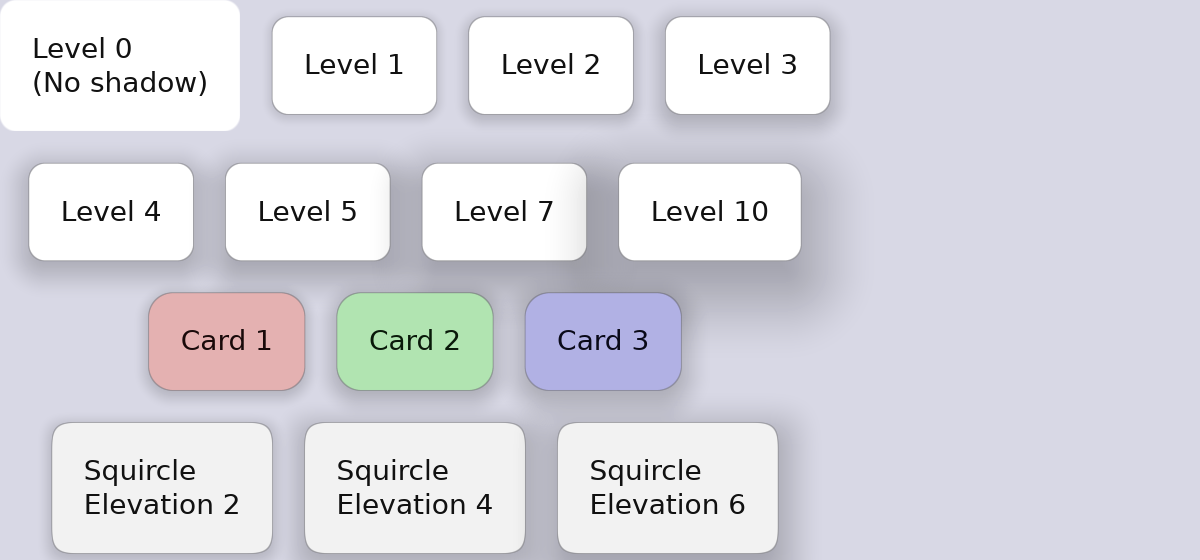
}Elevation & Shadows
Guido supports Material Design-style elevation shadows for creating depth and hierarchy.
Basic Elevation
#![allow(unused)]
fn main() {
container().elevation(2.0)   // Subtle shadow
container().elevation(4.0)   // Light shadow
container().elevation(8.0)   // Medium shadow
container().elevation(12.0)  // Strong shadow
container().elevation(16.0)  // Very strong shadow
}
How Elevation Works
Elevation creates a diffuse shadow beneath the container. Higher values create:
- Larger shadow spread
- Greater blur
- More noticeable depth effect
Elevation in State Layers
Elevation can change on interaction for tactile feedback:
#![allow(unused)]
fn main() {
container()
    .elevation(2.0)
    .hover_state(|s| s.elevation(4.0))     // Lift on hover
    .pressed_state(|s| s.elevation(1.0))   // Press down on click
}
This creates a “lifting” effect on hover and a “pressing” effect on click.
Animated Elevation
Smooth elevation transitions:
#![allow(unused)]
fn main() {
container()
    .elevation(2.0)
    .animate_elevation(Transition::new(200.0, TimingFunction::EaseOut))
    .hover_state(|s| s.elevation(6.0))
}
Elevation with Corner Radius
Shadows respect corner radius:
#![allow(unused)]
fn main() {
container()
    .corner_radius(12.0)
    .squircle()
    .elevation(8.0)  // Shadow follows rounded shape
}
Complete Example
#![allow(unused)]
fn main() {
fn elevated_card() -> Container {
    container()
        .width(200.0)
        .padding(20.0)
        .background(Color::rgb(0.15, 0.15, 0.2))
        .corner_radius(12.0)
        .elevation(4.0)
        .animate_background(Transition::new(150.0, TimingFunction::EaseOut))
        .animate_elevation(Transition::new(200.0, TimingFunction::EaseOut))
        .hover_state(|s| s.elevation(8.0).lighter(0.05))
        .pressed_state(|s| s.elevation(2.0).darker(0.05))
        .layout(Flex::column().spacing(8.0))
        .children([
            text("Card Title").font_size(18.0).bold().color(Color::WHITE),
            text("Card content goes here").color(Color::rgb(0.7, 0.7, 0.75)),
        ])
}
}
Elevation Guidelines
When to Use Elevation
- Cards - Content containers that need to stand out
- Buttons - Interactive elements, especially floating action buttons
- Dialogs - Modal windows that overlay content
- Menus - Dropdown menus and popups
Elevation Levels
| Level | Use Case |
|---|---|
| 1-2 | Cards, list items |
| 3-4 | Buttons, small cards |
| 6-8 | App bars, snackbars |
| 12-16 | Dialogs, floating elements |
Interaction Patterns
- Hover: Increase elevation by 2-4 levels
- Pressed: Decrease elevation by 1-2 levels (or to minimum)
#![allow(unused)]
fn main() {
container()
    .elevation(4.0)
    .hover_state(|s| s.elevation(8.0))    // +4 on hover
    .pressed_state(|s| s.elevation(2.0))  // -2 on press
}
Elevation with Light/Dark Themes
On dark backgrounds, elevation is subtle but effective. Pair with slight background lightening for better visibility:
#![allow(unused)]
fn main() {
container()
    .background(Color::rgb(0.12, 0.12, 0.16))
    .elevation(4.0)
    .hover_state(|s| s.elevation(8.0).lighter(0.03))
}
Text
The Text widget renders styled text content with support for reactive updates.
Basic Text
#![allow(unused)]
fn main() {
text("Hello, World!")
}
Styling
Font Size
#![allow(unused)]
fn main() {
text("Large text").font_size(24.0)
text("Small text").font_size(12.0)
}
Color
#![allow(unused)]
fn main() {
text("Colored text").color(Color::rgb(0.9, 0.3, 0.3))
text("White text").color(Color::WHITE)
}
Font Family
Set the font family using predefined families or custom font names:
#![allow(unused)]
fn main() {
// Predefined font families
text("Sans-serif text").font_family(FontFamily::SansSerif)
text("Serif text").font_family(FontFamily::Serif)
text("Monospace text").font_family(FontFamily::Monospace)

// Shorthand for monospace
text("Code example").mono()

// Custom font by name (if available on system)
text("Custom font").font_family(FontFamily::Name("Inter".into()))
}
Available font families:
FontFamily::SansSerif- Default sans-serif fontFontFamily::Serif- Serif fontFontFamily::Monospace- Monospace/fixed-width fontFontFamily::Cursive- Cursive fontFontFamily::Fantasy- Fantasy/decorative fontFontFamily::Name(String)- Custom font by name
Font Weight
Set the font weight using predefined constants or numeric values (100-900):
#![allow(unused)]
fn main() {
// Using constants
text("Thin text").font_weight(FontWeight::THIN)
text("Light text").font_weight(FontWeight::LIGHT)
text("Normal text").font_weight(FontWeight::NORMAL)
text("Medium text").font_weight(FontWeight::MEDIUM)
text("Semi-bold text").font_weight(FontWeight::SEMI_BOLD)
text("Bold text").font_weight(FontWeight::BOLD)
text("Black text").font_weight(FontWeight::BLACK)

// Shorthand for bold
text("Bold text").bold()

// Custom numeric weight
text("Custom weight").font_weight(FontWeight(550))
}
Available weight constants:
FontWeight::THIN(100)FontWeight::EXTRA_LIGHT(200)FontWeight::LIGHT(300)FontWeight::NORMAL(400)FontWeight::MEDIUM(500)FontWeight::SEMI_BOLD(600)FontWeight::BOLD(700)FontWeight::EXTRA_BOLD(800)FontWeight::BLACK(900)
Text Wrapping
By default, text wraps to fit the available width. Disable wrapping for single-line text:
#![allow(unused)]
fn main() {
text("This text will not wrap").nowrap()
}
Reactive Text
Text content can update based on signals:
#![allow(unused)]
fn main() {
let message = create_signal("Hello".to_string());

text(move || message.get())
}
Formatted Reactive Text
#![allow(unused)]
fn main() {
let count = create_signal(0);

text(move || format!("Count: {}", count.get()))
}
Combining Styles
Chain style methods:
#![allow(unused)]
fn main() {
text("Styled Text")
    .font_size(18.0)
    .color(Color::WHITE)
    .font_family(FontFamily::Serif)
    .bold()
    .nowrap()
}
Text in Containers
Text is typically placed inside containers for padding and backgrounds:
#![allow(unused)]
fn main() {
container()
    .padding(12.0)
    .background(Color::rgb(0.2, 0.2, 0.3))
    .corner_radius(4.0)
    .child(
        text("Button Label")
            .color(Color::WHITE)
            .font_size(14.0)
    )
}
Typography Patterns
Headings
#![allow(unused)]
fn main() {
text("Page Title")
    .font_size(24.0)
    .bold()
    .color(Color::WHITE)
}
Body Text
#![allow(unused)]
fn main() {
text("Regular content text")
    .font_size(14.0)
    .color(Color::rgb(0.8, 0.8, 0.85))
}
Secondary Text
#![allow(unused)]
fn main() {
text("Subtitle or caption")
    .font_size(12.0)
    .color(Color::rgb(0.6, 0.6, 0.65))
}
Code/Monospace Text
#![allow(unused)]
fn main() {
text("let x = 42;")
    .mono()
    .font_size(13.0)
    .color(Color::rgb(0.6, 0.9, 0.6))
}
Labels
#![allow(unused)]
fn main() {
text("LABEL")
    .font_size(11.0)
    .bold()
    .color(Color::rgb(0.5, 0.5, 0.55))
}
App-Level Default Font
Set a default font family for the entire application:
#![allow(unused)]
fn main() {
App::new()
    .default_font_family(FontFamily::Name("Inter".into()))
    .run(|app| {
        app.add_surface(config, || view);
    });
}
All text widgets will use this font family unless they explicitly override it.
Complete Example
#![allow(unused)]
fn main() {
fn article_card(title: &str, author: &str, preview: &str) -> Container {
    container()
        .padding(16.0)
        .background(Color::rgb(0.12, 0.12, 0.16))
        .corner_radius(8.0)
        .layout(Flex::column().spacing(8.0))
        .child(
            // Title - bold serif
            text(title)
                .font_size(18.0)
                .font_family(FontFamily::Serif)
                .bold()
                .color(Color::WHITE)
        )
        .child(
            // Author - light weight
            text(format!("By {}", author))
                .font_size(12.0)
                .font_weight(FontWeight::LIGHT)
                .color(Color::rgb(0.5, 0.5, 0.6))
        )
        .child(
            // Preview text
            text(preview)
                .font_size(14.0)
                .color(Color::rgb(0.7, 0.7, 0.75))
        )
}
}
API Reference
All properties accept static values, signals, or closures.
#![allow(unused)]
fn main() {
text(content: impl IntoSignal<String, M>) -> Text

impl Text {
    pub fn font_size<M>(self, size: impl IntoSignal<f32, M>) -> Self;  // integers work: .font_size(16)
    pub fn color<M>(self, color: impl IntoSignal<Color, M>) -> Self;
    pub fn font_family<M>(self, family: impl IntoSignal<FontFamily, M>) -> Self;
    pub fn font_weight<M>(self, weight: impl IntoSignal<FontWeight, M>) -> Self;
    pub fn bold(self) -> Self;      // Shorthand for FontWeight::BOLD
    pub fn mono(self) -> Self;      // Shorthand for FontFamily::Monospace
    pub fn nowrap(self) -> Self;
}
}
Text Input
The TextInput widget provides single-line text editing with support for selection, clipboard operations, undo/redo, and password masking.
Basic Usage
#![allow(unused)]
fn main() {
let username = create_signal(String::new());

text_input(username)
}
TextInput uses two-way binding with signals:
- When the user types, the signal is automatically updated
- When the signal changes programmatically, the input reflects the new value
No manual synchronization is needed - just pass a Signal<String> and the binding works automatically.
Styling
Text Color
#![allow(unused)]
fn main() {
text_input(value)
    .text_color(Color::WHITE)
}
Cursor Color
#![allow(unused)]
fn main() {
text_input(value)
    .cursor_color(Color::rgb(0.4, 0.8, 1.0))
}
Selection Color
#![allow(unused)]
fn main() {
text_input(value)
    .selection_color(Color::rgba(0.4, 0.6, 1.0, 0.4))
}
Font Size
#![allow(unused)]
fn main() {
text_input(value)
    .font_size(16.0)
}
Font Family
#![allow(unused)]
fn main() {
// Predefined families
text_input(value)
    .font_family(FontFamily::Monospace)

// Shorthand for monospace
text_input(value)
    .mono()

// Custom font
text_input(value)
    .font_family(FontFamily::Name("JetBrains Mono".into()))
}
Font Weight
#![allow(unused)]
fn main() {
// Using constants
text_input(value)
    .font_weight(FontWeight::BOLD)

// Shorthand for bold
text_input(value)
    .bold()
}
Password Mode
Hide text input for sensitive data like passwords:
#![allow(unused)]
fn main() {
text_input(password)
    .password(true)
}
By default, characters are masked with •. Customize the mask character:
#![allow(unused)]
fn main() {
text_input(password)
    .password(true)
    .mask_char('*')
}
Callbacks
On Change
Called whenever the text content changes:
#![allow(unused)]
fn main() {
text_input(value)
    .on_change(|new_text| {
        println!("Text changed: {}", new_text);
    })
}
On Submit
Called when the user presses Enter:
#![allow(unused)]
fn main() {
text_input(value)
    .on_submit(|text| {
        println!("Submitted: {}", text);
    })
}
Keyboard Shortcuts
The TextInput widget supports standard text editing shortcuts:
| Shortcut | Action |
|---|---|
Ctrl+A | Select all |
Ctrl+C | Copy selection |
Ctrl+X | Cut selection |
Ctrl+V | Paste |
Ctrl+Z | Undo |
Ctrl+Shift+Z or Ctrl+Y | Redo |
Left/Right | Move cursor |
Ctrl+Left/Right | Move by word |
Shift+Left/Right | Extend selection |
Home/End | Move to start/end |
Backspace | Delete before cursor |
Delete | Delete after cursor |
Styling with Container
TextInput handles text editing but not visual styling like backgrounds and borders. Wrap it in a Container for full styling:
#![allow(unused)]
fn main() {
container()
    .padding(Padding::horizontal(12.0).vertical(8.0))
    .background(Color::rgb(0.15, 0.15, 0.2))
    .border(1.0, Color::rgb(0.3, 0.3, 0.4))
    .corner_radius(4.0)
    .child(
        text_input(value)
            .text_color(Color::WHITE)
            .font_size(14.0)
    )
}
With Focus State
Add visual feedback when the input is focused:
#![allow(unused)]
fn main() {
container()
    .padding(Padding::horizontal(12.0).vertical(8.0))
    .background(Color::rgb(0.15, 0.15, 0.2))
    .border(1.0, Color::rgb(0.3, 0.3, 0.4))
    .corner_radius(4.0)
    .focused_state(|s| s.border_color(Color::rgb(0.4, 0.6, 1.0)))
    .child(
        text_input(value)
            .text_color(Color::WHITE)
    )
}
Complete Example
A login form with username and password fields:
#![allow(unused)]
fn main() {
fn login_form() -> Container {
    let username = create_signal(String::new());
    let password = create_signal(String::new());

    container()
        .padding(24.0)
        .background(Color::rgb(0.1, 0.1, 0.15))
        .corner_radius(12.0)
        .layout(Flex::column().spacing(16.0))
        .children([
            // Username field
            container()
                .layout(Flex::column().spacing(4.0))
                .children([
                    text("Username")
                        .font_size(12.0)
                        .color(Color::rgb(0.6, 0.6, 0.7)),
                    container()
                        .padding(Padding::horizontal(12.0).vertical(8.0))
                        .background(Color::rgb(0.15, 0.15, 0.2))
                        .border(1.0, Color::rgb(0.3, 0.3, 0.4))
                        .corner_radius(4.0)
                        .focused_state(|s| s.border_color(Color::rgb(0.4, 0.6, 1.0)))
                        .child(
                            text_input(username)
                                .text_color(Color::WHITE)
                                .font_size(14.0)
                        ),
                ]),
            // Password field
            container()
                .layout(Flex::column().spacing(4.0))
                .children([
                    text("Password")
                        .font_size(12.0)
                        .color(Color::rgb(0.6, 0.6, 0.7)),
                    container()
                        .padding(Padding::horizontal(12.0).vertical(8.0))
                        .background(Color::rgb(0.15, 0.15, 0.2))
                        .border(1.0, Color::rgb(0.3, 0.3, 0.4))
                        .corner_radius(4.0)
                        .focused_state(|s| s.border_color(Color::rgb(0.4, 0.6, 1.0)))
                        .child(
                            text_input(password)
                                .password(true)
                                .text_color(Color::WHITE)
                                .font_size(14.0)
                        ),
                ]),
            // Submit button
            container()
                .padding(Padding::horizontal(16.0).vertical(10.0))
                .background(Color::rgb(0.3, 0.5, 0.9))
                .corner_radius(6.0)
                .hover_state(|s| s.lighter(0.1))
                .pressed_state(|s| s.darker(0.1))
                .on_click(move || {
                    println!("Login: {} / {}", username.get(), password.get());
                })
                .child(
                    text("Sign In")
                        .color(Color::WHITE)
                        .font_size(14.0)
                        .bold()
                ),
        ])
}
}
Features
- Selection: Click and drag to select text, or use Shift+Arrow keys
- Clipboard: Full copy/cut/paste support via Ctrl+C/X/V
- Undo/Redo: History with intelligent coalescing of rapid edits
- Scrolling: Long text scrolls horizontally to keep cursor visible
- Cursor Blinking: Standard blinking cursor when focused
- Key Repeat: Hold keys for continuous input
API Reference
#![allow(unused)]
fn main() {
text_input(signal: Signal<String>) -> TextInput

impl TextInput {
    pub fn text_color<M>(self, color: impl IntoSignal<Color, M>) -> Self;
    pub fn cursor_color<M>(self, color: impl IntoSignal<Color, M>) -> Self;
    pub fn selection_color<M>(self, color: impl IntoSignal<Color, M>) -> Self;
    pub fn font_size<M>(self, size: impl IntoSignal<f32, M>) -> Self;
    pub fn font_family<M>(self, family: impl IntoSignal<FontFamily, M>) -> Self;
    pub fn font_weight<M>(self, weight: impl IntoSignal<FontWeight, M>) -> Self;
    pub fn bold(self) -> Self;      // Shorthand for FontWeight::BOLD
    pub fn mono(self) -> Self;      // Shorthand for FontFamily::Monospace
    pub fn password(self, enabled: bool) -> Self;
    pub fn mask_char(self, c: char) -> Self;
    pub fn on_change<F: Fn(&str) + 'static>(self, callback: F) -> Self;
    pub fn on_submit<F: Fn(&str) + 'static>(self, callback: F) -> Self;
}
}
Note: The on_change callback is optional and is called in addition to the automatic signal update. Use it for side effects like validation or logging, not for updating the signal (that happens automatically).
Images
Guido supports displaying both raster images (PNG, JPEG, GIF, WebP) and SVG vector graphics. Images are rendered as GPU textures and compose seamlessly with container transforms.
Basic Usage
The image() function creates an image widget from a file path:
#![allow(unused)]
fn main() {
use guido::prelude::*;

// Load a PNG image
image("./icon.png")
    .width(32.0)
    .height(32.0)

// Load an SVG (auto-detected by extension)
image("./logo.svg")
    .width(100.0)
    .height(100.0)
}
Image Sources
You can load images from different sources using ImageSource:
#![allow(unused)]
fn main() {
// From file path (raster)
ImageSource::Path("./photo.jpg".into())

// From memory (raster)
ImageSource::Bytes(image_bytes.into())

// From file path (SVG)
ImageSource::SvgPath("./icon.svg".into())

// From memory (SVG)
ImageSource::SvgBytes(svg_string.as_bytes().into())
}
When using a string path with image(), the file extension determines the type automatically: .svg files use SVG rendering, all others use raster decoding.
Sizing
You can specify explicit dimensions or let the image use its intrinsic size:
#![allow(unused)]
fn main() {
// Explicit width and height
image("./icon.png")
    .width(32.0)
    .height(32.0)

// Only width - height calculated from aspect ratio
image("./banner.png")
    .width(200.0)

// Only height - width calculated from aspect ratio
image("./logo.svg")
    .height(48.0)

// No size - uses intrinsic dimensions
image("./icon.png")
}
Content Fit Modes
The content_fit() method controls how images fit within their bounds:
| Mode | Description |
|---|---|
ContentFit::Contain | Fit within bounds, preserving aspect ratio (default) |
ContentFit::Cover | Cover the bounds, may crop, preserving aspect ratio |
ContentFit::Fill | Stretch to fill exactly, ignoring aspect ratio |
ContentFit::None | Use intrinsic size, ignoring widget bounds |
#![allow(unused)]
fn main() {
// Cover mode - fills the space, may crop
image("./photo.jpg")
    .width(200.0)
    .height(150.0)
    .content_fit(ContentFit::Cover)
}
Transform Composition
Images inherit transforms from parent containers, just like text:
#![allow(unused)]
fn main() {
// Rotated image
container()
    .rotate(15.0)
    .child(
        image("./badge.svg")
            .width(32.0)
            .height(32.0)
    )

// Scaled image
container()
    .scale(1.5)
    .child(
        image("./icon.png")
            .width(24.0)
            .height(24.0)
    )

// Combined transforms
container()
    .rotate(45.0)
    .scale(2.0)
    .child(image("./logo.svg"))
}
SVG Quality
SVGs are automatically rasterized at the appropriate scale for crisp rendering:
- HiDPI displays: SVGs render at the display scale factor
- Transforms: When scaled via container transforms, SVGs re-rasterize at the higher resolution
- Quality: A 2x supersampling multiplier ensures smooth edges
This means SVGs stay crisp regardless of how they’re scaled or transformed.
In-Memory SVGs
For dynamically generated or embedded SVGs:
#![allow(unused)]
fn main() {
let svg_data = r##"
    <svg viewBox="0 0 100 100" xmlns="http://www.w3.org/2000/svg">
        <circle cx="50" cy="50" r="40" fill="#4f46e5" />
    </svg>
"##;

image(ImageSource::SvgBytes(svg_data.as_bytes().into()))
    .width(48.0)
    .height(48.0)
}
Reactive Images
Image sources can be reactive, allowing dynamic image changes:
#![allow(unused)]
fn main() {
let icon_source = create_signal(ImageSource::Path("./play.png".into()));

// The image updates when the signal changes
image(icon_source)
    .width(32.0)
    .height(32.0)

// Change the image on click
container()
    .on_click(move || {
        icon_source.set(ImageSource::Path("./pause.png".into()));
    })
    .child(image(icon_source))
}
Supported Formats
Raster Formats
- PNG
- JPEG
- GIF
- WebP
Vector Formats
- SVG
Example
Here’s a complete example showing various image features:
use guido::prelude::*;

fn main() {
    App::new().run(|app| {
        let svg_icon = r##"
            <svg viewBox="0 0 24 24" xmlns="http://www.w3.org/2000/svg">
                <circle cx="12" cy="12" r="10" fill="#3b82f6"/>
            </svg>
        "##;

        let view = container()
            .padding(16.0)
            .layout(Flex::row().spacing(16.0))
            .child(
                // PNG image
                image("./logo.png")
                    .width(48.0)
                    .height(48.0)
            )
            .child(
                // SVG from memory
                image(ImageSource::SvgBytes(svg_icon.as_bytes().into()))
                    .width(32.0)
                    .height(32.0)
            )
            .child(
                // Rotated image
                container()
                    .rotate(15.0)
                    .child(
                        image("./icon.svg")
                            .width(24.0)
                            .height(24.0)
                    )
            );

        app.add_surface(
            SurfaceConfig::new()
                .height(80)
                .background_color(Color::rgb(0.1, 0.1, 0.15)),
            move || view,
        );
    });
}
Performance Notes
- Images are cached as GPU textures
- The cache holds up to 64 textures with LRU eviction
- SVGs are re-rasterized when their display scale changes significantly
- Texture uploads happen once per unique image/scale combination
Interactivity
This section covers how to make your UI respond to user input with visual feedback.
The State Layer API
Guido uses a declarative state layer system for interaction feedback. Instead of manually managing hover states with signals, you declare what should change:
#![allow(unused)]
fn main() {
container()
    .background(Color::rgb(0.2, 0.2, 0.3))
    .hover_state(|s| s.lighter(0.1))      // Lighten on hover
    .pressed_state(|s| s.ripple())         // Ripple on press
}
The framework handles:
- State tracking (hover, pressed)
- Animations between states
- Ripple effect rendering
- Transform hit testing
In This Section
- State Layer API - Overview of the state layer system
- Hover & Pressed States - Define visual overrides per state
- Ripple Effects - Material Design-style touch feedback
- Event Handling - Click, hover, and scroll events
Why State Layers?
Before state layers, creating hover effects required manual signal management:
#![allow(unused)]
fn main() {
// Old way (tedious)
let bg_color = create_signal(Color::rgb(0.2, 0.2, 0.3));
container()
    .background(bg_color)
    .on_hover(move |hovered| {
        if hovered {
            bg_color.set(Color::rgb(0.3, 0.3, 0.4));
        } else {
            bg_color.set(Color::rgb(0.2, 0.2, 0.3));
        }
    })
}
With state layers:
#![allow(unused)]
fn main() {
// New way (clean)
container()
    .background(Color::rgb(0.2, 0.2, 0.3))
    .hover_state(|s| s.lighter(0.1))
}
Benefits:
- Less boilerplate code
- No manual signal management
- Built-in animation support
- Ripple effects included
State Layer API
The state layer system provides declarative style overrides based on widget interaction state.
Overview
State layers let containers define how they should look when:
- Hovered - Mouse cursor is over the widget
- Pressed - Mouse button is held down on the widget
Changes are defined declaratively, and the framework handles state transitions, animations, and rendering.
Basic Usage
#![allow(unused)]
fn main() {
container()
    .background(Color::rgb(0.2, 0.2, 0.3))
    .corner_radius(8.0)
    .hover_state(|s| s.lighter(0.1))      // Style when hovered
    .pressed_state(|s| s.ripple())         // Style when pressed
    .child(text("Click me"))
}
Available Overrides
State layers can override these properties:
Background
#![allow(unused)]
fn main() {
// Explicit color
.hover_state(|s| s.background(Color::rgb(0.4, 0.6, 0.9)))

// Relative to base
.hover_state(|s| s.lighter(0.1))   // 10% lighter
.pressed_state(|s| s.darker(0.1))  // 10% darker
}
Border
#![allow(unused)]
fn main() {
.hover_state(|s| s.border(2.0, Color::WHITE))
.hover_state(|s| s.border_width(2.0))
.hover_state(|s| s.border_color(Color::WHITE))
}
Transform
#![allow(unused)]
fn main() {
.pressed_state(|s| s.transform(Transform::scale(0.98)))
}
Corner Radius
#![allow(unused)]
fn main() {
.hover_state(|s| s.corner_radius(12.0))
}
Elevation
#![allow(unused)]
fn main() {
.hover_state(|s| s.elevation(8.0))
.pressed_state(|s| s.elevation(2.0))
}
Ripple
#![allow(unused)]
fn main() {
.pressed_state(|s| s.ripple())
.pressed_state(|s| s.ripple_with_color(Color::rgba(1.0, 0.8, 0.0, 0.4)))
}
Combining Overrides
Chain multiple overrides in a single state:
#![allow(unused)]
fn main() {
.hover_state(|s| s
    .lighter(0.1)
    .border(2.0, Color::WHITE)
    .elevation(6.0)
)

.pressed_state(|s| s
    .ripple()
    .darker(0.05)
    .transform(Transform::scale(0.98))
)
}
With Animations
Add transitions for smooth state changes:
#![allow(unused)]
fn main() {
container()
    .background(Color::rgb(0.3, 0.5, 0.8))
    .animate_background(Transition::new(200.0, TimingFunction::EaseOut))
    .hover_state(|s| s.lighter(0.15))
    .pressed_state(|s| s.darker(0.1))
}
Complete Example
#![allow(unused)]
fn main() {
fn interactive_button(label: &str) -> Container {
    container()
        .padding(16.0)
        .background(Color::rgb(0.3, 0.5, 0.8))
        .corner_radius(8.0)
        .border(1.0, Color::rgb(0.4, 0.6, 0.9))

        // Animations
        .animate_background(Transition::new(200.0, TimingFunction::EaseOut))
        .animate_border_width(Transition::new(150.0, TimingFunction::EaseOut))
        .animate_transform(Transition::spring(SpringConfig::SMOOTH))

        // State layers
        .hover_state(|s| s
            .lighter(0.1)
            .border(2.0, Color::rgb(0.5, 0.7, 1.0))
        )
        .pressed_state(|s| s
            .ripple()
            .darker(0.05)
            .transform(Transform::scale(0.98))
        )

        .child(text(label).color(Color::WHITE))
}
}
How It Works
Internally, StateStyle holds all possible overrides:
#![allow(unused)]
fn main() {
pub struct StateStyle {
    pub background: Option<BackgroundOverride>,
    pub border_width: Option<f32>,
    pub border_color: Option<Color>,
    pub corner_radius: Option<f32>,
    pub transform: Option<Transform>,
    pub elevation: Option<f32>,
    pub ripple: Option<RippleConfig>,
}
}
When the container paints, it checks the current state and applies overrides accordingly, blending with animations when configured.
Hover & Pressed States
Define visual changes for different interaction states.
Hover State
Applied when the mouse cursor is over the widget:
#![allow(unused)]
fn main() {
container()
    .background(Color::rgb(0.2, 0.2, 0.3))
    .hover_state(|s| s.lighter(0.1))
}
Common Hover Patterns
Lighten background:
#![allow(unused)]
fn main() {
.hover_state(|s| s.lighter(0.1))
}
Explicit color change:
#![allow(unused)]
fn main() {
.hover_state(|s| s.background(Color::rgb(0.4, 0.6, 0.9)))
}
Border highlight:
#![allow(unused)]
fn main() {
.border(1.0, Color::rgb(0.3, 0.3, 0.4))
.hover_state(|s| s.border(2.0, Color::rgb(0.5, 0.5, 0.6)))
}
Elevation lift:
#![allow(unused)]
fn main() {
.elevation(2.0)
.hover_state(|s| s.elevation(4.0))
}
Pressed State
Applied when the mouse button is held down:
#![allow(unused)]
fn main() {
container()
    .background(Color::rgb(0.2, 0.2, 0.3))
    .pressed_state(|s| s.darker(0.1))
}
Common Pressed Patterns
Darken background:
#![allow(unused)]
fn main() {
.pressed_state(|s| s.darker(0.1))
}
Scale down (tactile feedback):
#![allow(unused)]
fn main() {
.pressed_state(|s| s.transform(Transform::scale(0.98)))
}
Reduce elevation (press into surface):
#![allow(unused)]
fn main() {
.elevation(4.0)
.pressed_state(|s| s.elevation(1.0))
}
Ripple effect:
#![allow(unused)]
fn main() {
.pressed_state(|s| s.ripple())
}Combining Hover and Pressed
Most interactive elements use both states:
#![allow(unused)]
fn main() {
container()
.background(Color::rgb(0.2, 0.2, 0.3))
.hover_state(|s| s.lighter(0.1))
.pressed_state(|s| s.ripple().darker(0.05))
}Combining Multiple Overrides
Each state can override multiple properties:
#![allow(unused)]
fn main() {
.hover_state(|s| s
.lighter(0.1)
.border(2.0, Color::rgb(0.5, 0.7, 1.0))
.elevation(6.0)
)
.pressed_state(|s| s
.ripple()
.darker(0.05)
.transform(Transform::scale(0.98))
.elevation(2.0)
)
}With Animations
Add transitions for smooth state changes:
#![allow(unused)]
fn main() {
container()
.background(Color::rgb(0.3, 0.5, 0.8))
.animate_background(Transition::new(200.0, TimingFunction::EaseOut))
.animate_border_width(Transition::new(150.0, TimingFunction::EaseOut))
.animate_transform(Transition::spring(SpringConfig::SMOOTH))
.hover_state(|s| s.lighter(0.1).border(2.0, Color::WHITE))
.pressed_state(|s| s.darker(0.1).transform(Transform::scale(0.98)))
}Button Patterns
Simple Button
#![allow(unused)]
fn main() {
container()
.padding(12.0)
.background(Color::rgb(0.3, 0.5, 0.8))
.corner_radius(6.0)
.hover_state(|s| s.lighter(0.1))
.pressed_state(|s| s.ripple())
.on_click(|| println!("Clicked!"))
.child(text("Click me").color(Color::WHITE))
}Outlined Button
#![allow(unused)]
fn main() {
container()
.padding(12.0)
.background(Color::TRANSPARENT)
.corner_radius(6.0)
.border(1.0, Color::rgb(0.5, 0.5, 0.6))
.hover_state(|s| s.background(Color::rgba(1.0, 1.0, 1.0, 0.1)))
.pressed_state(|s| s.ripple())
.child(text("Outlined").color(Color::WHITE))
}Card with Lift
#![allow(unused)]
fn main() {
container()
.padding(16.0)
.background(Color::rgb(0.15, 0.15, 0.2))
.corner_radius(8.0)
.elevation(2.0)
.animate_elevation(Transition::new(200.0, TimingFunction::EaseOut))
.hover_state(|s| s.elevation(6.0).lighter(0.03))
.pressed_state(|s| s.elevation(1.0))
.children([...])
}API Reference
StateStyle Builder
#![allow(unused)]
fn main() {
impl StateStyleBuilder {
// Background
pub fn background(self, color: Color) -> Self;
pub fn lighter(self, amount: f32) -> Self;
pub fn darker(self, amount: f32) -> Self;
// Border
pub fn border(self, width: f32, color: Color) -> Self;
pub fn border_width(self, width: f32) -> Self;
pub fn border_color(self, color: Color) -> Self;
// Other
pub fn corner_radius(self, radius: f32) -> Self;
pub fn transform(self, transform: Transform) -> Self;
pub fn elevation(self, level: f32) -> Self;
// Ripple
pub fn ripple(self) -> Self;
pub fn ripple_with_color(self, color: Color) -> Self;
}
}Ripple Effects
Ripples provide Material Design-style touch feedback. They expand from the click point and create a visual acknowledgment of user interaction.
Basic Ripple
Add a default ripple to the pressed state:
#![allow(unused)]
fn main() {
container()
.background(Color::rgb(0.2, 0.2, 0.3))
.corner_radius(8.0)
.pressed_state(|s| s.ripple())
}The default ripple uses a semi-transparent white overlay.
Colored Ripple
Customize the ripple color:
#![allow(unused)]
fn main() {
.pressed_state(|s| s.ripple_with_color(Color::rgba(1.0, 0.8, 0.0, 0.4)))
}Good ripple colors have transparency (alpha 0.2-0.5):
#![allow(unused)]
fn main() {
// Subtle white
Color::rgba(1.0, 1.0, 1.0, 0.2)
// Yellow accent
Color::rgba(1.0, 0.8, 0.0, 0.4)
// Blue accent
Color::rgba(0.3, 0.5, 1.0, 0.3)
}Ripple with Other Effects
Combine ripples with other pressed state changes:
#![allow(unused)]
fn main() {
.pressed_state(|s| s
.ripple()
.darker(0.05)
.transform(Transform::scale(0.98))
)
}How Ripples Work
- Click - Ripple starts at the click point
- Expand - Ripple grows to fill the container bounds
- Release - Ripple contracts toward the release point
- Fade - Ripple fades out
The ripple:
- Respects corner radius and container shape
- Works correctly with transformed containers (rotated, scaled)
- Renders in the overlay layer (on top of content)
Ripples on Transformed Containers
Ripples work correctly even with transforms:
#![allow(unused)]
fn main() {
container()
.padding(16.0)
.background(Color::rgb(0.4, 0.6, 0.4))
.corner_radius(8.0)
.transform(Transform::rotate_degrees(5.0).then(&Transform::translate(10.0, 15.0)))
.hover_state(|s| s.lighter(0.1))
.pressed_state(|s| s.ripple())
}Click coordinates are properly transformed to local container space.
Ripples with Corner Curvature
Ripples respect different corner styles:
#![allow(unused)]
fn main() {
// Squircle ripple
container()
.corner_radius(12.0)
.squircle()
.pressed_state(|s| s.ripple())
// Beveled ripple
container()
.corner_radius(12.0)
.bevel()
.pressed_state(|s| s.ripple())
}Complete Example
#![allow(unused)]
fn main() {
fn ripple_button(label: &str, color: Color) -> Container {
container()
.padding(16.0)
.background(color)
.corner_radius(8.0)
// Subtle hover, ripple on press
.hover_state(|s| s.lighter(0.1))
.pressed_state(|s| s.ripple().transform(Transform::scale(0.98)))
.on_click(|| println!("Clicked!"))
.child(text(label).color(Color::WHITE))
}
// Usage
ripple_button("Default Ripple", Color::rgb(0.3, 0.5, 0.8))
ripple_button("Action Button", Color::rgb(0.8, 0.3, 0.3))
}Ripple Color Guidelines
| Background | Ripple Color |
|---|---|
| Dark | Color::rgba(1.0, 1.0, 1.0, 0.2-0.3) |
| Light | Color::rgba(0.0, 0.0, 0.0, 0.1-0.2) |
| Colored | Lighter tint with 0.3-0.4 alpha |
API Reference
#![allow(unused)]
fn main() {
// Default semi-transparent white ripple
.pressed_state(|s| s.ripple())
// Custom colored ripple
.pressed_state(|s| s.ripple_with_color(Color::rgba(r, g, b, a)))
}Event Handling
Containers can respond to mouse events for user interaction.
Click Events
#![allow(unused)]
fn main() {
container()
.on_click(|| {
println!("Clicked!");
})
}Click events fire when the mouse button is pressed and released within the container bounds.
With Signal Updates
#![allow(unused)]
fn main() {
let count = create_signal(0);
container()
.on_click(move || {
count.update(|c| *c += 1);
})
.child(text(move || format!("Clicks: {}", count.get())))
}Hover Events
#![allow(unused)]
fn main() {
container()
.on_hover(|hovered| {
if hovered {
println!("Mouse entered");
} else {
println!("Mouse left");
}
})
}The callback receives a boolean indicating hover state.
Hover with State Layer
For visual hover effects, use hover_state instead:
#![allow(unused)]
fn main() {
// Preferred for visual effects
container().hover_state(|s| s.lighter(0.1))
// Use on_hover for side effects only
container().on_hover(|hovered| {
log::info!("Hover changed: {}", hovered);
})
}Scroll Events
#![allow(unused)]
fn main() {
container()
.on_scroll(|dx, dy, source| {
println!("Scroll: dx={}, dy={}", dx, dy);
})
}Parameters:
dx- Horizontal scroll amountdy- Vertical scroll amountsource- Scroll source (wheel, touchpad)
Scroll with Signal
#![allow(unused)]
fn main() {
let offset = create_signal(0.0f32);
container()
.on_scroll(move |_dx, dy, _source| {
offset.update(|o| *o += dy);
})
.child(text(move || format!("Offset: {:.0}", offset.get())))
}Combining Events
A container can have multiple event handlers:
#![allow(unused)]
fn main() {
let count = create_signal(0);
let hovered = create_signal(false);
container()
.on_click(move || count.update(|c| *c += 1))
.on_hover(move |h| hovered.set(h))
.hover_state(|s| s.lighter(0.1))
.pressed_state(|s| s.ripple())
}Event Propagation
Events flow through the widget tree from children to parents. A child receives events first; if it handles the event, the parent won’t receive it.
#![allow(unused)]
fn main() {
// Inner container handles clicks, outer doesn't receive them
container()
.on_click(|| println!("Outer - won't fire for inner clicks"))
.child(
container()
.on_click(|| println!("Inner - handles click"))
.child(text("Click me"))
)
}Hit Testing
Events only fire when the click is within the container’s bounds. Guido properly handles:
- Corner radius - Clicks outside rounded corners don’t register
- Transforms - Rotated/scaled containers have correct hit areas
- Nested transforms - Parent transforms are accounted for
Complete Example
#![allow(unused)]
fn main() {
fn interactive_counter() -> impl Widget {
let count = create_signal(0);
let scroll_offset = create_signal(0.0f32);
container()
.layout(Flex::column().spacing(12.0))
.padding(16.0)
.children([
// Click counter
container()
.padding(12.0)
.background(Color::rgb(0.3, 0.5, 0.8))
.corner_radius(8.0)
.hover_state(|s| s.lighter(0.1))
.pressed_state(|s| s.ripple())
.on_click(move || count.update(|c| *c += 1))
.child(
text(move || format!("Clicked {} times", count.get()))
.color(Color::WHITE)
),
// Scroll display
container()
.padding(12.0)
.background(Color::rgb(0.2, 0.3, 0.2))
.corner_radius(8.0)
.hover_state(|s| s.lighter(0.05))
.on_scroll(move |_dx, dy, _source| {
scroll_offset.update(|o| *o += dy);
})
.child(
text(move || format!("Scroll offset: {:.0}", scroll_offset.get()))
.color(Color::WHITE)
),
])
}
}API Reference
#![allow(unused)]
fn main() {
impl Container {
/// Handle click events
pub fn on_click(self, handler: impl Fn() + 'static) -> Self;
/// Handle hover state changes
pub fn on_hover(self, handler: impl Fn(bool) + 'static) -> Self;
/// Handle scroll events
pub fn on_scroll(
self,
handler: impl Fn(f32, f32, ScrollSource) + 'static
) -> Self;
}
}Animations
Guido supports smooth animations for property changes using both duration-based transitions and spring physics.
Overview
Animations in Guido work by:
- Declaring which properties can animate
- Specifying a transition type (duration or spring)
- Letting the framework interpolate between values
#![allow(unused)]
fn main() {
container()
.background(Color::rgb(0.3, 0.5, 0.8))
.animate_background(Transition::new(200.0, TimingFunction::EaseOut))
.hover_state(|s| s.lighter(0.15))
}When the hover state changes, the background animates smoothly over 200ms.
In This Section
- Transitions - Duration-based animations
- Timing Functions - Easing curves for natural motion
- Spring Physics - Physics-based animations
- Animatable Properties - What can be animated
Two Types of Animation
Duration-Based
Fixed duration with easing curve:
#![allow(unused)]
fn main() {
Transition::new(200.0, TimingFunction::EaseOut)
}Good for:
- UI state changes (hover, pressed)
- Color transitions
- Border changes
Spring-Based
Physics simulation for natural motion:
#![allow(unused)]
fn main() {
Transition::spring(SpringConfig::BOUNCY)
}Good for:
- Size changes
- Position changes
- Transform animations
- Any motion that should feel physical
Quick Reference
#![allow(unused)]
fn main() {
// Duration-based
.animate_background(Transition::new(200.0, TimingFunction::EaseOut))
.animate_border_width(Transition::new(150.0, TimingFunction::EaseInOut))
// Spring-based
.animate_transform(Transition::spring(SpringConfig::BOUNCY))
.animate_width(Transition::spring(SpringConfig::SMOOTH))
}Transitions
Duration-based transitions animate properties over a fixed time with an easing curve.
Creating Transitions
#![allow(unused)]
fn main() {
Transition::new(duration_ms, timing_function)
}duration_ms- Animation duration in millisecondstiming_function- Easing curve for the animation
Examples
Background Animation
#![allow(unused)]
fn main() {
container()
.background(Color::rgb(0.3, 0.5, 0.8))
.animate_background(Transition::new(200.0, TimingFunction::EaseOut))
.hover_state(|s| s.lighter(0.15))
}Border Animation
#![allow(unused)]
fn main() {
container()
.border(1.0, Color::rgb(0.3, 0.3, 0.4))
.animate_border_width(Transition::new(150.0, TimingFunction::EaseOut))
.animate_border_color(Transition::new(150.0, TimingFunction::EaseOut))
.hover_state(|s| s.border(2.0, Color::rgb(0.5, 0.5, 0.6)))
}Transform Animation
#![allow(unused)]
fn main() {
container()
.animate_transform(Transition::new(300.0, TimingFunction::EaseOut))
.pressed_state(|s| s.transform(Transform::scale(0.98)))
}Duration Guidelines
| Duration | Use Case |
|---|---|
| 100-150ms | Quick feedback (button press) |
| 150-200ms | State changes (hover) |
| 200-300ms | Content changes (expand/collapse) |
| 300-500ms | Major transitions (page changes) |
Combining with State Layers
Transitions work seamlessly with state layers:
#![allow(unused)]
fn main() {
container()
.background(Color::rgb(0.2, 0.2, 0.3))
.elevation(2.0)
// Animate multiple properties
.animate_background(Transition::new(200.0, TimingFunction::EaseOut))
.animate_elevation(Transition::new(200.0, TimingFunction::EaseOut))
// State changes trigger animations
.hover_state(|s| s.lighter(0.1).elevation(4.0))
.pressed_state(|s| s.darker(0.05).elevation(1.0))
}Complete Example
#![allow(unused)]
fn main() {
fn animated_card() -> Container {
container()
.padding(20.0)
.background(Color::rgb(0.15, 0.15, 0.2))
.corner_radius(12.0)
.border(1.0, Color::rgb(0.25, 0.25, 0.3))
.elevation(4.0)
// Animations
.animate_background(Transition::new(200.0, TimingFunction::EaseOut))
.animate_border_width(Transition::new(150.0, TimingFunction::EaseOut))
.animate_border_color(Transition::new(150.0, TimingFunction::EaseOut))
.animate_elevation(Transition::new(250.0, TimingFunction::EaseOut))
// State layers
.hover_state(|s| s
.lighter(0.05)
.border(2.0, Color::rgb(0.4, 0.6, 0.9))
.elevation(8.0)
)
.pressed_state(|s| s
.darker(0.02)
.elevation(2.0)
)
.child(text("Hover me!").color(Color::WHITE))
}
}API Reference
#![allow(unused)]
fn main() {
/// Create a duration-based transition
Transition::new(duration_ms: f32, timing: TimingFunction) -> Transition
/// Create a spring-based transition
Transition::spring(config: SpringConfig) -> Transition
}Timing Functions
Timing functions (also called easing curves) control how animations progress over time.
Available Functions
Linear
Constant speed throughout:
#![allow(unused)]
fn main() {
TimingFunction::Linear
}Use for: Progress indicators, mechanical motion
EaseIn
Starts slow, accelerates:
#![allow(unused)]
fn main() {
TimingFunction::EaseIn
}Use for: Elements leaving the screen
EaseOut
Starts fast, decelerates:
#![allow(unused)]
fn main() {
TimingFunction::EaseOut
}Use for: Most UI animations - feels responsive and natural
EaseInOut
Slow start and end, fast middle:
#![allow(unused)]
fn main() {
TimingFunction::EaseInOut
}Use for: On-screen transitions, modal appearances
Visual Comparison
Linear: ────────────────
EaseIn: ___──────────
EaseOut: ──────────___
EaseInOut: ___────────___
Recommendations
For State Changes (Hover, Press)
Use EaseOut - immediate response, smooth finish:
#![allow(unused)]
fn main() {
.animate_background(Transition::new(200.0, TimingFunction::EaseOut))
}For Expanding/Collapsing
Use EaseInOut - smooth start and stop:
#![allow(unused)]
fn main() {
.animate_width(Transition::new(300.0, TimingFunction::EaseInOut))
}For Enter Animations
Use EaseOut - quick appearance, smooth settle:
#![allow(unused)]
fn main() {
Transition::new(250.0, TimingFunction::EaseOut)
}For Exit Animations
Use EaseIn - quick exit, fades out:
#![allow(unused)]
fn main() {
Transition::new(200.0, TimingFunction::EaseIn)
}Examples
Button Hover
#![allow(unused)]
fn main() {
container()
.animate_background(Transition::new(200.0, TimingFunction::EaseOut))
.hover_state(|s| s.lighter(0.1))
}Card Expansion
#![allow(unused)]
fn main() {
let expanded = create_signal(false);
container()
.width(move || if expanded.get() { 400.0 } else { 200.0 })
.animate_width(Transition::new(300.0, TimingFunction::EaseInOut))
.on_click(move || expanded.update(|e| *e = !*e))
}Smooth Transform
#![allow(unused)]
fn main() {
container()
.animate_transform(Transition::new(300.0, TimingFunction::EaseOut))
.pressed_state(|s| s.transform(Transform::scale(0.98)))
}When to Use Springs Instead
For physical motion (bouncing, overshooting), use spring animations:
#![allow(unused)]
fn main() {
// Spring for bouncy physical motion
.animate_transform(Transition::spring(SpringConfig::BOUNCY))
// Duration for smooth UI transitions
.animate_background(Transition::new(200.0, TimingFunction::EaseOut))
}See Spring Physics for more on spring animations.
API Reference
#![allow(unused)]
fn main() {
pub enum TimingFunction {
Linear,
EaseIn,
EaseOut,
EaseInOut,
}
}Spring Physics
Spring animations use physics simulation for natural, dynamic motion. Unlike duration-based transitions, springs can overshoot and bounce.
Creating Spring Transitions
#![allow(unused)]
fn main() {
Transition::spring(SpringConfig::BOUNCY)
}Built-in Configurations
DEFAULT
Balanced spring - responsive without excessive bounce:
#![allow(unused)]
fn main() {
SpringConfig::DEFAULT
}SMOOTH
Gentle spring - minimal overshoot:
#![allow(unused)]
fn main() {
SpringConfig::SMOOTH
}BOUNCY
Energetic spring - visible bounce:
#![allow(unused)]
fn main() {
SpringConfig::BOUNCY
}When to Use Springs
Springs excel at:
- Width/height animations - Expanding cards, accordions
- Transform animations - Scale, rotation, translation
- Physical feedback - Elements that should feel tangible
#![allow(unused)]
fn main() {
// Width expansion with spring
let expanded = create_signal(false);
container()
.width(move || if expanded.get() { 600.0 } else { 50.0 })
.animate_width(Transition::spring(SpringConfig::DEFAULT))
.on_click(move || expanded.update(|e| *e = !*e))
}Spring vs Duration
Use Duration For:
- Color changes
- Opacity changes
- Border changes
- Subtle state transitions
Use Springs For:
- Size changes
- Position changes
- Scale transforms
- Anything that should feel physical
Examples
Bouncy Scale
#![allow(unused)]
fn main() {
let scale_factor = create_signal(1.0f32);
let is_scaled = create_signal(false);
container()
.scale(scale_factor)
.animate_transform(Transition::spring(SpringConfig::BOUNCY))
.on_click(move || {
is_scaled.update(|s| *s = !*s);
let target = if is_scaled.get() { 1.3 } else { 1.0 };
scale_factor.set(target);
})
}Smooth Expansion
#![allow(unused)]
fn main() {
let expanded = create_signal(false);
container()
.width(move || at_least(if expanded.get() { 400.0 } else { 200.0 }))
.animate_width(Transition::spring(SpringConfig::SMOOTH))
.on_click(move || expanded.update(|e| *e = !*e))
}Animated Rotation
#![allow(unused)]
fn main() {
let rotation = create_signal(0.0f32);
container()
.rotate(rotation)
.animate_transform(Transition::spring(SpringConfig::DEFAULT))
.on_click(move || rotation.update(|r| *r += 90.0))
}Combining Spring and Duration
Use different transition types for different properties:
#![allow(unused)]
fn main() {
container()
// Spring for physical properties
.animate_transform(Transition::spring(SpringConfig::BOUNCY))
.animate_width(Transition::spring(SpringConfig::SMOOTH))
// Duration for color properties
.animate_background(Transition::new(200.0, TimingFunction::EaseOut))
.animate_border_color(Transition::new(150.0, TimingFunction::EaseOut))
}Complete Example
#![allow(unused)]
fn main() {
fn spring_button() -> Container {
let pressed = create_signal(false);
container()
.padding(20.0)
.background(Color::rgb(0.3, 0.5, 0.8))
.corner_radius(12.0)
.scale(move || if pressed.get() { 1.1 } else { 1.0 })
// Spring for scale - bouncy feedback
.animate_transform(Transition::spring(SpringConfig::BOUNCY))
// Duration for color - smooth transition
.animate_background(Transition::new(200.0, TimingFunction::EaseOut))
.hover_state(|s| s.lighter(0.1))
.on_click(move || {
pressed.set(true);
// In real app: trigger action and reset
})
.child(text("Spring!").color(Color::WHITE).font_size(18.0))
}
}API Reference
#![allow(unused)]
fn main() {
/// Spring configuration presets
pub struct SpringConfig {
pub stiffness: f32,
pub damping: f32,
pub mass: f32,
}
impl SpringConfig {
pub const DEFAULT: SpringConfig;
pub const SMOOTH: SpringConfig;
pub const BOUNCY: SpringConfig;
}
/// Create spring transition
Transition::spring(config: SpringConfig) -> Transition
}Animatable Properties
This page lists all container properties that can be animated.
Background
Animate background color changes:
#![allow(unused)]
fn main() {
container()
.background(Color::rgb(0.2, 0.2, 0.3))
.animate_background(Transition::new(200.0, TimingFunction::EaseOut))
.hover_state(|s| s.lighter(0.1))
}Works with:
- Solid colors
- State layer overrides (lighter, darker, explicit)
Border Width
Animate border thickness:
#![allow(unused)]
fn main() {
container()
.border(1.0, Color::rgb(0.3, 0.3, 0.4))
.animate_border_width(Transition::new(150.0, TimingFunction::EaseOut))
.hover_state(|s| s.border_width(2.0))
}Border Color
Animate border color:
#![allow(unused)]
fn main() {
container()
.border(2.0, Color::rgb(0.3, 0.3, 0.4))
.animate_border_color(Transition::new(150.0, TimingFunction::EaseOut))
.hover_state(|s| s.border_color(Color::rgb(0.5, 0.7, 1.0)))
}Transform
Animate translation, rotation, and scale:
#![allow(unused)]
fn main() {
container()
.animate_transform(Transition::new(300.0, TimingFunction::EaseOut))
.pressed_state(|s| s.transform(Transform::scale(0.98)))
}Works with:
- Rotate
- Scale
- Translate
- Combined transforms
Spring animations are especially good for transforms:
#![allow(unused)]
fn main() {
.animate_transform(Transition::spring(SpringConfig::BOUNCY))
}Width
Animate width changes:
#![allow(unused)]
fn main() {
let expanded = create_signal(false);
container()
.width(move || if expanded.get() { 400.0 } else { 200.0 })
.animate_width(Transition::spring(SpringConfig::DEFAULT))
}Elevation
Animate shadow depth:
#![allow(unused)]
fn main() {
container()
.elevation(2.0)
.animate_elevation(Transition::new(200.0, TimingFunction::EaseOut))
.hover_state(|s| s.elevation(6.0))
}Multiple Animations
Combine animations on a single container:
#![allow(unused)]
fn main() {
container()
.background(Color::rgb(0.2, 0.2, 0.3))
.border(1.0, Color::rgb(0.3, 0.3, 0.4))
.elevation(2.0)
// Animate all
.animate_background(Transition::new(200.0, TimingFunction::EaseOut))
.animate_border_width(Transition::new(150.0, TimingFunction::EaseOut))
.animate_border_color(Transition::new(150.0, TimingFunction::EaseOut))
.animate_elevation(Transition::new(250.0, TimingFunction::EaseOut))
.animate_transform(Transition::spring(SpringConfig::SMOOTH))
.hover_state(|s| s
.lighter(0.1)
.border(2.0, Color::WHITE)
.elevation(6.0)
)
.pressed_state(|s| s
.transform(Transform::scale(0.98))
.elevation(1.0)
)
}Complete Reference
| Property | Method | Recommended Transition |
|---|---|---|
| Background | animate_background() | Duration, EaseOut |
| Border Width | animate_border_width() | Duration, EaseOut |
| Border Color | animate_border_color() | Duration, EaseOut |
| Transform | animate_transform() | Spring or Duration |
| Width | animate_width() | Spring |
| Elevation | animate_elevation() | Duration, EaseOut |
Best Practices
Match Durations for Related Properties
#![allow(unused)]
fn main() {
// Same duration for border width and color
.animate_border_width(Transition::new(150.0, TimingFunction::EaseOut))
.animate_border_color(Transition::new(150.0, TimingFunction::EaseOut))
}Use Springs for Physical Motion
#![allow(unused)]
fn main() {
// Spring for size/position changes
.animate_width(Transition::spring(SpringConfig::DEFAULT))
.animate_transform(Transition::spring(SpringConfig::BOUNCY))
// Duration for visual changes
.animate_background(Transition::new(200.0, TimingFunction::EaseOut))
}Keep Animations Subtle
- 150-300ms for most UI animations
- Avoid overly bouncy springs in professional UIs
- Let animations enhance, not distract
API Reference
#![allow(unused)]
fn main() {
impl Container {
pub fn animate_background(self, transition: Transition) -> Self;
pub fn animate_border_width(self, transition: Transition) -> Self;
pub fn animate_border_color(self, transition: Transition) -> Self;
pub fn animate_transform(self, transition: Transition) -> Self;
pub fn animate_width(self, transition: Transition) -> Self;
pub fn animate_elevation(self, transition: Transition) -> Self;
}
}Transforms
Guido provides a complete 2D transform system for translating, rotating, and scaling widgets.
Transform Types
- Translate - Move widgets by offset values
- Rotate - Spin widgets around a pivot point
- Scale - Resize widgets uniformly or non-uniformly
Quick Example
#![allow(unused)]
fn main() {
container()
.translate(20.0, 10.0) // Move 20px right, 10px down
.rotate(45.0) // Rotate 45 degrees
.scale(1.5) // Scale to 150%
}In This Section
- Transform Basics - Translate, rotate, and scale
- Transform Origins - Control pivot points
- Animated Transforms - Smooth transform animations
- Nested Transforms - Parent-child transform composition
Key Features
- Reactive - Transforms can use signals for dynamic updates
- Animated - Smooth transitions with spring or duration-based animations
- Hit Testing - Clicks correctly detect transformed bounds
- Composable - Combine multiple transforms with proper ordering
Transform Basics
Learn the fundamental transform operations: translate, rotate, and scale.
Translation
Move a widget by offset values:
#![allow(unused)]
fn main() {
container()
.translate(20.0, 10.0) // Move 20px right, 10px down
}Negative values move in the opposite direction:
#![allow(unused)]
fn main() {
container()
.translate(-10.0, 0.0) // Move 10px left
}Rotation
Rotate a widget around its center (default):
#![allow(unused)]
fn main() {
container()
.rotate(45.0) // Rotate 45 degrees clockwise
}Rotation uses degrees by default. For radians:
#![allow(unused)]
fn main() {
use std::f32::consts::PI;
Transform::rotate(PI / 4.0) // 45 degrees in radians
}Scale
Uniform Scale
Scale equally in both dimensions:
#![allow(unused)]
fn main() {
container().scale(1.5) // 150% size
container().scale(0.8) // 80% size
}Non-Uniform Scale
Scale differently on each axis:
#![allow(unused)]
fn main() {
container().scale_xy(2.0, 0.5) // 200% width, 50% height
}Using the Transform Type
For more control, use Transform directly:
#![allow(unused)]
fn main() {
container().transform(Transform::rotate_degrees(30.0))
container().transform(Transform::translate(10.0, 20.0))
container().transform(Transform::scale(1.2))
}Transform Composition
Combine multiple transforms using .then():
#![allow(unused)]
fn main() {
// Rotate then translate
let t = Transform::rotate_degrees(30.0)
.then(&Transform::translate(50.0, 0.0));
container().transform(t)
}Order matters: a.then(&b) applies b first, then a.
Example: Rotate Around Point
To rotate around a specific point, translate, rotate, then translate back:
#![allow(unused)]
fn main() {
// Rotate 45° around point (100, 100)
let pivot = Transform::translate(100.0, 100.0);
let rotate = Transform::rotate_degrees(45.0);
let un_pivot = Transform::translate(-100.0, -100.0);
let t = pivot.then(&rotate).then(&un_pivot);
}(Or use transform origins for easier pivot control.)
Reactive Transforms
Transforms can use signals for dynamic updates:
#![allow(unused)]
fn main() {
let rotation = create_signal(0.0f32);
container()
.rotate(rotation)
.on_click(move || rotation.update(|r| *r += 45.0))
}When the signal changes, the transform updates automatically.
Complete Example
#![allow(unused)]
fn main() {
fn transform_demo() -> impl Widget {
let rotation = create_signal(0.0f32);
let scale_factor = create_signal(1.0f32);
container()
.layout(Flex::row().spacing(20.0))
.children([
// Static rotation
container()
.width(60.0)
.height(60.0)
.background(Color::rgb(0.8, 0.3, 0.3))
.corner_radius(8.0)
.rotate(45.0)
.child(text("45°").color(Color::WHITE)),
// Click to rotate
container()
.width(60.0)
.height(60.0)
.background(Color::rgb(0.3, 0.6, 0.8))
.corner_radius(8.0)
.rotate(rotation)
.hover_state(|s| s.lighter(0.1))
.on_click(move || rotation.update(|r| *r += 45.0))
.child(text("Click").color(Color::WHITE)),
// Click to scale
container()
.width(60.0)
.height(60.0)
.background(Color::rgb(0.3, 0.8, 0.4))
.corner_radius(8.0)
.scale(scale_factor)
.hover_state(|s| s.lighter(0.1))
.on_click(move || {
let new = if scale_factor.get() > 1.0 { 1.0 } else { 1.3 };
scale_factor.set(new);
})
.child(text("Scale").color(Color::WHITE)),
])
}
}API Reference
Container Methods
All transform properties accept static values, signals, or closures. Integers also work (e.g., .rotate(45), .scale(2)).
#![allow(unused)]
fn main() {
impl Container {
pub fn translate(self, x: f32, y: f32) -> Self;
pub fn rotate<M>(self, degrees: impl IntoSignal<f32, M>) -> Self;
pub fn scale<M>(self, factor: impl IntoSignal<f32, M>) -> Self;
pub fn scale_xy(self, sx: f32, sy: f32) -> Self;
pub fn transform(self, transform: Transform) -> Self;
}
}Transform Type
#![allow(unused)]
fn main() {
impl Transform {
pub fn identity() -> Self;
pub fn translate(x: f32, y: f32) -> Self;
pub fn rotate(angle_radians: f32) -> Self;
pub fn rotate_degrees(angle_degrees: f32) -> Self;
pub fn scale(s: f32) -> Self;
pub fn scale_xy(sx: f32, sy: f32) -> Self;
pub fn then(&self, other: &Transform) -> Transform;
}
}Transform Origins
By default, rotation and scale occur around the widget’s center. Transform origins let you change this pivot point.
Setting Transform Origin
#![allow(unused)]
fn main() {
container()
.rotate(45.0)
.transform_origin(TransformOrigin::TOP_LEFT)
}Now the container rotates around its top-left corner instead of its center.
Built-in Origins
| Origin | Position |
|---|---|
CENTER | 50%, 50% (default) |
TOP_LEFT | 0%, 0% |
TOP_RIGHT | 100%, 0% |
BOTTOM_LEFT | 0%, 100% |
BOTTOM_RIGHT | 100%, 100% |
TOP | 50%, 0% |
BOTTOM | 50%, 100% |
LEFT | 0%, 50% |
RIGHT | 100%, 50% |
Visual Examples
Rotation from Different Origins
CENTER (default): TOP_LEFT:
┌───┐ ┌───┐
│ ↻ │ ↻
└───┘
BOTTOM_RIGHT:
┌───┐
│ │↻
└───┘
Examples
Rotate from Top-Left
#![allow(unused)]
fn main() {
container()
.width(80.0)
.height(80.0)
.background(Color::rgb(0.3, 0.5, 0.8))
.rotate(30.0)
.transform_origin(TransformOrigin::TOP_LEFT)
}Scale from Bottom-Right
#![allow(unused)]
fn main() {
container()
.scale(1.5)
.transform_origin(TransformOrigin::BOTTOM_RIGHT)
}Pivot from Top Edge
#![allow(unused)]
fn main() {
container()
.rotate(15.0)
.transform_origin(TransformOrigin::TOP)
}Custom Origin
Specify exact percentages:
#![allow(unused)]
fn main() {
// 25% from left, 75% from top
TransformOrigin::custom(0.25, 0.75)
}Values are percentages of the widget’s size:
0.0= left/top edge0.5= center1.0= right/bottom edge
Reactive Origins
Transform origins can be reactive:
#![allow(unused)]
fn main() {
let origin = create_signal(TransformOrigin::CENTER);
container()
.rotate(45.0)
.transform_origin(origin)
.on_click(move || {
// Cycle through origins
let next = match origin.get() {
TransformOrigin::CENTER => TransformOrigin::TOP_LEFT,
TransformOrigin::TOP_LEFT => TransformOrigin::BOTTOM_RIGHT,
_ => TransformOrigin::CENTER,
};
origin.set(next);
})
}Complete Example
#![allow(unused)]
fn main() {
fn origin_demo() -> impl Widget {
container()
.layout(Flex::row().spacing(40.0))
.children([
// Rotate from center (default)
create_rotating_box(TransformOrigin::CENTER, "Center"),
// Rotate from top-left
create_rotating_box(TransformOrigin::TOP_LEFT, "Top-Left"),
// Rotate from bottom-right
create_rotating_box(TransformOrigin::BOTTOM_RIGHT, "Bottom-Right"),
])
}
fn create_rotating_box(origin: TransformOrigin, label: &'static str) -> Container {
let rotation = create_signal(0.0f32);
container()
.layout(Flex::column().spacing(8.0))
.children([
container()
.width(60.0)
.height(60.0)
.background(Color::rgb(0.3, 0.5, 0.8))
.corner_radius(8.0)
.rotate(rotation)
.transform_origin(origin)
.animate_transform(Transition::new(300.0, TimingFunction::EaseOut))
.hover_state(|s| s.lighter(0.1))
.on_click(move || rotation.update(|r| *r += 45.0)),
text(label).font_size(12.0).color(Color::WHITE),
])
}
}API Reference
#![allow(unused)]
fn main() {
impl Container {
pub fn transform_origin(
self,
origin: impl IntoSignal<TransformOrigin, M>
) -> Self;
}
impl TransformOrigin {
pub const CENTER: TransformOrigin;
pub const TOP_LEFT: TransformOrigin;
pub const TOP_RIGHT: TransformOrigin;
pub const BOTTOM_LEFT: TransformOrigin;
pub const BOTTOM_RIGHT: TransformOrigin;
pub const TOP: TransformOrigin;
pub const BOTTOM: TransformOrigin;
pub const LEFT: TransformOrigin;
pub const RIGHT: TransformOrigin;
pub fn custom(x: f32, y: f32) -> TransformOrigin;
}
}Animated Transforms
Animate transform changes with smooth transitions.
Enabling Animation
#![allow(unused)]
fn main() {
container()
.rotate(rotation_signal)
.animate_transform(Transition::new(300.0, TimingFunction::EaseOut))
}When rotation_signal changes, the transform animates smoothly.
Duration-Based Animation
Standard easing curve transitions:
#![allow(unused)]
fn main() {
// Smooth ease-out rotation
container()
.rotate(rotation)
.animate_transform(Transition::new(300.0, TimingFunction::EaseOut))
.on_click(move || rotation.update(|r| *r += 45.0))
}Spring-Based Animation
Physics simulation for bouncy, natural motion:
#![allow(unused)]
fn main() {
container()
.scale(scale_signal)
.animate_transform(Transition::spring(SpringConfig::BOUNCY))
}Spring presets:
SpringConfig::DEFAULT- BalancedSpringConfig::SMOOTH- Gentle, minimal overshootSpringConfig::BOUNCY- Energetic with visible bounce
Examples
Click to Rotate
#![allow(unused)]
fn main() {
let rotation = create_signal(0.0f32);
container()
.width(80.0)
.height(80.0)
.background(Color::rgb(0.3, 0.6, 0.8))
.corner_radius(8.0)
.rotate(rotation)
.animate_transform(Transition::new(300.0, TimingFunction::EaseOut))
.hover_state(|s| s.lighter(0.1))
.pressed_state(|s| s.ripple())
.on_click(move || rotation.update(|r| *r += 45.0))
}Bouncy Scale Toggle
#![allow(unused)]
fn main() {
let scale_factor = create_signal(1.0f32);
let is_scaled = create_signal(false);
container()
.scale(scale_factor)
.animate_transform(Transition::spring(SpringConfig::BOUNCY))
.on_click(move || {
is_scaled.update(|s| *s = !*s);
let target = if is_scaled.get() { 1.3 } else { 1.0 };
scale_factor.set(target);
})
}Scale on Press (State Layer)
#![allow(unused)]
fn main() {
container()
.animate_transform(Transition::spring(SpringConfig::SMOOTH))
.pressed_state(|s| s.transform(Transform::scale(0.98)))
}Smooth Translation
#![allow(unused)]
fn main() {
let offset_x = create_signal(0.0f32);
container()
.translate(offset_x, 0.0)
.animate_transform(Transition::new(400.0, TimingFunction::EaseInOut))
.on_scroll(move |_, dy, _| {
offset_x.update(|x| *x += dy * 10.0);
})
}When to Use Each Type
Duration-Based
- Rotation on click
- State layer transforms
- Predictable, controlled motion
Spring-Based
- Scale effects that should feel physical
- Bounce-back effects
- Natural, dynamic interactions
Complete Example
#![allow(unused)]
fn main() {
fn animated_transforms_demo() -> impl Widget {
let rotation = create_signal(0.0f32);
let scale = create_signal(1.0f32);
let is_scaled = create_signal(false);
container()
.layout(Flex::row().spacing(20.0))
.padding(20.0)
.children([
// Duration-based rotation
container()
.width(80.0)
.height(80.0)
.background(Color::rgb(0.3, 0.5, 0.8))
.corner_radius(8.0)
.rotate(rotation)
.animate_transform(Transition::new(300.0, TimingFunction::EaseOut))
.hover_state(|s| s.lighter(0.1))
.pressed_state(|s| s.ripple())
.on_click(move || rotation.update(|r| *r += 45.0))
.layout(Flex::column().main_alignment(MainAlignment::Center).cross_alignment(CrossAlignment::Center))
.child(text("Rotate").color(Color::WHITE).font_size(12.0)),
// Spring-based scale
container()
.width(80.0)
.height(80.0)
.background(Color::rgb(0.3, 0.8, 0.4))
.corner_radius(8.0)
.scale(scale)
.animate_transform(Transition::spring(SpringConfig::BOUNCY))
.hover_state(|s| s.lighter(0.1))
.pressed_state(|s| s.ripple())
.on_click(move || {
is_scaled.update(|s| *s = !*s);
scale.set(if is_scaled.get() { 1.3 } else { 1.0 });
})
.layout(Flex::column().main_alignment(MainAlignment::Center).cross_alignment(CrossAlignment::Center))
.child(text("Scale").color(Color::WHITE).font_size(12.0)),
])
}
}API Reference
#![allow(unused)]
fn main() {
impl Container {
pub fn animate_transform(self, transition: Transition) -> Self;
}
// Duration-based
Transition::new(duration_ms: f32, timing: TimingFunction) -> Transition
// Spring-based
Transition::spring(config: SpringConfig) -> Transition
}Nested Transforms
Transforms compose through the widget hierarchy. A child inherits and builds upon its parent’s transform.
How Nesting Works
When a parent has a transform, children are affected:
#![allow(unused)]
fn main() {
container()
.rotate(20.0) // Parent rotated
.child(
container()
.scale(0.8) // Child scaled within rotated parent
.child(text("Nested"))
)
}The child appears both rotated (from parent) and scaled (its own).
Transform Order
Parent transforms apply first, then child transforms:
World Space
↓
Parent Transform (rotate 20°)
↓
Child Space (already rotated)
↓
Child Transform (scale 0.8)
↓
Final Position
Example: Rotated Cards
#![allow(unused)]
fn main() {
container()
.rotate(15.0) // Tilt the whole group
.layout(Flex::row().spacing(10.0))
.children([
// Each card inherits the rotation
card("One"),
card("Two"),
card("Three"),
])
}All cards appear tilted by 15°.
Example: Scaled Child with Rotation
#![allow(unused)]
fn main() {
container()
.width(100.0)
.height(100.0)
.background(Color::rgb(0.3, 0.3, 0.4))
.rotate(30.0)
.child(
container()
.width(50.0)
.height(50.0)
.background(Color::rgb(0.5, 0.7, 0.9))
.scale(1.2) // Child is 20% larger within rotated parent
)
}Hit Testing with Nested Transforms
Guido properly handles hit testing through nested transforms. A click on a nested, transformed element correctly detects the widget.
#![allow(unused)]
fn main() {
container()
.rotate(45.0)
.child(
container()
.scale(0.8)
.on_click(|| println!("Clicked!")) // Works correctly
)
}Transform Independence
Each container has its own transform that doesn’t affect siblings:
#![allow(unused)]
fn main() {
container()
.layout(Flex::row().spacing(20.0))
.children([
// Each has independent transform
container().rotate(15.0).child(...),
container().rotate(-15.0).child(...),
container().scale(0.9).child(...),
])
}Complete Example
#![allow(unused)]
fn main() {
fn nested_transforms_demo() -> impl Widget {
container()
.padding(40.0)
.child(
// Outer container with rotation
container()
.width(200.0)
.height(200.0)
.background(Color::rgb(0.2, 0.2, 0.3))
.corner_radius(16.0)
.rotate(10.0)
.layout(Flex::column().spacing(16.0).main_alignment(MainAlignment::Center).cross_alignment(CrossAlignment::Center))
.children([
text("Parent (rotated 10°)").color(Color::WHITE).font_size(12.0),
// Inner container with scale
container()
.width(120.0)
.height(80.0)
.background(Color::rgb(0.3, 0.5, 0.8))
.corner_radius(8.0)
.scale(0.9)
.hover_state(|s| s.lighter(0.1))
.pressed_state(|s| s.ripple())
.layout(Flex::column().main_alignment(MainAlignment::Center).cross_alignment(CrossAlignment::Center))
.child(
text("Child (scaled 0.9)")
.color(Color::WHITE)
.font_size(10.0)
),
])
)
}
}Caveats
Transform Origin Applies Locally
A child’s transform origin is relative to its own bounds, not the parent’s:
#![allow(unused)]
fn main() {
container()
.rotate(45.0) // Rotates around its own center
.child(
container()
.rotate(30.0)
.transform_origin(TransformOrigin::TOP_LEFT) // Relative to child's top-left
)
}Performance
Deep nesting with many transforms is fine for typical UIs. The transform matrices multiply efficiently.
Tips
- Keep it simple - Deep transform nesting can be hard to reason about
- Use for grouping - Apply a transform to a parent to affect all children
- Independent animations - Each level can have its own animated transform
#![allow(unused)]
fn main() {
// Group animation
container()
.rotate(group_rotation)
.animate_transform(Transition::new(300.0, TimingFunction::EaseOut))
.children([
// Individual children can have their own animations
container()
.scale(child_scale)
.animate_transform(Transition::spring(SpringConfig::BOUNCY))
.child(...),
])
}Advanced Topics
This section covers advanced patterns for building complex Guido applications.
In This Section
- Creating Components - Reusable widgets with the
#[component]macro - Dynamic Children - Reactive lists and conditional rendering
- Background Tasks - Integrating async operations
- Widget Ref - Querying widget bounds at runtime
- Wayland Layer Shell - Positioning and layer configuration
- App Lifecycle - Quit, restart, and exit handling
- Context - App-wide state without prop drilling
When You Need These
These topics become relevant when building:
- Reusable UI libraries - Components with props and callbacks
- Data-driven UIs - Lists that update from external sources
- Real-time applications - System monitors, clocks, live data
- Desktop widgets - Status bars, panels, overlays
Creating Components
The #[component] macro creates reusable widgets from functions. Function parameters become props, and the function body becomes the render method.
Basic Component
#![allow(unused)]
fn main() {
use guido::prelude::*;
#[component]
pub fn button(label: String) -> impl Widget {
container()
.padding(12.0)
.background(Color::rgb(0.3, 0.5, 0.8))
.corner_radius(6.0)
.hover_state(|s| s.lighter(0.1))
.pressed_state(|s| s.ripple())
.child(text(label.clone()).color(Color::WHITE))
}
}Use the component with the auto-generated builder:
#![allow(unused)]
fn main() {
button().label("Click me")
}The macro generates a Button struct (PascalCase) and a button() constructor function from the function name.
Props
All function parameters are props. Use #[prop(...)] attributes for special behavior.
Standard Props
Parameters without attributes become standard props with Default::default():
#![allow(unused)]
fn main() {
#[component]
pub fn button(label: String) -> impl Widget {
container().child(text(label.clone()))
}
}#![allow(unused)]
fn main() {
button().label("Required")
}Props with Defaults
#![allow(unused)]
fn main() {
#[component]
pub fn button(
label: String,
#[prop(default = "Color::rgb(0.3, 0.3, 0.4)")]
background: Color,
#[prop(default = "Padding::all(8.0)")]
padding: Padding,
) -> impl Widget {
container()
.padding(padding)
.background(background)
.child(text(label.clone()).color(Color::WHITE))
}
}Optional — uses default if not specified:
#![allow(unused)]
fn main() {
button().label("Uses defaults")
button().label("Custom").background(Color::RED).padding(16.0)
}Callback Props
#![allow(unused)]
fn main() {
#[component]
pub fn button(
label: String,
#[prop(callback)] on_click: (),
) -> impl Widget {
container()
.on_click_option(on_click.clone())
.child(text(label.clone()))
}
}Provide closures for events:
#![allow(unused)]
fn main() {
button()
.label("Click me")
.on_click(|| println!("Clicked!"))
}Accessing Props
In the function body, each prop is a read-only Signal<T> (which is Copy). Pass the signal directly to widget methods — this preserves reactivity so props update automatically when the caller provides reactive values (both RwSignal<T> and Signal<T> work as prop values via IntoSignal):
#![allow(unused)]
fn main() {
#[component]
pub fn button(
label: String,
#[prop(default = "Padding::all(8.0)")] padding: Padding,
#[prop(default = "Color::rgb(0.3, 0.3, 0.4)")] background: Color,
#[prop(callback)] on_click: (),
) -> impl Widget {
container()
.padding(padding) // Pass Signal<Padding> directly (Copy, keeps reactivity)
.background(background) // Pass Signal<Color> directly (Copy, keeps reactivity)
.on_click_option(on_click.clone()) // Clone optional callback
.child(text(label.clone()))
}
}Components with Children
#![allow(unused)]
fn main() {
#[component]
pub fn card(
title: String,
#[prop(children)] children: (),
) -> impl Widget {
container()
.padding(16.0)
.background(Color::rgb(0.18, 0.18, 0.22))
.corner_radius(8.0)
.layout(Flex::column().spacing(8.0))
.child(text(title.clone()).font_size(18.0).color(Color::WHITE))
.children_source(children)
}
}Use with child/children methods:
#![allow(unused)]
fn main() {
card()
.title("My Card")
.child(text("First child"))
.child(text("Second child"))
}Slot Props
Slots let a component accept named widget positions — useful for layout components like headers, sidebars, or multi-region containers:
#![allow(unused)]
fn main() {
#[component]
pub fn center_box(
#[prop(slot)] left: (),
#[prop(slot)] center: (),
#[prop(slot)] right: (),
) -> impl Widget {
container()
.layout(Flex::row())
.children(vec![
left,
center,
right,
].into_iter().flatten())
}
}Use with the auto-generated builder methods:
#![allow(unused)]
fn main() {
center_box()
.left(text("Left"))
.center(text("Center"))
.right(text("Right"))
}Each slot accepts any impl Widget + 'static. Inside the function body, use the parameter name
directly — it’s an Option<Box<dyn Widget>> that was automatically consumed from the slot.
Reactive Props
Props accept signals and closures:
#![allow(unused)]
fn main() {
let count = create_signal(0);
button()
.label(move || format!("Count: {}", count.get()))
.background(move || {
if count.get() > 5 {
Color::rgb(0.3, 0.8, 0.3)
} else {
Color::rgb(0.3, 0.5, 0.8)
}
})
}Complete Example
use guido::prelude::*;
#[component]
pub fn button(
label: String,
#[prop(default = "Color::rgb(0.3, 0.3, 0.4)")] background: Color,
#[prop(default = "Padding::all(8.0)")] padding: Padding,
#[prop(callback)] on_click: (),
) -> impl Widget {
container()
.padding(padding)
.background(background)
.corner_radius(6.0)
.hover_state(|s| s.lighter(0.1))
.pressed_state(|s| s.ripple())
.on_click_option(on_click.clone())
.child(text(label.clone()).color(Color::WHITE))
}
#[component]
pub fn card(
title: String,
#[prop(default = "Color::rgb(0.18, 0.18, 0.22)")] background: Color,
#[prop(children)] children: (),
) -> impl Widget {
container()
.padding(16.0)
.background(background)
.corner_radius(8.0)
.layout(Flex::column().spacing(8.0))
.child(text(title.clone()).font_size(18.0).color(Color::WHITE))
.children_source(children)
}
fn main() {
App::new().run(|app| {
let count = create_signal(0);
let view = container()
.padding(16.0)
.layout(Flex::column().spacing(12.0))
.child(
card()
.title("Counter")
.child(text(move || format!("Count: {}", count.get())).color(Color::WHITE))
.child(
container()
.layout(Flex::row().spacing(8.0))
.child(button().label("Increment").on_click(move || count.update(|c| *c += 1)))
.child(button().label("Reset").on_click(move || count.set(0)))
)
);
app.add_surface(
SurfaceConfig::new()
.width(400)
.height(200)
.background_color(Color::rgb(0.1, 0.1, 0.15)),
move || view,
);
});
}When to Use Components
Components are ideal for:
- Repeated patterns - Buttons, cards, list items
- Configurable widgets - Same structure, different props
- Encapsulated state - Self-contained logic
- Team collaboration - Clear interfaces and contracts
For one-off layouts, regular functions returning impl Widget may be simpler.
Dynamic Children
Learn the different ways to add children to containers, from static to fully reactive with automatic resource cleanup.
Static Children
Single Child
#![allow(unused)]
fn main() {
container().child(text("Hello"))
}Multiple Children
#![allow(unused)]
fn main() {
container().children([
text("First"),
text("Second"),
text("Third"),
])
}Dynamic Children with Keyed Reconciliation
For lists that change based on signals, use the keyed children API:
#![allow(unused)]
fn main() {
let items = create_signal(vec![1u64, 2, 3]);
container().children(move || {
items.get().into_iter().map(|id| {
// Return (key, closure) - closure creates the widget
(id, move || {
container()
.padding(8.0)
.background(Color::rgb(0.2, 0.2, 0.3))
.child(text(format!("Item {}", id)))
})
})
})
}The Closure Pattern
The key insight is returning (key, || widget) instead of (key, widget):
#![allow(unused)]
fn main() {
// The closure ensures:
// 1. Widget is only created for NEW keys (not every frame)
// 2. Signals/effects inside are automatically owned
// 3. Cleanup runs when the child is removed
(item.id, move || create_item_widget(item))
}How Keys Work
The key identifies each item for efficient updates:
#![allow(unused)]
fn main() {
// Good: Unique, stable identifier
(item.id, move || widget)
// Bad: Index changes when items reorder
(index as u64, move || widget)
}With proper keys:
- Reordering preserves widget state
- Insertions only create new widgets
- Deletions only remove specific widgets
Automatic Ownership & Cleanup
Signals and effects created inside the child closure are automatically owned and cleaned up when the child is removed:
#![allow(unused)]
fn main() {
container().children(move || {
items.get().into_iter().map(|id| (id, move || {
// This signal is OWNED by this child
let local_count = create_signal(0);
// This effect is also owned
create_effect(move || {
println!("Count: {}", local_count.get());
});
// Register cleanup for non-reactive resources
on_cleanup(move || {
println!("Child {} removed!", id);
});
container()
.on_click(move || local_count.update(|c| *c += 1))
.child(text(move || local_count.get().to_string()))
}))
})
}When a child is removed:
- The widget is dropped
on_cleanupcallbacks run- Effects are disposed
- Signals are disposed
Extracting Widget Creation
You can extract the widget creation into a function:
#![allow(unused)]
fn main() {
fn create_item_widget(id: u64, name: String) -> impl Widget {
// Everything here is automatically owned!
let hover = create_signal(false);
on_cleanup(move || {
log::info!("Item {} cleaned up", id);
});
container()
.padding(8.0)
.background(move || {
if hover.get() { Color::rgb(0.3, 0.3, 0.4) }
else { Color::rgb(0.2, 0.2, 0.3) }
})
.on_hover(move |h| hover.set(h))
.child(text(name).color(Color::WHITE))
}
// Use it with the closure wrapper
container().children(move || {
items.get().into_iter().map(|item| {
(item.id, move || create_item_widget(item.id, item.name.clone()))
})
})
}Complete Example
#![allow(unused)]
fn main() {
#[derive(Clone)]
struct Item {
id: u64,
name: String,
}
fn dynamic_list_demo() -> impl Widget {
let items = create_signal(vec![
Item { id: 1, name: "First".into() },
Item { id: 2, name: "Second".into() },
Item { id: 3, name: "Third".into() },
]);
let next_id = create_signal(4u64);
container()
.padding(16.0)
.layout(Flex::column().spacing(12.0))
.child(
// Control buttons
container()
.layout(Flex::row().spacing(8.0))
.children([
button("Add", move || {
let id = next_id.get();
next_id.set(id + 1);
items.update(|list| {
list.push(Item { id, name: format!("Item {}", id) });
});
}),
button("Remove Last", move || {
items.update(|list| { list.pop(); });
}),
button("Reverse", move || {
items.update(|list| { list.reverse(); });
}),
])
)
.child(
// Dynamic list with automatic cleanup
container()
.layout(Flex::column().spacing(4.0))
.children(move || {
items.get().into_iter().map(|item| {
let id = item.id;
let name = item.name.clone();
(id, move || {
// Local state for this item
let clicks = create_signal(0);
on_cleanup(move || {
log::info!("Item {} removed", id);
});
container()
.padding(8.0)
.background(Color::rgb(0.2, 0.2, 0.3))
.corner_radius(4.0)
.hover_state(|s| s.lighter(0.1))
.pressed_state(|s| s.ripple())
.on_click(move || clicks.update(|c| *c += 1))
.child(
text(move || format!("{} (clicks: {})", name, clicks.get()))
.color(Color::WHITE)
)
})
})
})
)
}
fn button(label: &str, on_click: impl Fn() + 'static) -> Container {
container()
.padding(8.0)
.background(Color::rgb(0.3, 0.3, 0.4))
.corner_radius(4.0)
.hover_state(|s| s.lighter(0.1))
.pressed_state(|s| s.ripple())
.on_click(on_click)
.child(text(label).color(Color::WHITE))
}
}Mixing Static and Dynamic
Combine static and dynamic children freely:
#![allow(unused)]
fn main() {
container()
.layout(Flex::column().spacing(8.0))
// Static header
.child(text("Items:").font_size(18.0).color(Color::WHITE))
// Dynamic list
.children(move || {
items.get().into_iter().map(|item| {
(item.id, move || item_view(item.clone()))
})
})
// Static footer
.child(text("End of list").color(Color::rgb(0.6, 0.6, 0.7)))
}API Reference
#![allow(unused)]
fn main() {
impl Container {
// Single child
pub fn child(self, child: impl Widget + 'static) -> Self;
// Multiple static children
pub fn children<W: Widget + 'static>(
self,
children: impl IntoIterator<Item = W>
) -> Self;
// Dynamic keyed children with automatic ownership
pub fn children<F, I, G, W>(self, children: F) -> Self
where
F: Fn() -> I + 'static,
I: IntoIterator<Item = (u64, G)>,
G: FnOnce() -> W + 'static,
W: Widget + 'static;
}
// Cleanup registration (use inside dynamic child closures)
pub fn on_cleanup(f: impl FnOnce() + 'static);
}Background Tasks
Guido signals (RwSignal<T> and Signal<T>) live on the main thread and are !Send — they cannot be captured directly in background tasks. To update signals from a background task, call .writer() on an RwSignal<T> to obtain a WriteSignal<T>, which is Send. Writes through a WriteSignal are queued and applied on the main thread during the next frame.
The create_service API provides a convenient way to spawn async background tasks that are automatically cleaned up when the component unmounts. Services run as tokio tasks.
Basic Pattern: Read-Only Service
For services that only push data to signals (no commands from UI):
#![allow(unused)]
fn main() {
use std::time::Duration;
let time = create_signal(String::new());
let time_w = time.writer(); // Get a Send-able write handle
// Spawn a read-only service - use () as command type
let _ = create_service::<(), _, _>(move |_rx, ctx| async move {
while ctx.is_running() {
time_w.set(chrono::Local::now().format("%H:%M:%S").to_string());
tokio::time::sleep(Duration::from_secs(1)).await;
}
});
// The service automatically stops when the component unmounts
}Bidirectional Service
For services that also receive commands from the UI, use tokio::select! for efficient async multiplexing:
#![allow(unused)]
fn main() {
enum Cmd {
Refresh,
SetInterval(u64),
}
let data = create_signal(String::new());
let data_w = data.writer(); // Get a Send-able write handle
let service = create_service(move |mut rx, ctx| async move {
let mut interval = Duration::from_secs(1);
loop {
tokio::select! {
Some(cmd) = rx.recv() => {
match cmd {
Cmd::Refresh => {
data_w.set(fetch_data());
}
Cmd::SetInterval(secs) => {
interval = Duration::from_secs(secs);
}
}
}
_ = tokio::time::sleep(interval) => {
if !ctx.is_running() { break; }
data_w.set(fetch_data());
}
}
}
});
// Send commands from UI callbacks
container()
.on_click(move || service.send(Cmd::Refresh))
.child(text("Refresh"))
}Complete Example: System Monitor
use guido::prelude::*;
use std::time::Duration;
fn main() {
App::new().run(|app| {
// Signals for system data
let cpu_usage = create_signal(0.0f32);
let memory_usage = create_signal(0.0f32);
let time = create_signal(String::new());
// Get Send-able write handles for the background task
let cpu_w = cpu_usage.writer();
let mem_w = memory_usage.writer();
let time_w = time.writer();
// Background monitoring service
let _ = create_service::<(), _, _>(move |_rx, ctx| async move {
while ctx.is_running() {
// Simulate system monitoring
cpu_w.set(rand::random::<f32>() * 100.0);
mem_w.set(rand::random::<f32>() * 100.0);
time_w.set(chrono::Local::now().format("%H:%M:%S").to_string());
tokio::time::sleep(Duration::from_secs(1)).await;
}
});
// Build UI
let view = container()
.layout(Flex::column().spacing(8.0))
.padding(16.0)
.children([
text(move || format!("CPU: {:.1}%", cpu_usage.get())).color(Color::WHITE),
text(move || format!("Memory: {:.1}%", memory_usage.get())).color(Color::WHITE),
text(move || format!("Time: {}", time.get())).color(Color::WHITE),
]);
app.add_surface(
SurfaceConfig::new()
.width(200)
.height(100)
.background_color(Color::rgb(0.1, 0.1, 0.15)),
move || view,
);
});
}Multiple Services
You can create multiple independent services:
#![allow(unused)]
fn main() {
let weather = create_signal(String::new());
let news = create_signal(String::new());
let weather_w = weather.writer();
let news_w = news.writer();
// Weather service
let _ = create_service::<(), _, _>(move |_rx, ctx| async move {
while ctx.is_running() {
weather_w.set(fetch_weather());
tokio::time::sleep(Duration::from_secs(300)).await; // Every 5 minutes
}
});
// News service
let _ = create_service::<(), _, _>(move |_rx, ctx| async move {
while ctx.is_running() {
news_w.set(fetch_news());
tokio::time::sleep(Duration::from_secs(60)).await; // Every minute
}
});
}Error Handling
Handle errors from background services:
#![allow(unused)]
fn main() {
enum DataState {
Loading,
Success(String),
Error(String),
}
let status = create_signal(DataState::Loading);
let status_w = status.writer();
let _ = create_service::<(), _, _>(move |_rx, ctx| async move {
while ctx.is_running() {
match fetch_data() {
Ok(data) => status_w.set(DataState::Success(data)),
Err(e) => status_w.set(DataState::Error(e.to_string())),
}
tokio::time::sleep(Duration::from_secs(1)).await;
}
});
// In UI
text(move || match status.get() {
DataState::Loading => "Loading...".to_string(),
DataState::Success(s) => s,
DataState::Error(e) => format!("Error: {}", e),
})
}Timer Example
Simple clock using a service:
#![allow(unused)]
fn main() {
let time = create_signal(String::new());
let time_w = time.writer();
let _ = create_service::<(), _, _>(move |_rx, ctx| async move {
while ctx.is_running() {
let now = chrono::Local::now();
time_w.set(now.format("%H:%M:%S").to_string());
tokio::time::sleep(Duration::from_millis(100)).await;
}
});
let view = container()
.padding(20.0)
.child(text(move || time.get()).font_size(48.0).color(Color::WHITE));
}Best Practices
Use tokio::select! for Responsive Shutdown
#![allow(unused)]
fn main() {
// Good: select! wakes on either event
loop {
tokio::select! {
Some(cmd) = rx.recv() => {
handle_command(cmd);
}
_ = tokio::time::sleep(Duration::from_secs(1)) => {
if !ctx.is_running() { break; }
// periodic work
}
}
}
// Also fine for simple loops
while ctx.is_running() {
// do work
tokio::time::sleep(Duration::from_millis(50)).await;
}
}Batch Signal Updates
If multiple signals update together, update them in sequence:
#![allow(unused)]
fn main() {
let cpu_w = cpu.writer();
let memory_w = memory.writer();
let disk_w = disk.writer();
let _ = create_service::<(), _, _>(move |_rx, ctx| async move {
while ctx.is_running() {
let data = fetch_all_data();
// All updates happen before next render
cpu_w.set(data.cpu);
memory_w.set(data.memory);
disk_w.set(data.disk);
tokio::time::sleep(Duration::from_secs(1)).await;
}
});
}Clone Service Handle for Multiple Callbacks
#![allow(unused)]
fn main() {
let service = create_service(...);
// Clone for each callback that needs it
let svc1 = service.clone();
let svc2 = service.clone();
container()
.child(
container()
.on_click(move || svc1.send(Cmd::Action1))
.child(text("Action 1"))
)
.child(
container()
.on_click(move || svc2.send(Cmd::Action2))
.child(text("Action 2"))
)
}Widget Ref
The WidgetRef API provides reactive access to a widget’s layout bounds. This is useful when you need to position one widget relative to another — for example, centering a popup menu under a status bar module.
Creating a WidgetRef
#![allow(unused)]
fn main() {
use guido::prelude::*;
let module_ref = create_widget_ref();
}This creates a WidgetRef with an internal Signal<Rect> initialized to Rect::default() (all zeros). The signal is updated automatically after each layout pass.
Attaching to a Container
Attach the ref to a container using the .widget_ref() builder method:
#![allow(unused)]
fn main() {
let module = container()
.widget_ref(module_ref)
.padding(8.0)
.background(Color::rgb(0.2, 0.2, 0.3))
.child(text("System Info"));
}Reading Bounds Reactively
Read the bounds via .rect(), which returns a Signal<Rect>:
#![allow(unused)]
fn main() {
let bounds_text = text(move || {
let r = module_ref.rect().get();
format!("x={:.0} y={:.0} w={:.0} h={:.0}", r.x, r.y, r.width, r.height)
});
}The Rect contains surface-relative coordinates:
x,y— top-left corner position relative to the surface originwidth,height— the widget’s layout size
Positioning a Popup
A common use case is positioning a popup centered under a clickable module:
#![allow(unused)]
fn main() {
let module_ref = create_widget_ref();
// The module in the status bar
let module = container()
.widget_ref(module_ref)
.on_click(move || show_popup.set(true))
.child(text("Menu"));
// The popup, centered under the module
let popup = container()
.translate(
move || {
let r = module_ref.rect().get();
let midpoint = r.x + r.width / 2.0;
(midpoint - POPUP_WIDTH / 2.0).clamp(8.0, SCREEN_WIDTH - POPUP_WIDTH - 8.0)
},
BAR_HEIGHT,
)
.child(popup_content());
}Edge Cases
- Before first layout: The signal returns
Rect::default()(all zeros) - Widget removal: The registry entry is automatically cleaned up
- Cross-surface reads: Works naturally since all surfaces share the main thread. Surface B may read a one-frame-old value if it renders before surface A
Wayland Layer Shell
Guido uses the Wayland layer shell protocol for positioning widgets on the desktop. This enables status bars, panels, overlays, and multi-surface applications.
Surface Configuration
Each surface is configured using SurfaceConfig:
#![allow(unused)]
fn main() {
App::new().run(|app| {
let _surface_id = app.add_surface(
SurfaceConfig::new()
.width(1920)
.height(32)
.anchor(Anchor::TOP | Anchor::LEFT | Anchor::RIGHT)
.layer(Layer::Top)
.keyboard_interactivity(KeyboardInteractivity::OnDemand)
.namespace("my-status-bar")
.background_color(Color::rgb(0.1, 0.1, 0.15)),
|| view,
);
});
}Note: run() takes a setup closure where you add surfaces. add_surface() returns a SurfaceId that can be used to get a SurfaceHandle for dynamic property modification.
Layers
Control where your surface appears in the stacking order:
#![allow(unused)]
fn main() {
SurfaceConfig::new().layer(Layer::Top)
}| Layer | Description |
|---|---|
Background | Below all windows |
Bottom | Above background, below windows |
Top | Above windows (default) |
Overlay | Above everything |
Use Cases
- Background: Desktop widgets, wallpaper effects
- Bottom: Dock bars (below windows but above background)
- Top: Status bars, panels (above windows)
- Overlay: Notifications, lock screens
Keyboard Interactivity
Control how the surface receives keyboard focus:
#![allow(unused)]
fn main() {
SurfaceConfig::new().keyboard_interactivity(KeyboardInteractivity::OnDemand)
}| Mode | Description |
|---|---|
None | Surface never receives keyboard focus |
OnDemand | Surface receives focus when clicked (default) |
Exclusive | Surface grabs keyboard focus exclusively |
Use Cases
- None: Status bars that only respond to mouse
- OnDemand: Panels with text input fields
- Exclusive: Lock screens, app launchers, modal dialogs
Anchoring
Control which screen edges the surface attaches to:
#![allow(unused)]
fn main() {
SurfaceConfig::new().anchor(Anchor::TOP | Anchor::LEFT | Anchor::RIGHT)
}| Anchor | Effect |
|---|---|
TOP | Attach to top edge |
BOTTOM | Attach to bottom edge |
LEFT | Attach to left edge |
RIGHT | Attach to right edge |
Common Patterns
Top status bar (full width):
#![allow(unused)]
fn main() {
SurfaceConfig::new()
.anchor(Anchor::TOP | Anchor::LEFT | Anchor::RIGHT)
.height(32)
}Bottom dock (full width):
#![allow(unused)]
fn main() {
SurfaceConfig::new()
.anchor(Anchor::BOTTOM | Anchor::LEFT | Anchor::RIGHT)
.height(48)
}Left sidebar (full height):
#![allow(unused)]
fn main() {
SurfaceConfig::new()
.anchor(Anchor::TOP | Anchor::BOTTOM | Anchor::LEFT)
.width(64)
}Corner widget (top-right):
#![allow(unused)]
fn main() {
SurfaceConfig::new()
.anchor(Anchor::TOP | Anchor::RIGHT)
.width(200)
.height(100)
}Centered floating (no anchors):
#![allow(unused)]
fn main() {
// No anchor = centered on screen
SurfaceConfig::new()
.width(400)
.height(300)
}Size Behavior
Size depends on anchoring:
- Anchored dimension: Expands to fill (e.g., width when LEFT+RIGHT anchored)
- Unanchored dimension: Uses specified size
- No anchors: Uses exact size, centered on screen
#![allow(unused)]
fn main() {
// Width fills screen, height is 32px
SurfaceConfig::new()
.anchor(Anchor::TOP | Anchor::LEFT | Anchor::RIGHT)
.height(32)
// Both dimensions specified, widget is 200x100
SurfaceConfig::new()
.anchor(Anchor::TOP | Anchor::RIGHT)
.width(200)
.height(100)
}Namespace
Identify your surface to the compositor:
#![allow(unused)]
fn main() {
SurfaceConfig::new().namespace("my-app-name")
}Some compositors use this for:
- Workspace rules
- Blur effects
- Per-app settings
Exclusive Zones
Reserve screen space (windows won’t overlap):
#![allow(unused)]
fn main() {
SurfaceConfig::new()
.anchor(Anchor::TOP | Anchor::LEFT | Anchor::RIGHT)
.height(32)
.exclusive_zone(32) // Reserve 32px at top
}Without exclusive zone, windows can cover the surface.
Multi-Surface Applications
Guido supports creating multiple surfaces within a single application. All surfaces share the same reactive state, allowing for coordinated updates.
Multiple Static Surfaces
Define multiple surfaces at startup:
fn main() {
App::new().run(|app| {
// Shared reactive state
let count = create_signal(0);
// Top status bar
app.add_surface(
SurfaceConfig::new()
.height(32)
.anchor(Anchor::TOP | Anchor::LEFT | Anchor::RIGHT)
.layer(Layer::Top)
.namespace("status-bar")
.background_color(Color::rgb(0.1, 0.1, 0.15)),
move || {
container()
.height(fill())
.layout(
Flex::row()
.main_alignment(MainAlignment::SpaceBetween)
.cross_alignment(CrossAlignment::Center)
)
.padding([0.0, 16.0])
.child(text("Status Bar"))
.child(text(move || format!("Count: {}", count.get())))
},
);
// Bottom dock
app.add_surface(
SurfaceConfig::new()
.height(48)
.anchor(Anchor::BOTTOM | Anchor::LEFT | Anchor::RIGHT)
.layer(Layer::Top)
.namespace("dock")
.background_color(Color::rgb(0.15, 0.15, 0.2)),
move || {
container()
.height(fill())
.layout(
Flex::row()
.spacing(16.0)
.main_alignment(MainAlignment::Center)
.cross_alignment(CrossAlignment::Center)
)
.child(
container()
.padding([8.0, 16.0])
.background(Color::rgb(0.3, 0.3, 0.4))
.corner_radius(8.0)
.hover_state(|s| s.lighter(0.1))
.on_click(move || count.update(|c| *c += 1))
.child(text("+").color(Color::WHITE))
)
},
);
});
}Key Points
- Shared State: All surfaces share the same reactive signals
- Independent Widget Trees: Each surface has its own widget tree
- Fill Layout: Use
height(fill())to make containers expand to fill the surface
Dynamic Surfaces
Create and destroy surfaces at runtime using spawn_surface():
use std::cell::RefCell;
use std::rc::Rc;
fn main() {
App::new().run(|app| {
let popup_handle: Rc<RefCell<Option<SurfaceHandle>>> = Rc::new(RefCell::new(None));
let popup_clone = popup_handle.clone();
app.add_surface(
SurfaceConfig::new()
.height(32)
.anchor(Anchor::TOP | Anchor::LEFT | Anchor::RIGHT),
move || {
container()
.child(
container()
.padding(8.0)
.hover_state(|s| s.lighter(0.1))
.on_click({
let popup_handle = popup_clone.clone();
move || {
let mut handle = popup_handle.borrow_mut();
if let Some(h) = handle.take() {
// Close existing popup
h.close();
} else {
// Create new popup
let new_handle = spawn_surface(
SurfaceConfig::new()
.width(200)
.height(300)
.anchor(Anchor::TOP | Anchor::RIGHT)
.layer(Layer::Overlay)
.keyboard_interactivity(KeyboardInteractivity::Exclusive),
|| {
container()
.padding(16.0)
.child(text("Popup Content"))
}
);
*handle = Some(new_handle);
}
}
})
.child(text("Toggle Popup"))
)
},
);
});
}SurfaceHandle API
The SurfaceHandle allows controlling a surface after creation:
#![allow(unused)]
fn main() {
impl SurfaceHandle {
/// Close and destroy the surface
pub fn close(&self);
/// Get the surface ID
pub fn id(&self) -> SurfaceId;
/// Change the layer (Background, Bottom, Top, Overlay)
pub fn set_layer(&self, layer: Layer);
/// Change keyboard interactivity mode
pub fn set_keyboard_interactivity(&self, mode: KeyboardInteractivity);
/// Change anchor edges
pub fn set_anchor(&self, anchor: Anchor);
/// Change surface size
pub fn set_size(&self, width: u32, height: u32);
/// Change exclusive zone
pub fn set_exclusive_zone(&self, zone: i32);
/// Change margins
pub fn set_margin(&self, top: i32, right: i32, bottom: i32, left: i32);
}
}Getting a Handle for Existing Surfaces
Use surface_handle() to get a handle for any surface by its ID:
#![allow(unused)]
fn main() {
App::new().run(|app| {
// Store the ID when adding the surface
let status_bar_id = app.add_surface(config, move || {
container()
.on_click(move || {
// Get handle and modify properties dynamically
let handle = surface_handle(status_bar_id);
handle.set_layer(Layer::Overlay);
handle.set_keyboard_interactivity(KeyboardInteractivity::Exclusive);
})
.child(text("Click to promote to overlay"))
});
});
}Complete Examples
Status Bar
fn main() {
App::new().run(|app| {
app.add_surface(
SurfaceConfig::new()
.height(32)
.anchor(Anchor::TOP | Anchor::LEFT | Anchor::RIGHT)
.layer(Layer::Top)
.exclusive_zone(Some(32))
.namespace("status-bar")
.background_color(Color::rgb(0.1, 0.1, 0.15)),
|| {
container()
.height(fill())
.layout(
Flex::row()
.main_alignment(MainAlignment::SpaceBetween)
.cross_alignment(CrossAlignment::Center)
)
.children([
left_section(),
center_section(),
right_section(),
])
},
);
});
}Dock
fn main() {
App::new().run(|app| {
app.add_surface(
SurfaceConfig::new()
.height(64)
.anchor(Anchor::BOTTOM | Anchor::LEFT | Anchor::RIGHT)
.layer(Layer::Top)
.exclusive_zone(Some(64))
.namespace("dock")
.background_color(Color::rgba(0.1, 0.1, 0.15, 0.9)),
|| {
container()
.height(fill())
.layout(
Flex::row()
.spacing(8.0)
.main_alignment(MainAlignment::Center)
.cross_alignment(CrossAlignment::Center)
)
.children([
dock_icon("terminal"),
dock_icon("browser"),
dock_icon("files"),
])
},
);
});
}Floating Overlay with Keyboard Focus
fn main() {
App::new().run(|app| {
app.add_surface(
SurfaceConfig::new()
.width(300)
.height(100)
.anchor(Anchor::TOP | Anchor::RIGHT)
.layer(Layer::Overlay)
.keyboard_interactivity(KeyboardInteractivity::Exclusive)
.namespace("notification")
.background_color(Color::TRANSPARENT),
|| {
container()
.padding(20.0)
.background(Color::rgb(0.15, 0.15, 0.2))
.corner_radius(12.0)
.child(text("Notification").color(Color::WHITE))
},
);
});
}API Reference
SurfaceConfig
#![allow(unused)]
fn main() {
impl SurfaceConfig {
pub fn new() -> Self;
pub fn width(self, width: u32) -> Self;
pub fn height(self, height: u32) -> Self;
pub fn anchor(self, anchor: Anchor) -> Self;
pub fn layer(self, layer: Layer) -> Self;
pub fn keyboard_interactivity(self, mode: KeyboardInteractivity) -> Self;
pub fn exclusive_zone(self, zone: Option<i32>) -> Self;
pub fn namespace(self, namespace: impl Into<String>) -> Self;
pub fn background_color(self, color: Color) -> Self;
}
}App
#![allow(unused)]
fn main() {
impl App {
pub fn new() -> Self;
pub fn run(self, setup: impl FnOnce(&mut Self)) -> ExitReason;
pub fn add_surface<W, F>(&mut self, config: SurfaceConfig, widget_fn: F) -> SurfaceId
where
W: Widget + 'static,
F: FnOnce() -> W + 'static;
}
}Dynamic Surface Creation
#![allow(unused)]
fn main() {
/// Spawn a new surface at runtime
pub fn spawn_surface<W, F>(config: SurfaceConfig, widget_fn: F) -> SurfaceHandle
where
W: Widget + 'static,
F: FnOnce() -> W + Send + 'static;
/// Get a handle for an existing surface by ID
pub fn surface_handle(id: SurfaceId) -> SurfaceHandle;
}SurfaceHandle
#![allow(unused)]
fn main() {
impl SurfaceHandle {
pub fn id(&self) -> SurfaceId;
pub fn close(&self);
pub fn set_layer(&self, layer: Layer);
pub fn set_keyboard_interactivity(&self, mode: KeyboardInteractivity);
pub fn set_anchor(&self, anchor: Anchor);
pub fn set_size(&self, width: u32, height: u32);
pub fn set_exclusive_zone(&self, zone: i32);
pub fn set_margin(&self, top: i32, right: i32, bottom: i32, left: i32);
}
}App Lifecycle
Guido applications can programmatically quit or restart. App::run() returns an ExitReason so the caller knows why the loop exited.
Quitting
Call quit_app() to request a clean shutdown:
#![allow(unused)]
fn main() {
use guido::prelude::*;
container()
.padding([8.0, 16.0])
.background(Color::rgb(0.3, 0.3, 0.4))
.hover_state(|s| s.lighter(0.1))
.on_click(|| quit_app())
.child(text("Quit"))
}The current App::run() loop exits and returns ExitReason::Quit.
Restarting
Call restart_app() to request a restart. The loop exits and returns ExitReason::Restart, letting the caller re-create the app:
#![allow(unused)]
fn main() {
container()
.on_click(|| restart_app())
.child(text("Restart"))
}Restart Loop
Use a loop in main() to support restart:
use guido::prelude::*;
fn main() {
loop {
let reason = App::new().run(|app| {
app.add_surface(
SurfaceConfig::new()
.height(32)
.anchor(Anchor::TOP | Anchor::LEFT | Anchor::RIGHT)
.layer(Layer::Top)
.namespace("my-bar")
.background_color(Color::rgb(0.1, 0.1, 0.15)),
|| build_ui(),
);
});
match reason {
ExitReason::Quit => break,
ExitReason::Restart => continue,
}
}
}This is useful for reloading configuration, switching themes, or resetting application state.
Calling from Background Tasks
Both quit_app() and restart_app() are Send — they work from any thread, including background services:
#![allow(unused)]
fn main() {
let _ = create_service::<(), _, _>(move |_rx, ctx| async move {
loop {
tokio::select! {
_ = watch_config_file() => {
// Config changed — trigger restart
restart_app();
break;
}
_ = tokio::time::sleep(Duration::from_millis(50)) => {
if !ctx.is_running() { break; }
}
}
}
});
}API Reference
ExitReason
#![allow(unused)]
fn main() {
pub enum ExitReason {
/// Normal exit (compositor closed, all surfaces destroyed, etc.)
Quit,
/// Restart requested. The caller should re-create `App` and run again.
Restart,
}
}Functions
#![allow(unused)]
fn main() {
/// Request a clean application quit.
/// App::run() will return ExitReason::Quit.
pub fn quit_app();
/// Request a clean application restart.
/// App::run() will return ExitReason::Restart.
/// Call from any thread — uses an atomic + ping to wake the event loop.
pub fn restart_app();
}App::run
#![allow(unused)]
fn main() {
impl App {
/// Run the application. Returns the reason the loop exited.
pub fn run(self, setup: impl FnOnce(&mut Self)) -> ExitReason;
}
}Context
Context provides a way to share app-wide state (config, theme, services) across widgets without passing values through every level of the widget tree.
When to Use Context
Use context for cross-cutting concerns that many widgets need:
- Application configuration
- Theme or styling data
- Service handles (loggers, API clients)
- User preferences
For state that only a few nearby widgets share, passing signals directly is simpler and preferred.
Providing Context
Call provide_context in your App::run() setup to make a value available everywhere:
#![allow(unused)]
fn main() {
use guido::prelude::*;
App::new().run(|app| {
provide_context(Config::load());
app.add_surface(config, || build_ui());
});
}Retrieving Context
use_context (fallible)
Returns Option<T> — useful when the context is optional:
#![allow(unused)]
fn main() {
if let Some(cfg) = use_context::<Config>() {
println!("threshold: {}", cfg.warn_threshold);
}
}expect_context (infallible)
Panics with a helpful message if the context was not provided:
#![allow(unused)]
fn main() {
let cfg = expect_context::<Config>();
}with_context (zero-clone)
Borrows the value without cloning — ideal for large structs when you only need one field:
#![allow(unused)]
fn main() {
let threshold = with_context::<Config, _>(|cfg| cfg.cpu.warn_threshold);
}has_context (existence check)
Check if a context has been provided without retrieving it:
#![allow(unused)]
fn main() {
if has_context::<Logger>() {
expect_context::<Logger>().info("ready");
}
}Reactive Context
For mutable shared state, store a Signal<T> as context. This is the most powerful pattern — any widget reading the signal during paint/layout auto-tracks it for reactive updates.
provide_signal_context
Creates an RwSignal and provides it as context in one step:
#![allow(unused)]
fn main() {
App::new().run(|app| {
// Creates RwSignal<Theme> and stores it as context
let theme = provide_signal_context(Theme::default());
app.add_surface(config, || build_ui());
});
}Reading a signal context
#![allow(unused)]
fn main() {
fn themed_box() -> Container {
let theme = expect_context::<RwSignal<Theme>>();
container()
.background(move || theme.get().bg_color)
.child(text(move || theme.get().title.clone()))
}
}When the signal is updated anywhere, all widgets reading it automatically repaint.
Combining with SignalFields
For config structs with many fields, use #[derive(SignalFields)] with context so each widget only repaints when the specific field it reads changes:
#![allow(unused)]
fn main() {
#[derive(Clone, PartialEq, SignalFields)]
pub struct AppConfig {
pub cpu_warn: f64,
pub mem_warn: f64,
pub title: String,
}
App::new().run(|app| {
let config = AppConfigSignals::new(AppConfig {
cpu_warn: 80.0,
mem_warn: 90.0,
title: "My App".into(),
});
provide_context(config);
app.add_surface(surface_config, || build_ui());
});
// In a widget — only repaints when cpu_warn changes
fn cpu_indicator() -> Container {
let config = expect_context::<AppConfigSignals>();
let threshold = config.cpu_warn; // Signal<f64>
container()
.background(move || {
if current_cpu() > threshold.get() {
Color::RED
} else {
Color::GREEN
}
})
}
}Context vs Passing Signals
| Approach | Best for |
|---|---|
| Pass signals directly | Parent-child, 1-2 levels deep, few consumers |
| Context | App-wide state, many consumers across modules |
Since Signal<T> is Copy, passing them directly is zero-cost. Context adds a Vec scan + downcast, which is negligible but unnecessary when only a few widgets need the value.
API Reference
#![allow(unused)]
fn main() {
// Store a value (one per type, replaces if exists)
pub fn provide_context<T: 'static>(value: T);
// Retrieve (clones)
pub fn use_context<T: Clone + 'static>() -> Option<T>;
pub fn expect_context<T: Clone + 'static>() -> T;
// Borrow without cloning
pub fn with_context<T: 'static, R>(f: impl FnOnce(&T) -> R) -> Option<R>;
// Existence check
pub fn has_context<T: 'static>() -> bool;
// Create signal + provide as context
pub fn provide_signal_context<T: Clone + PartialEq + Send + 'static>(
value: T
) -> RwSignal<T>;
}Architecture
This section covers Guido’s internal architecture for developers who want to understand how the library works or contribute to it.
System Overview
┌─────────────────────────────────────────────────────────────────┐
│ Application │
│ ┌─────────────┐ ┌─────────────┐ ┌─────────────────────────┐ │
│ │ Widgets │ │ Reactive │ │ Platform │ │
│ │ Container │ │ Signals │ │ Wayland Layer Shell │ │
│ │ Text │ │ Memo │ │ Event Loop (calloop) │ │
│ │ Layout │ │ Effects │ │ │ │
│ └──────┬──────┘ └──────┬──────┘ └───────────┬─────────────┘ │
│ │ │ │ │
│ └────────────────┼─────────────────────┘ │
│ │ │
│ ┌─────┴─────┐ │
│ │ Renderer │ │
│ │ wgpu │ │
│ │ glyphon │ │
│ └───────────┘ │
└─────────────────────────────────────────────────────────────────┘
Module Structure
| Module | Purpose |
|---|---|
reactive/ | Signals, memos, effects |
widgets/ | Container, Text, Layout trait |
renderer/ | wgpu rendering, shaders, text |
platform/ | Wayland layer shell integration |
transform.rs | 2D transformation matrices |
In This Section
- System Overview - Module structure and key types
- Rendering Pipeline - How shapes and text are drawn
- Event System - Input event flow and handling
Key Design Decisions
Fine-Grained Reactivity
Guido uses signals rather than virtual DOM diffing. Widgets are created once; their properties update automatically through signal subscriptions.
Builder Pattern
All configuration uses the builder pattern with method chaining:
#![allow(unused)]
fn main() {
container()
.padding(16.0)
.background(Color::RED)
.child(text("Hello"))
}SDF Rendering
Shapes use Signed Distance Fields for resolution-independent rendering with crisp anti-aliasing at any scale.
Layer Shell Native
Guido is built specifically for Wayland layer shell, not as a general windowing toolkit with layer shell support added later.
System Overview
This page details Guido’s module structure and key types.
Module Structure
reactive/ - Reactive System
Single-threaded reactive primitives inspired by SolidJS.
Key Types:
RwSignal<T>- Read-write reactive values (8 bytes,Copy). Created viacreate_signal(). Supports.get(),.set(),.update(),.writer()Signal<T>- Read-only reactive values (16 bytes,Copy). Created viacreate_stored(),create_derived(), orRwSignal::read_only(). Supports.get(),.with()— no.set()Memo<T>- Eager derived values that only notify on actual changesEffect- Side effects that re-run on changes
How It Works:
The runtime uses thread-local storage for dependency tracking. When a signal is read inside a Memo, Effect, or during widget paint()/layout(), it registers as a dependency.
#![allow(unused)]
fn main() {
let count = create_signal(0);
let doubled = create_memo(move || count.get() * 2);
// Runtime knows doubled depends on count
}widgets/ - UI Components
Container (widgets/container.rs)
The primary building block supporting:
- Padding, backgrounds (solid/gradient)
- Corners with superellipse curvature
- Borders with SDF rendering
- Shadows (elevation)
- Transforms
- State layers (hover/pressed)
- Ripple effects
- Event handlers
- Pluggable layouts
Text (widgets/text.rs)
Text rendering with:
- Reactive content
- Font styling (size, weight, color)
- Wrapping control
Layout (widgets/layout.rs)
Pluggable layouts via the Layout trait:
#![allow(unused)]
fn main() {
pub trait Layout {
fn layout(
&mut self,
tree: &mut Tree,
children: &[WidgetId],
constraints: Constraints,
origin: (f32, f32),
) -> Size;
}
}Built-in: Flex for row/column layouts.
renderer/ - GPU Rendering
Components:
Renderer- GPU resource managementPaintContext- Accumulates shapes during painting- WGSL shaders for SDF-based rendering
Features:
- Superellipse corners (CSS K-values)
- SDF borders for crisp anti-aliasing
- Linear gradients
- Clipping
- Transform support
- HiDPI scaling
platform/ - Wayland Integration
Features:
- Smithay-client-toolkit for protocols
- Layer shell (Top, Bottom, Overlay, Background)
- Anchor edges and exclusive zones
- Event loop via calloop
transform.rs - 2D Transforms
4x4 matrices for 2D operations:
#![allow(unused)]
fn main() {
Transform::translate(x, y)
Transform::rotate_degrees(deg)
Transform::scale(s)
t1.then(&t2) // Composition
t.inverse() // Inversion
}transform_origin.rs - Pivot Points
Define rotation/scale pivot:
#![allow(unused)]
fn main() {
TransformOrigin::CENTER
TransformOrigin::TOP_LEFT
TransformOrigin::custom(0.25, 0.75)
}Widget Trait
All widgets implement:
#![allow(unused)]
fn main() {
pub trait Widget {
fn layout(&mut self, tree: &mut Tree, id: WidgetId, constraints: Constraints) -> Size;
fn paint(&self, tree: &Tree, id: WidgetId, ctx: &mut PaintContext);
fn event(&mut self, tree: &mut Tree, id: WidgetId, event: &Event) -> EventResponse;
}
}Widgets access children through the Tree parameter, which provides centralized widget storage and layout metadata. Widget bounds and origins are stored in the Tree (use tree.get_bounds(id) and tree.set_origin(id, x, y)).
Constraints System
Parent passes constraints to children:
#![allow(unused)]
fn main() {
pub struct Constraints {
pub min_width: f32,
pub max_width: f32,
pub min_height: f32,
pub max_height: f32,
}
}Children choose a size within constraints.
Key Files Reference
| File | Purpose |
|---|---|
src/lib.rs | App entry, main loop |
src/widgets/container.rs | Container implementation |
src/widgets/state_layer.rs | State layer types |
src/renderer/mod.rs | Renderer, GPU setup |
src/renderer/types.rs | Shape types (Gradient, Shadow) |
src/renderer/shader.wgsl | GPU shaders |
src/reactive/signal.rs | Signal implementation |
src/transform.rs | Transform matrices |
src/platform/mod.rs | Wayland integration |
Performance Considerations
Buffer Reuse
PaintContext uses pre-allocated buffers cleared each frame, avoiding per-frame allocations.
Reactive Efficiency
Signals only notify dependents when values actually change. The render loop reads current values without recreating widgets.
GPU Batching
Shapes batch into vertex/index buffers for efficient GPU submission. Text uses glyphon’s atlas system.
Rendering Pipeline
This page explains how Guido renders widgets to the screen.
Pipeline Overview
Main loop (once per frame):
1. flush_bg_writes() → Drain queued background-thread signal writes
2. take_frame_request() → Check if a frame was requested
Per-surface rendering:
3. Dispatch events → Route input events to widgets
4. drain_non_animation_jobs() → Collect non-animation jobs (Animation jobs stay in queue)
5. handle_unregister_jobs() → Cleanup dropped widgets
6. handle_paint_jobs() → Mark widgets needing paint, accumulate damage
7. handle_reconcile_jobs() → Reconcile dynamic children
8. handle_layout_jobs() → Collect layout roots
9. Partial layout → Only dirty subtrees re-layout
10. Skip-frame check → Skip paint if root is clean
11. widget.paint(tree, ctx) → Build render tree (cache reuse for clean children)
12. cache_paint_results() → Store rendered nodes, clear needs_paint flags
13. flatten_tree_into() → Flatten to draw commands (incremental for clean subtrees)
14. GPU rendering → Instanced SDF shapes with HiDPI scaling
15. damage_buffer() → Report damage region to Wayland compositor
16. wl_surface.commit() → Present frame
After all surfaces render:
17. drain_pending_jobs() → Collect remaining Animation jobs
18. handle_animation_jobs() → Advance animations once per frame
Animation jobs are processed centrally after all surfaces render. This prevents cross-surface job loss in multi-surface apps, where one surface’s drain could swallow another surface’s animation continuation jobs.
Layout Pass
The main loop calls layout with screen constraints:
#![allow(unused)]
fn main() {
let constraints = Constraints {
min_width: 0.0,
max_width: screen_width,
min_height: 0.0,
max_height: screen_height,
};
widget.layout(constraints);
}Each widget:
- Calculates its preferred size within constraints
- Positions children (if any)
- Returns its final size
Paint Pass
After layout, widgets paint to the PaintContext:
#![allow(unused)]
fn main() {
fn paint(&self, ctx: &mut PaintContext) {
// Draw background
ctx.draw_rounded_rect(self.bounds, self.background, self.corner_radius);
// Draw border
ctx.draw_border(self.bounds, self.border_width, self.border_color);
// Paint children
for child in &self.children {
child.paint(ctx);
}
}
}PaintContext accumulates:
- Shapes - Rectangles, rounded rects, gradients
- Text - Glyphs for text rendering
- Overlay shapes - Ripples, effects on top of content
HiDPI Scaling
The renderer converts logical coordinates to physical pixels:
#![allow(unused)]
fn main() {
let physical_x = logical_x * scale_factor;
let physical_y = logical_y * scale_factor;
}Widgets work in logical coordinates; scaling is automatic.
SDF Rendering
Shapes use Signed Distance Field techniques:
// In shader
let dist = sdf_rounded_rect(uv, size, radius, k_value);
let alpha = smoothstep(0.0, -pixel_width, dist);
Benefits:
- Resolution-independent anti-aliasing
- Crisp edges at any scale
- Superellipse corner support
Render Order
Shapes render in three layers:
- Background layer - Container backgrounds, borders
- Text layer - Text content
- Overlay layer - Ripple effects, state layer overlays
This ensures ripples appear on top of text.
Shape Types
Rounded Rectangle
#![allow(unused)]
fn main() {
struct RoundedRect {
bounds: Rect,
color: Color,
corner_radius: f32,
corner_curvature: f32, // K-value
}
}Gradient
#![allow(unused)]
fn main() {
struct GradientRect {
bounds: Rect,
start_color: Color,
end_color: Color,
direction: GradientDirection,
}
}Border
Rendered as SDF outline:
#![allow(unused)]
fn main() {
struct Border {
bounds: Rect,
width: f32,
color: Color,
corner_radius: f32,
}
}Transform Handling
The render tree handles transforms hierarchically:
#![allow(unused)]
fn main() {
fn paint(&self, tree: &Tree, id: WidgetId, ctx: &mut PaintContext) {
// Get bounds from Tree (single source of truth)
let bounds = tree.get_bounds(id).unwrap_or_default();
// Apply user transform (rotation, scale) if set
if !self.user_transform.is_identity() {
ctx.apply_transform_with_origin(self.user_transform, self.transform_origin);
}
// Paint content in LOCAL coordinates (0,0 is widget origin)
let local_bounds = Rect::new(0.0, 0.0, bounds.width, bounds.height);
ctx.draw_rounded_rect(local_bounds, Color::BLUE, 8.0);
// Paint children - parent sets their position transform
for &child_id in self.children.iter() {
// Get child bounds from Tree - in LOCAL coordinates (relative to parent)
let child_bounds = tree.get_bounds(child_id).unwrap_or_default();
let child_local = Rect::new(0.0, 0.0, child_bounds.width, child_bounds.height);
let mut child_ctx = ctx.add_child(child_id.as_u64(), child_local);
child_ctx.set_transform(Transform::translate(child_bounds.x, child_bounds.y));
tree.with_widget(child_id, |child| {
child.paint(tree, child_id, &mut child_ctx);
});
}
}
}Transforms are inherited through the render tree hierarchy. Each node has a local transform that is composed with its parent’s world transform during tree flattening.
Text Rendering
Text uses the glyphon library:
- Text widget provides content and style
- Glyphon lays out glyphs
- Glyphs render from a texture atlas
- Correct blending with background
Clipping
Containers set a clip region for their content:
#![allow(unused)]
fn main() {
// Set clip for this node and all children (in local coordinates)
ctx.set_clip(local_bounds, self.corner_radius, self.corner_curvature);
// For overlay-only clipping (e.g., ripple effects)
ctx.set_overlay_clip(local_bounds, self.corner_radius, self.corner_curvature);
}Clipping respects corner radius and curvature for proper rounded container clipping. Clip regions are inherited through the render tree and transformed along with their parent nodes.
Animation Advancement
Animations advance after all surfaces render, once per frame in the main loop:
#![allow(unused)]
fn main() {
// After all surfaces have rendered:
let animation_jobs = drain_pending_jobs(); // Only Animation jobs remain
handle_animation_jobs(&animation_jobs, &mut tree);
}This ordering means the current frame renders with the current animation state,
and advance_animations() prepares values for the next frame. Widgets like
TextInput use advance_animations() to drive cursor blinking via Animation(Paint)
jobs, which mark the widget for repaint on the next frame when the cursor
visibility toggles.
Performance Notes
Vertex Buffer Reuse
PaintContext reuses buffers between frames:
#![allow(unused)]
fn main() {
self.vertices.clear(); // Reuse allocation
self.indices.clear(); // Reuse allocation
}Batching
Similar shapes batch together to reduce draw calls. Text renders in a single pass using the glyph atlas.
Layout Optimization
The layout system includes several optimizations:
Relayout Boundaries: Widgets with fixed width and height are relayout boundaries. Layout changes inside don’t propagate to the parent, limiting recalculation scope.
Layout Caching: Layout results are cached. The system uses reactive version tracking to detect when signals have changed. Layout only runs when:
- Constraints change
- Animations are active
- Reactive state (signals) update
Paint-Only Scrolling: Scroll is implemented as a transform operation during paint, not a layout change. When content scrolls:
- Scroll offset is stored as a transform
- Transform is applied during paint phase
- Children render at their original layout positions
- The transform shifts content visually
- Clip bounds are adjusted for correct clipping
This means scrolling doesn’t trigger layout, significantly reducing CPU overhead.
Paint Caching and Damage Regions
The rendering pipeline includes several optimizations to avoid redundant work:
Partial Paint: Each widget in the Tree has a needs_paint flag. When a widget’s
visual state changes (e.g., a signal update triggers a Paint job), the flag propagates
upward to ancestors. During paint, Container checks each child’s flag — clean children
reuse their cached RenderNode from the previous frame, with only the parent position
transform updated.
Skip Frame: If no widget needs paint after job processing and layout, the entire paint→flatten→render→commit cycle is skipped for that surface. Animation jobs are processed centrally in the main loop regardless, so they always advance.
Damage Regions: As widgets are marked for paint, their surface-relative bounds are
accumulated into a DamageRegion (None, Partial, or Full). Before presenting, the
damage is reported to the Wayland compositor via wl_surface.damage_buffer(), allowing
the compositor to optimize its own compositing.
Incremental Flatten: The flattener caches its output per RenderNode. Clean subtrees
(where repainted == false) reuse their cached flattened commands with a translation
offset, avoiding the cost of recursing into unchanged subtrees.
Event System
This page explains how input events flow through Guido.
Event Flow
Wayland → Platform → App → Widget Tree
│
├─ MouseMove
├─ MouseEnter/MouseLeave
├─ MouseDown/MouseUp
└─ Scroll
Event Types
Mouse Movement
#![allow(unused)]
fn main() {
Event::MouseMove { x, y }
Event::MouseEnter
Event::MouseLeave
}Tracked for hover states. The platform layer determines which widget the cursor is over.
Mouse Buttons
#![allow(unused)]
fn main() {
Event::MouseDown { x, y, button }
Event::MouseUp { x, y, button }
}Used for click detection and pressed states.
Scrolling
#![allow(unused)]
fn main() {
Event::Scroll { dx, dy, source }
}dx- Horizontal scroll amountdy- Vertical scroll amountsource- Wheel or touchpad
Event Propagation
Events propagate from children to parents (bubble up):
- Event received at root
- Hit test finds deepest widget under cursor
- Event sent to that widget first
- If not handled, bubbles to parent
- Continues until handled or reaches root
#![allow(unused)]
fn main() {
fn event(&mut self, tree: &mut Tree, id: WidgetId, event: &Event) -> EventResponse {
// Check children first (innermost)
for &child_id in self.children.iter().rev() {
// Get child bounds from Tree
let child_bounds = tree.get_bounds(child_id).unwrap_or_default();
if child_bounds.contains(event.position()) {
let response = tree.with_widget_mut(child_id, |child, cid, tree| {
child.event(tree, cid, event)
});
if response == Some(EventResponse::Handled) {
return EventResponse::Handled;
}
}
}
// Then handle locally
if self.handles_event(event) {
return EventResponse::Handled;
}
EventResponse::Ignored
}
}Hit Testing
Basic Hit Test
#![allow(unused)]
fn main() {
fn contains(&self, x: f32, y: f32) -> bool {
x >= self.x && x <= self.x + self.width &&
y >= self.y && y <= self.y + self.height
}
}With Corner Radius
Clicks outside rounded corners don’t register:
#![allow(unused)]
fn main() {
// SDF-based hit test
let dist = sdf_rounded_rect(point, bounds, radius, k);
dist <= 0.0 // Inside if distance is negative
}With Transforms
Inverse transform applied to test point:
#![allow(unused)]
fn main() {
fn contains_transformed(&self, x: f32, y: f32) -> bool {
let (local_x, local_y) = self.transform.inverse().transform_point(x, y);
self.bounds.contains(local_x, local_y)
}
}Event Handlers
Containers register callbacks:
#![allow(unused)]
fn main() {
container()
.on_click(|| println!("Clicked!"))
.on_hover(|hovered| println!("Hover: {}", hovered))
.on_scroll(|dx, dy, source| println!("Scroll"))
}Internally stored as optional closures:
#![allow(unused)]
fn main() {
pub struct Container {
on_click: Option<Box<dyn Fn()>>,
on_hover: Option<Box<dyn Fn(bool)>>,
on_scroll: Option<Box<dyn Fn(f32, f32, ScrollSource)>>,
}
}State Layer Integration
The state layer system uses events internally:
- MouseEnter → Set hover state true
- MouseLeave → Set hover state false
- MouseDown → Set pressed state true, record click point
- MouseUp → Set pressed state false, trigger ripple contraction
#![allow(unused)]
fn main() {
fn event(&mut self, event: &Event) -> EventResponse {
match event {
Event::MouseEnter => {
self.hover_state = true;
}
Event::MouseDown { x, y, .. } => {
self.pressed_state = true;
self.press_point = Some((*x, *y));
}
// ...
}
}
}EventResponse
Widgets return whether they handled the event:
#![allow(unused)]
fn main() {
pub enum EventResponse {
Handled, // Stop propagation
Ignored, // Continue to parent
}
}Platform Integration
Wayland Events
The platform layer receives Wayland protocol events:
#![allow(unused)]
fn main() {
// From wl_pointer
fn pointer_motion(x: f32, y: f32) {
self.cursor_x = x;
self.cursor_y = y;
self.dispatch(Event::MouseMove { x, y });
}
fn pointer_button(button: u32, state: ButtonState) {
match state {
ButtonState::Pressed => self.dispatch(Event::MouseDown { ... }),
ButtonState::Released => self.dispatch(Event::MouseUp { ... }),
}
}
}Event Loop
Uses calloop for event loop integration:
#![allow(unused)]
fn main() {
// Main loop
loop {
// 1. Process Wayland events
event_queue.dispatch_pending()?;
// 2. Layout and paint
widget.layout(constraints);
widget.paint(&mut ctx);
// 3. Render to screen
renderer.render(&ctx);
}
}Keyboard Events
Currently not implemented. Future work includes:
- Key press/release events
- Focus management
- Text input for text fields