Elevation & Shadows
Guido supports Material Design-style elevation shadows for creating depth and hierarchy.
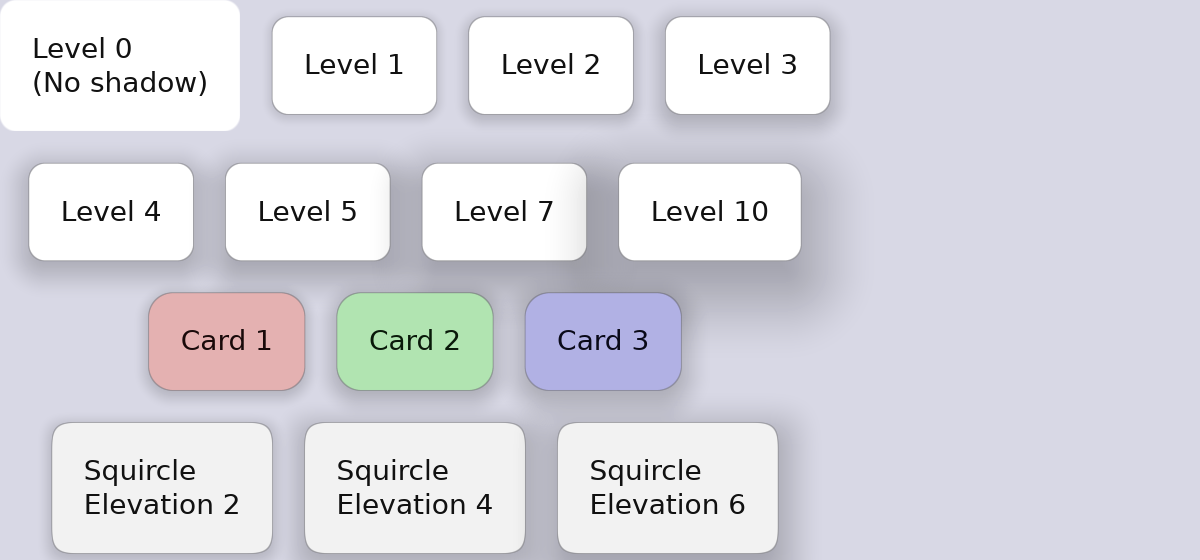
Basic Elevation
#![allow(unused)]
fn main() {
container().elevation(2.0)   // Subtle shadow
container().elevation(4.0)   // Light shadow
container().elevation(8.0)   // Medium shadow
container().elevation(12.0)  // Strong shadow
container().elevation(16.0)  // Very strong shadow
}
How Elevation Works
Elevation creates a diffuse shadow beneath the container. Higher values create:
- Larger shadow spread
- Greater blur
- More noticeable depth effect
Elevation in State Layers
Elevation can change on interaction for tactile feedback:
#![allow(unused)]
fn main() {
container()
    .elevation(2.0)
    .hover_state(|s| s.elevation(4.0))     // Lift on hover
    .pressed_state(|s| s.elevation(1.0))   // Press down on click
}
This creates a “lifting” effect on hover and a “pressing” effect on click.
Animated Elevation
Smooth elevation transitions:
#![allow(unused)]
fn main() {
container()
    .elevation(2.0)
    .animate_elevation(Transition::new(200.0, TimingFunction::EaseOut))
    .hover_state(|s| s.elevation(6.0))
}
Elevation with Corner Radius
Shadows respect corner radius:
#![allow(unused)]
fn main() {
container()
    .corner_radius(12.0)
    .squircle()
    .elevation(8.0)  // Shadow follows rounded shape
}
Complete Example
#![allow(unused)]
fn main() {
fn elevated_card() -> Container {
    container()
        .width(200.0)
        .padding(20.0)
        .background(Color::rgb(0.15, 0.15, 0.2))
        .corner_radius(12.0)
        .elevation(4.0)
        .animate_background(Transition::new(150.0, TimingFunction::EaseOut))
        .animate_elevation(Transition::new(200.0, TimingFunction::EaseOut))
        .hover_state(|s| s.elevation(8.0).lighter(0.05))
        .pressed_state(|s| s.elevation(2.0).darker(0.05))
        .layout(Flex::column().spacing(8.0))
        .children([
            text("Card Title").font_size(18.0).bold().color(Color::WHITE),
            text("Card content goes here").color(Color::rgb(0.7, 0.7, 0.75)),
        ])
}
}
Elevation Guidelines
When to Use Elevation
- Cards - Content containers that need to stand out
- Buttons - Interactive elements, especially floating action buttons
- Dialogs - Modal windows that overlay content
- Menus - Dropdown menus and popups
Elevation Levels
| Level | Use Case |
|---|---|
| 1-2 | Cards, list items |
| 3-4 | Buttons, small cards |
| 6-8 | App bars, snackbars |
| 12-16 | Dialogs, floating elements |
Interaction Patterns
- Hover: Increase elevation by 2-4 levels
- Pressed: Decrease elevation by 1-2 levels (or to minimum)
#![allow(unused)]
fn main() {
container()
    .elevation(4.0)
    .hover_state(|s| s.elevation(8.0))    // +4 on hover
    .pressed_state(|s| s.elevation(2.0))  // -2 on press
}
Elevation with Light/Dark Themes
On dark backgrounds, elevation is subtle but effective. Pair with slight background lightening for better visibility:
#![allow(unused)]
fn main() {
container()
    .background(Color::rgb(0.12, 0.12, 0.16))
    .elevation(4.0)
    .hover_state(|s| s.elevation(8.0).lighter(0.03))
}