Creating Components
The #[component] macro creates reusable widgets from functions. Function parameters become props, and the function body becomes the render method.
Basic Component
#![allow(unused)]
fn main() {
use guido::prelude::*;

#[component]
pub fn button(label: String) -> impl Widget {
    container()
        .padding(12.0)
        .background(Color::rgb(0.3, 0.5, 0.8))
        .corner_radius(6.0)
        .hover_state(|s| s.lighter(0.1))
        .pressed_state(|s| s.ripple())
        .child(text(label.clone()).color(Color::WHITE))
}
}
Use the component with the auto-generated builder:
#![allow(unused)]
fn main() {
button().label("Click me")
}
The macro generates a Button struct (PascalCase) and a button() constructor function from the function name.
Props
All function parameters are props. Use #[prop(...)] attributes for special behavior.
Standard Props
Parameters without attributes become standard props with Default::default():
#![allow(unused)]
fn main() {
#[component]
pub fn button(label: String) -> impl Widget {
    container().child(text(label.clone()))
}
}
#![allow(unused)]
fn main() {
button().label("Required")
}Props with Defaults
#![allow(unused)]
fn main() {
#[component]
pub fn button(
    label: String,
    #[prop(default = "Color::rgb(0.3, 0.3, 0.4)")]
    background: Color,
    #[prop(default = "Padding::all(8.0)")]
    padding: Padding,
) -> impl Widget {
    container()
        .padding(padding)
        .background(background)
        .child(text(label.clone()).color(Color::WHITE))
}
}
Optional — uses default if not specified:
#![allow(unused)]
fn main() {
button().label("Uses defaults")
button().label("Custom").background(Color::RED).padding(16.0)
}
Callback Props
#![allow(unused)]
fn main() {
#[component]
pub fn button(
    label: String,
    #[prop(callback)] on_click: (),
) -> impl Widget {
    container()
        .on_click_option(on_click.clone())
        .child(text(label.clone()))
}
}
Provide closures for events:
#![allow(unused)]
fn main() {
button()
    .label("Click me")
    .on_click(|| println!("Clicked!"))
}
Accessing Props
In the function body, each prop is a read-only Signal<T> (which is Copy). Pass the signal directly to widget methods — this preserves reactivity so props update automatically when the caller provides reactive values (both RwSignal<T> and Signal<T> work as prop values via IntoSignal):
#![allow(unused)]
fn main() {
#[component]
pub fn button(
    label: String,
    #[prop(default = "Padding::all(8.0)")] padding: Padding,
    #[prop(default = "Color::rgb(0.3, 0.3, 0.4)")] background: Color,
    #[prop(callback)] on_click: (),
) -> impl Widget {
    container()
        .padding(padding)                  // Pass Signal<Padding> directly (Copy, keeps reactivity)
        .background(background)            // Pass Signal<Color> directly (Copy, keeps reactivity)
        .on_click_option(on_click.clone()) // Clone optional callback
        .child(text(label.clone()))
}
}
Components with Children
#![allow(unused)]
fn main() {
#[component]
pub fn card(
    title: String,
    #[prop(children)] children: (),
) -> impl Widget {
    container()
        .padding(16.0)
        .background(Color::rgb(0.18, 0.18, 0.22))
        .corner_radius(8.0)
        .layout(Flex::column().spacing(8.0))
        .child(text(title.clone()).font_size(18.0).color(Color::WHITE))
        .children_source(children)
}
}
Use with child/children methods:
#![allow(unused)]
fn main() {
card()
    .title("My Card")
    .child(text("First child"))
    .child(text("Second child"))
}
Slot Props
Slots let a component accept named widget positions — useful for layout components like headers, sidebars, or multi-region containers:
#![allow(unused)]
fn main() {
#[component]
pub fn center_box(
    #[prop(slot)] left: (),
    #[prop(slot)] center: (),
    #[prop(slot)] right: (),
) -> impl Widget {
    container()
        .layout(Flex::row())
        .children(vec![
            left,
            center,
            right,
        ].into_iter().flatten())
}
}
Use with the auto-generated builder methods:
#![allow(unused)]
fn main() {
center_box()
    .left(text("Left"))
    .center(text("Center"))
    .right(text("Right"))
}
Each slot accepts any impl Widget + 'static. Inside the function body, use the parameter name
directly — it’s an Option<Box<dyn Widget>> that was automatically consumed from the slot.
Reactive Props
Props accept signals and closures:
#![allow(unused)]
fn main() {
let count = create_signal(0);
button()
.label(move || format!("Count: {}", count.get()))
.background(move || {
if count.get() > 5 {
Color::rgb(0.3, 0.8, 0.3)
} else {
Color::rgb(0.3, 0.5, 0.8)
}
})
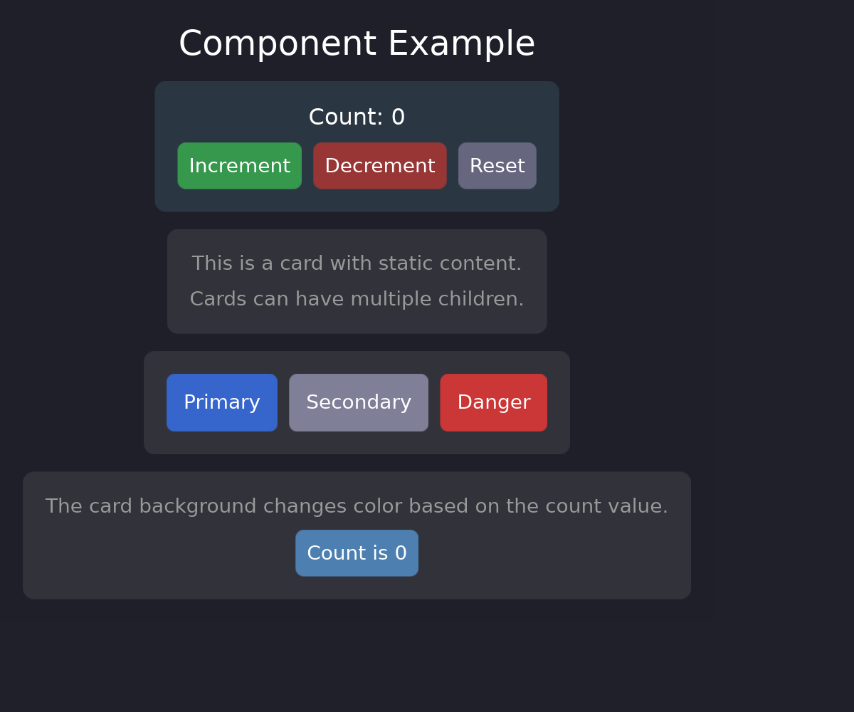
}Complete Example
use guido::prelude::*;

#[component]
pub fn button(
    label: String,
    #[prop(default = "Color::rgb(0.3, 0.3, 0.4)")] background: Color,
    #[prop(default = "Padding::all(8.0)")] padding: Padding,
    #[prop(callback)] on_click: (),
) -> impl Widget {
    container()
        .padding(padding)
        .background(background)
        .corner_radius(6.0)
        .hover_state(|s| s.lighter(0.1))
        .pressed_state(|s| s.ripple())
        .on_click_option(on_click.clone())
        .child(text(label.clone()).color(Color::WHITE))
}

#[component]
pub fn card(
    title: String,
    #[prop(default = "Color::rgb(0.18, 0.18, 0.22)")] background: Color,
    #[prop(children)] children: (),
) -> impl Widget {
    container()
        .padding(16.0)
        .background(background)
        .corner_radius(8.0)
        .layout(Flex::column().spacing(8.0))
        .child(text(title.clone()).font_size(18.0).color(Color::WHITE))
        .children_source(children)
}

fn main() {
    App::new().run(|app| {
        let count = create_signal(0);

        let view = container()
            .padding(16.0)
            .layout(Flex::column().spacing(12.0))
            .child(
                card()
                    .title("Counter")
                    .child(text(move || format!("Count: {}", count.get())).color(Color::WHITE))
                    .child(
                        container()
                            .layout(Flex::row().spacing(8.0))
                            .child(button().label("Increment").on_click(move || count.update(|c| *c += 1)))
                            .child(button().label("Reset").on_click(move || count.set(0)))
                    )
            );

        app.add_surface(
            SurfaceConfig::new()
                .width(400)
                .height(200)
                .background_color(Color::rgb(0.1, 0.1, 0.15)),
            move || view,
        );
    });
}
When to Use Components
Components are ideal for:
- Repeated patterns - Buttons, cards, list items
- Configurable widgets - Same structure, different props
- Encapsulated state - Self-contained logic
- Team collaboration - Clear interfaces and contracts
For one-off layouts, regular functions returning impl Widget may be simpler.